

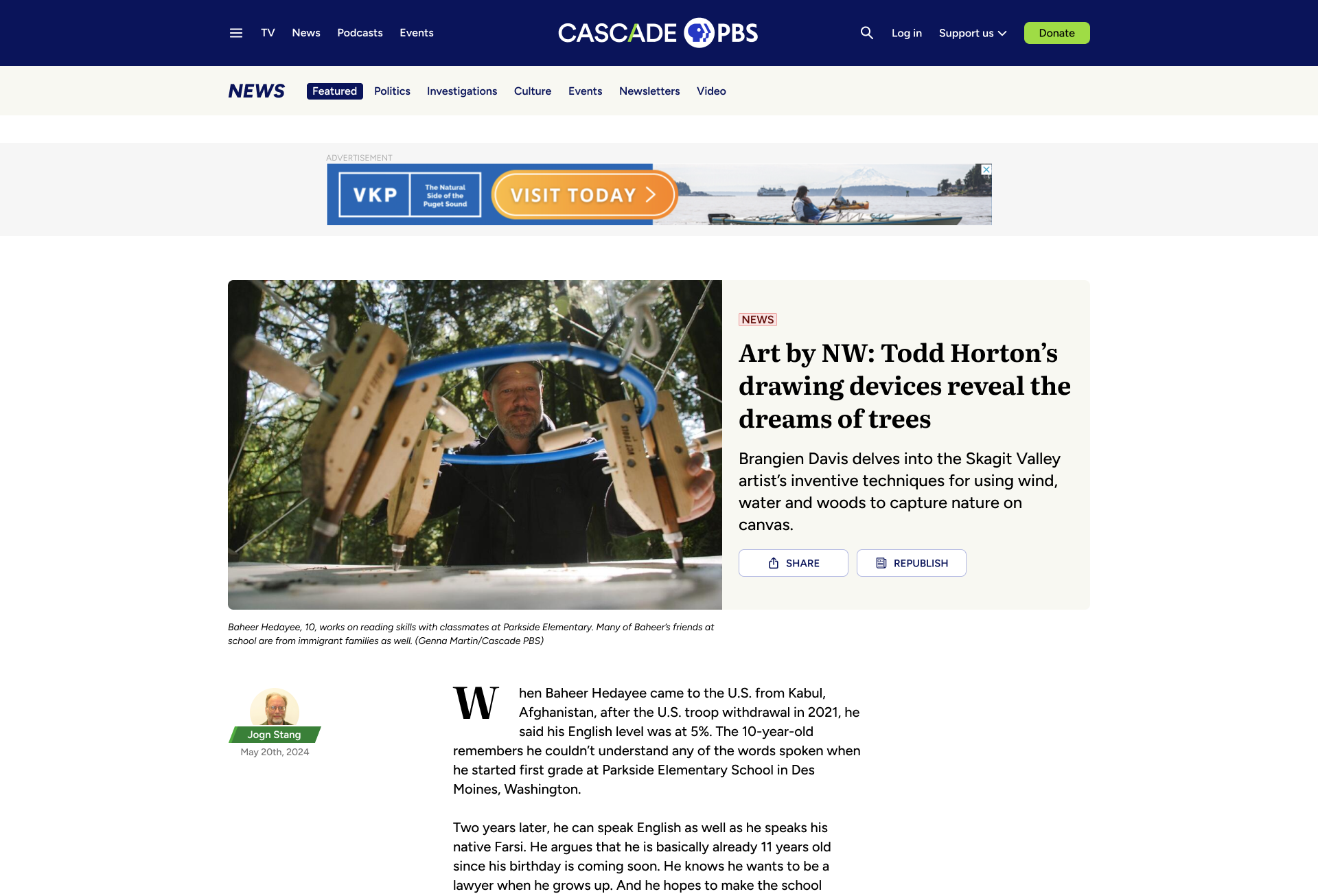
1. Overview
For years, Cascade PBS was KCTS 9, the PBS station, and Crosscut, the local news organization. Internally, teams from the two brands worked together. Externally there were two websites, two branding styles, and two different audiences. There was confusion around our brands and the sites were dated and hard to use.


In 2024, we combined the brands to be one entity, Cascade PBS, and transitioned two sites into one over the following year. The goal was to have a modern yet recognizable site that didn’t alienate users of just one brand while encouraging new or more adventurous users to discover the other parts of our business.

Role
UX Design Lead
TIMELINE
July 2024 - Sept. 2025
END USERS
Cascade PBS audience (100,000+)
TEAM
In-house product team (4)
External teams: Outpost (7)
Brand confusion
KCTS 9 and Crosscut appear as two separate entities even though their original content is produced by the same team. Users are unnecessarily siloed and missing out on content they would likely enjoy.

Problem

Provide a digital platform for migrating audiences
Provide a comprehensive streaming app that exceeds audience expectations. Make it available on a wide range of devices, including Roku, Apple TV, iOS, Android, and Fire TV.

Provide a digital platform for migrating audiences
Provide a comprehensive streaming app that exceeds audience expectations. Make it available on a wide range of devices, including Roku, Apple TV, iOS, Android, and Fire TV.
Goal

Success metrics
User adoption
Track the number of stations adopting the platform and the growth in active users.
Revenue growth
Monitor the increase in donations and memberships generated through the app, especially through features designed to enhance digital fundraising
Poor usability
The existing sites are dated and plagued with design debt that manifests as inconsistency and lack of accessibility. Users struggle to retrieve content and lack the opportunity to discover the quality work that in-house teams produce. Additionally, a lot of richer functionality that could delight users is missing.
Problem
Build a backend portal for stations to exchange content
Provide stations a CMS where they can share content, tagging, and content surfacing. Also give them easy tools to customize their own apps, allowing them to establish unique branding, messaging, and revenue generation.
Goal
Station feedback
Collect and incorporate feedback from participating stations to ensure the platform effectively meets their needs.
Success metrics
Stakeholders
My role
As the lead UX designer for the project, I worked with a variety of stakeholders as shown in the diagram below.
Additionally, due to the large scope of the project and the other projects I was working on, I hired a freelance UX designer who I managed.
Operational team
(COO, directors of each department)
Marketing/graphic design
Sponsorhip
(Ad placement, sponsorships)
Product team
(project manager, product manager, developers)
Internal teams
Ghost and Outpost
(The platform we used)
Contracted team

2. Design Process
To establish an optimal website architecture and design, I studied our existing two websites and competitor’s websites, and conducted usability tests on prototype options.
Initial Considerations
Personas
Competitive Analysis
Pain Points
Concepts
Usability study of prototypes
Information Architecture

Initial Considerations
Previous websites
To avoid alienating and losing fans of either website, it’s important to carry over their legacies in certain ways. Even if the new site looks fresh and new, it should act and feel familiar.
To delight existing users and bring in new ones, it’s important to provide new discovery opportunities and modernize the new site through new capabilities and a cleaner look.


5000 daily unique users of both sites

2200 unique daily KCTS 9 users
What to bring from KCTS 9
- Have a dedicated TV section
- Use a similar carousel layout with a featured item
Issues with KCTS 9
- Featured show is too large and pushes content down
- Browsing is limited to the TV homepage
2800 unique daily Crosscut users
What to bring from Crosscut
- Have a dedicated news section
- Display similar data for articles
Issues with Crosscut
- Featured story is too large and pushes content down
- Hierarchy and organization is lacking -- all stories are contained in a single column


Gathering requirements
To understand the wants and needs of the site, I spoke with two groups.
First, I spoke with users of both sites, working to understand how they use the sites and what issues they have. I also asked how they consume content in general to grasp how we could combine the sites and add functionality that users would actually use.
Next, I spoke with internal stakeholder who produce and manage all our content. They shared how they would like to build content, how they would like their content to be displayed, and issues they have with the current sites.
Balancing all the needs was a challenge. Users often have needs that surpass our capabilities in terms of content production and internal teams often didn’t conceptualize how their part could fit in the whole.
Additionally, some internal internal team members weren’t familiar with patterns of contemporary digital products. Listening, teaching, and understanding were just as important as ideating.
Personas
(The different audiences)
A major challenge in this project was catering to the diverse user base without alienating any party. A benefit of the previous two sites was users could easily be catered to. Creating personas was important in this project to understand how different users approach the site.

1

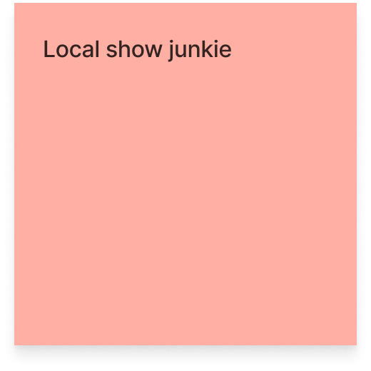
PBS
Junkie
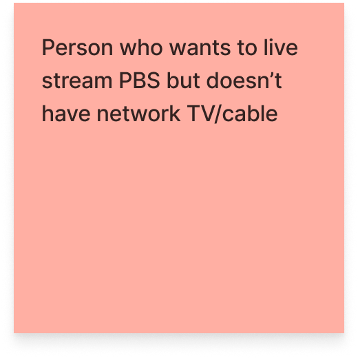
Kenny loves PBS. As a kid, he grew up watching Sesame Street. Now they enjoy the Masterpiece collection and let their children stream kids content.
PAGES visited
TV, News (occasional)
Devices used
Laptop, tablet
Frequency of use
Several times per week
Membership Status
Passport subscriber


2
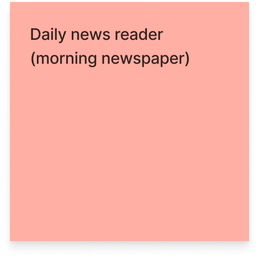
Daily
News
Reader
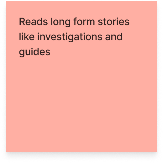
Elizabeth mainly uses the site for keeping up on the news. She reads local political and investigative stories, and watches PBS News Hour and Frontline.
PAGES visited
News, TV (occasional)
Devices used
Laptop, tablet
Frequency of use
Daily
Membership Status
Occasional donor

3
Local
Event
Enthusiast
Amelia is actively involved in their community. Whether it’s a political rally or local artists’ show, they want to know what’s happening this weekend.
PAGES visited
Events, News, TV
Devices used
Laptop, mobile
Frequency of use
Weekly
Membership Status
Non-member

4
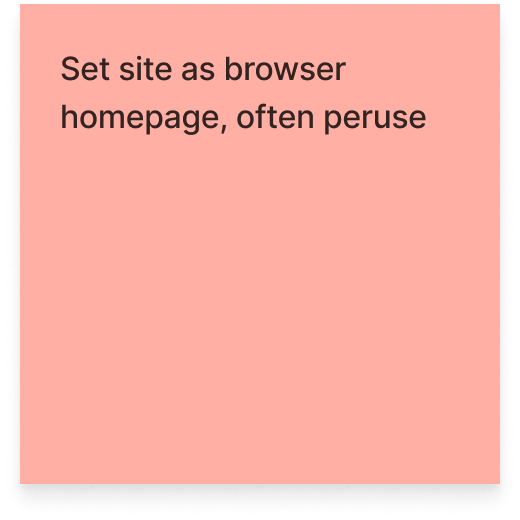
Browser
Homepage
User
Steve sets the site as his browser homepage where he can see local news, events, and content updates as he goes about his day
PAGES visited
Home, News, TV, Events
Devices used
Desktop, tablet
Frequency of use
Daily
Membership Status
Occasional donor

5
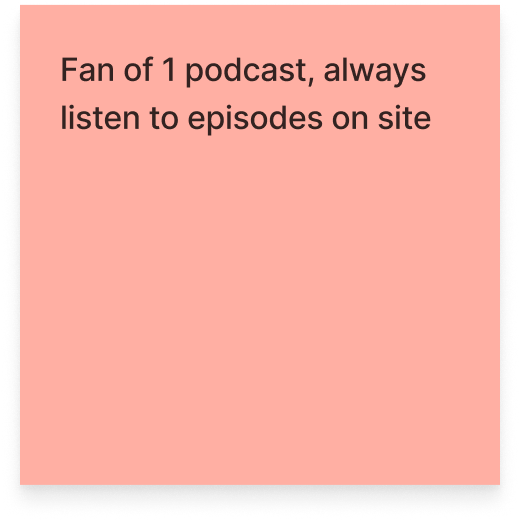
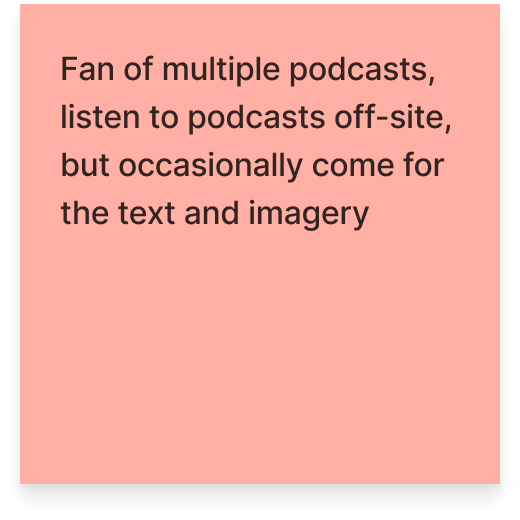
Podcast
Fanatic
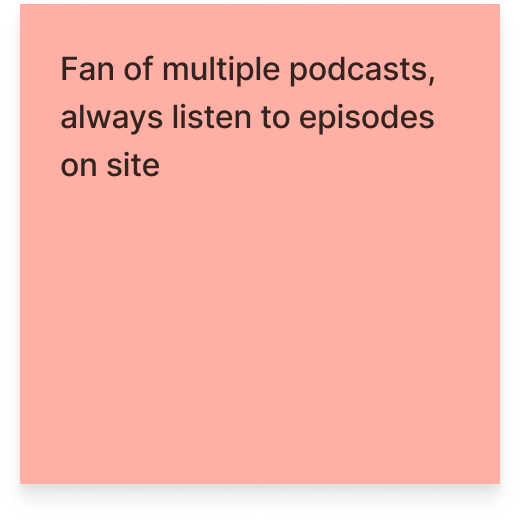
Chris enjoys listening to podcasts when he’s commuting to work or taking care of chores. Occasionally, he’ll check in on the local news as well.
PAGES visited
Podcasts, News
Devices used
Mobile
Frequency of use
Several times per week
Membership Status
Non-member

Competitive Analysis
The scope of the project was larger than most other websites, making it challenging to find competitive offerings. To overcome this, I studied a variety of News, Podcast, and Video sites (direct competitors) as well as more aggregative websites (indirect competitors).


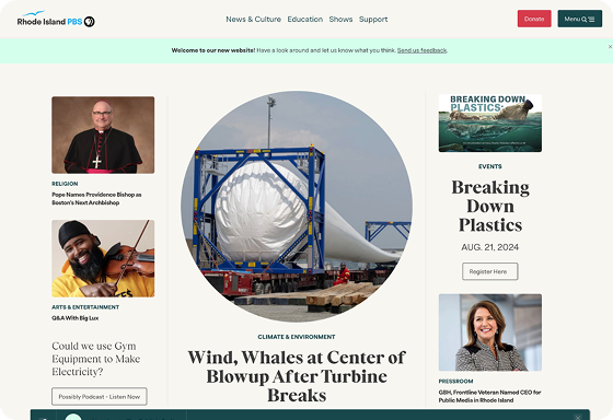


Current public media, like NPR and Rhode Island PBS, who just redesigned their site
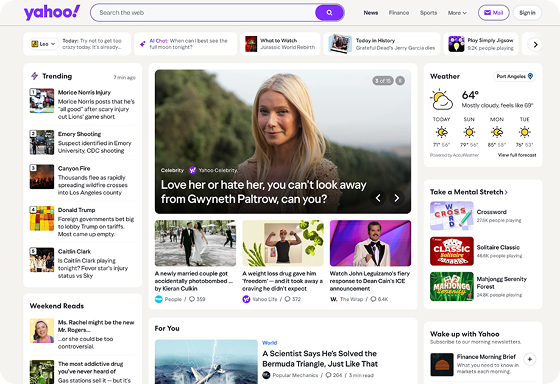
Large scope landing sites, like Yahoo!
Other local offerings, like The Stranger
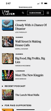
I worked with the team at Ghost to review their current customer’s sites, like The Lever and Hell Gate, and see what capabilities we should adopt
Popular news sites, like The New York Times and The Atlantic
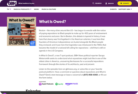
Podcasts websites, like WGBH and Spotify
Video websites, like YouTube
Pain Points
Below are four pain points that represent a selection of what we uncovered after reaching out to our users. Some of the pain points we discovered were large (like difficulty with search), while others were small, concerning a certain feature or interaction (like difficulty reading Briefs).
- Collections of original content are spread across the two current sites and organized in different ways, making them hard to find and follow.
- Original content isn’t differentiated, making it easy to miss.
1.
Original content is hard to find
View solution

- The search experience is different on the two sites and messy overall.
- Search filters are overwhelming and complicated.
- Search is not smart, requiring users to use the filters or scan through unwanted results.
2.
Search is difficult
- Understanding how and where to play episodes is difficult.
- Podcast episodes have dedicated pages (similar to articles), but it’s hard to control the episode player while reading the article.
3.
The podcast listening experience is lacking
- Briefs, a microblog feature, are hard to read because they appear in an infinite list without any navigation or filtering.
- Since Briefs appear in an infinite list, individual ones are hard to share.
4.
Reading and sharing “Briefs” is challenging
View solution

Concepts
To begin design work, I created
- Lo-fi wireframes to share ideas and layouts
- Medium fidelity concepts to share styling and detail possibilities (see below)
- Medium fidelity prototypes to test ideas with users (see next section)
Testing Prototypes
To validate ideas in a low stakes manner and understand how users feel early in the project, I tested prototypes with existing users and employees; ideas concerning information architecture, navigation, pages vs. modals, and layouts. Below is one example.
Desktop
Mobile
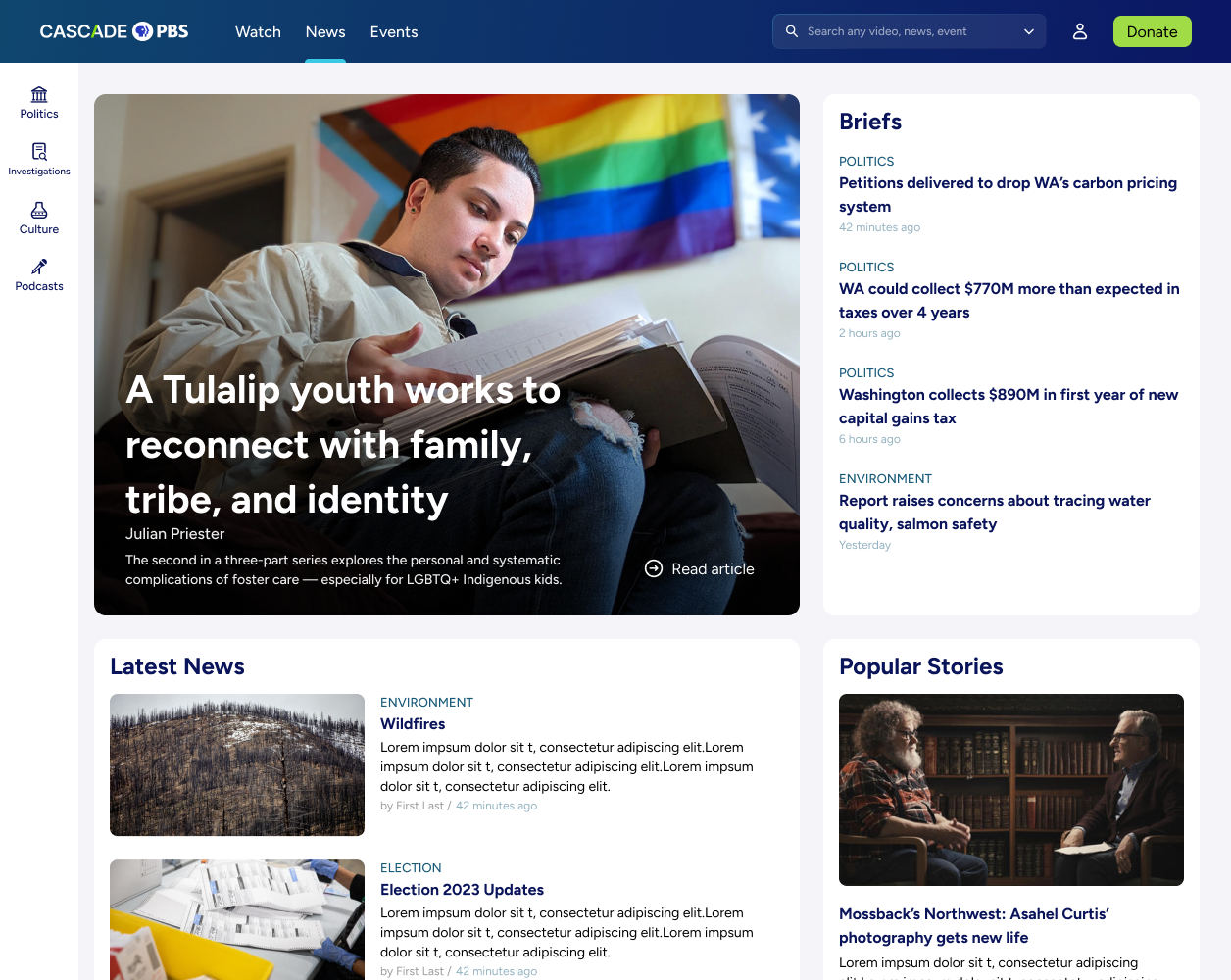
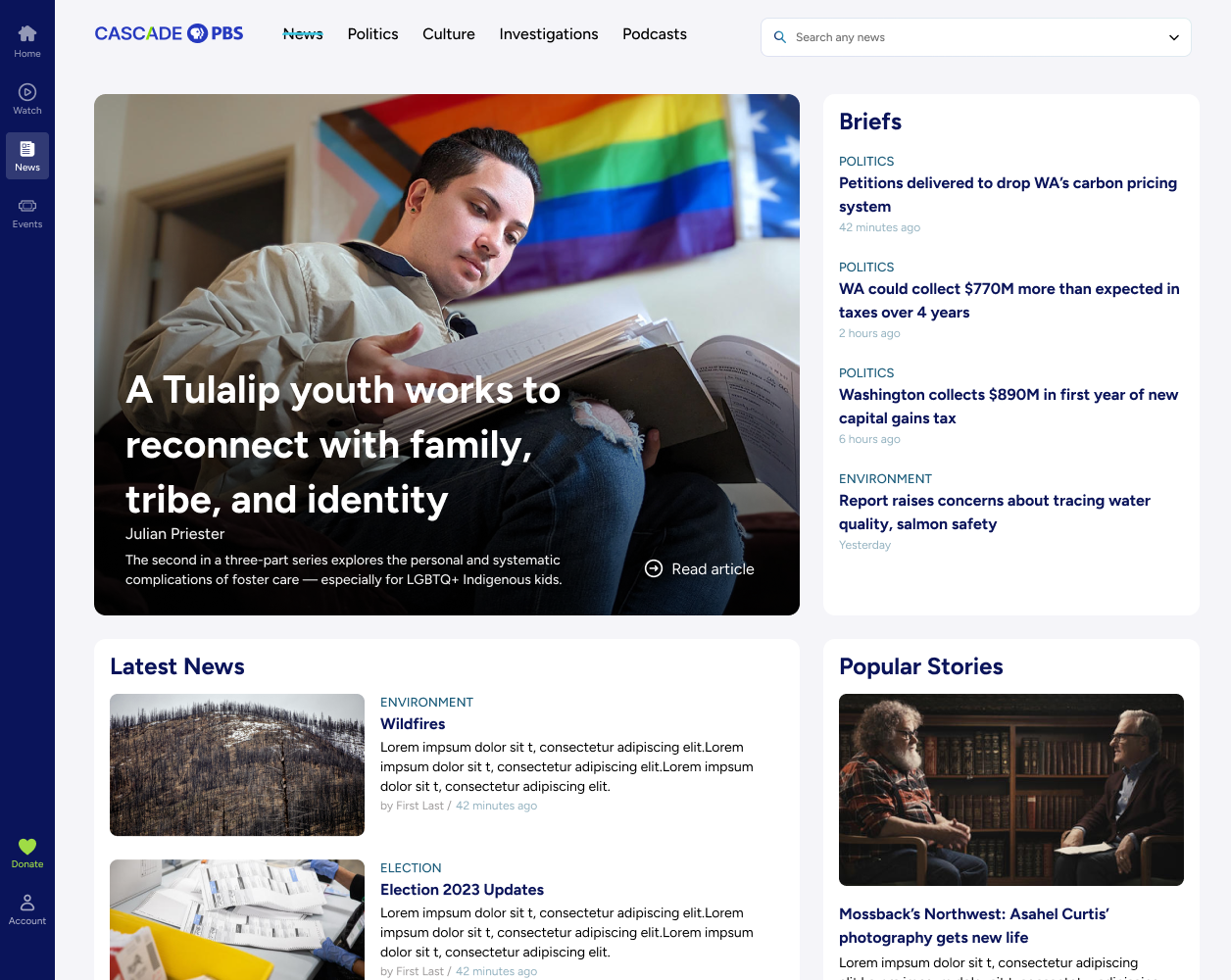
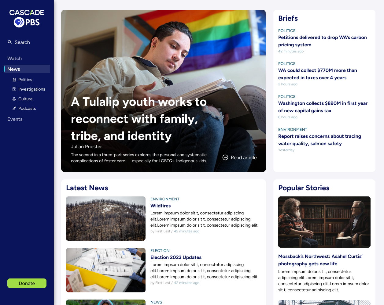


Side main nav, top sub navigation
Navigation Usability Study
Since the scope of the website is large with multiple different landing pages and content types, we needed to ensure navigation was intuitive and highly functional.
Our tests provided a few key learnings:
Although the side navigation options came with benefits (like the ability to stack items in a condensed space), the familiarity and orientation of having all navigation items at the top was more important to users.
However, we also learned that users appreciate a slide out menu (even on desktop) that gives the advantages of a side menu system (like being able to navigate anywhere on the site from any page).
Information Architecture
Below are the four main modes of navigation on the site.
- Use the top menu and/or hamburger menu to navigate between the four key sections of the site
- Navigate between different content types of a single brand, called a “Local original”
- Use tags to navigate between different content types of a singular topic
- Use search (AI will assist in surfacing the right content type, or one can use tabs to filter)
- News
- Podcasts
- Events
- TV
Home
Local originals


TV home
Series
Movies
Live
My list
Show page
Video page

Podcasts home
Podcast page
Podcast episode

Events home
Event page
News home
Briefs
Topics
Popular
Article
Author


Microsites
Donation
Search
Account
Newsletters
Misc.
Tag pages
Help, contact, Creative Works, etc.
Voter Guide, Ideas Festival, Black Arts Legacies, etc.

3. Final Product
To demonstrate the consideration of design throughout the project, I’ve selected four areas to highlight.
Home page
News
TV
Local Originals


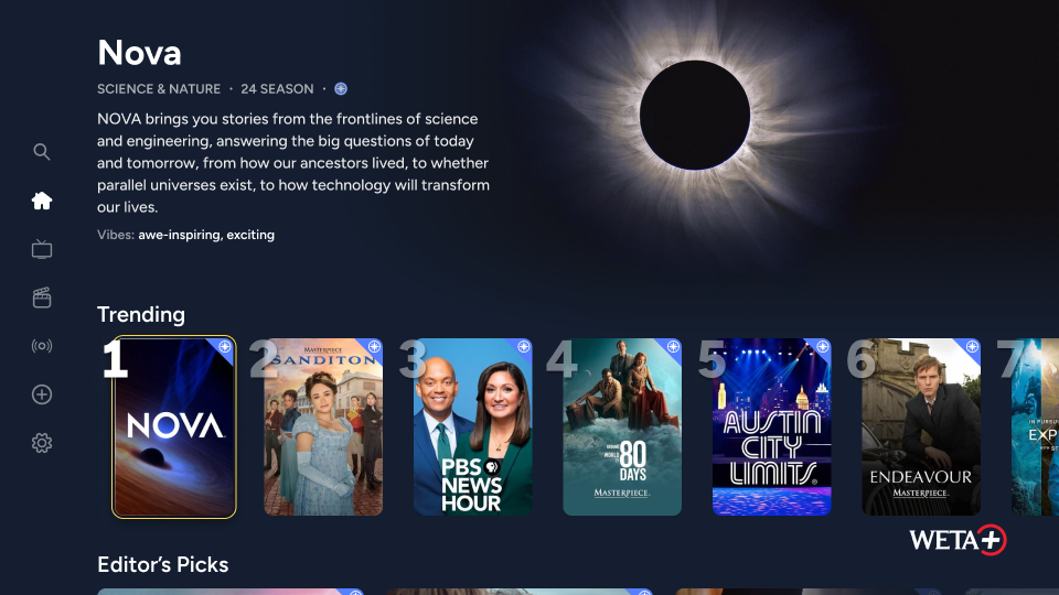
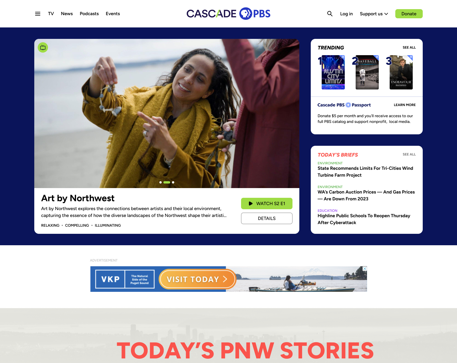
Combined homepage
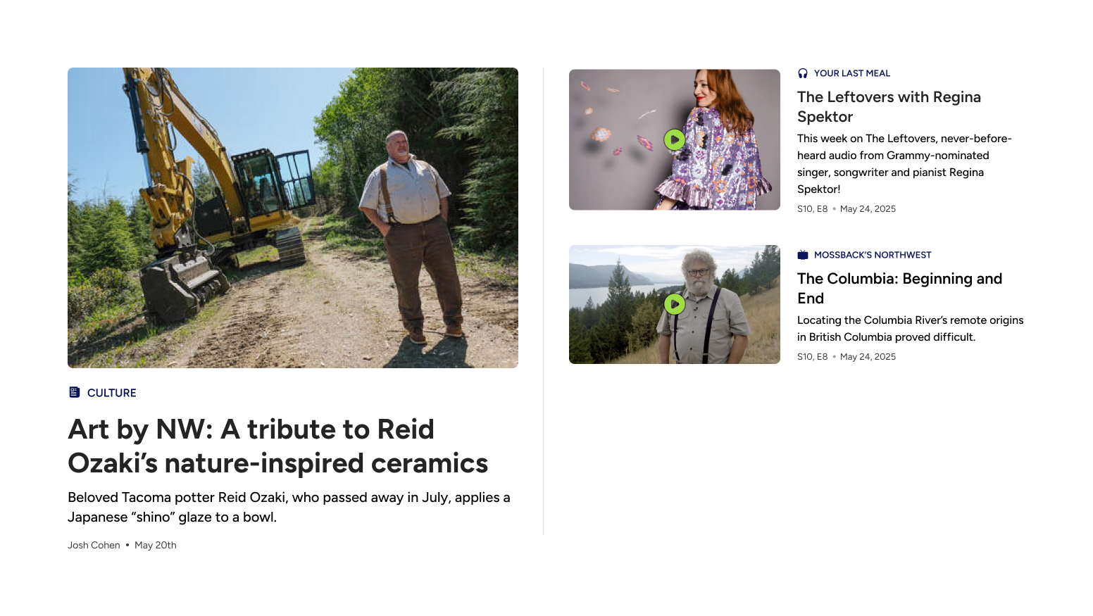
To design the homepage, I worked with a variety of stakeholders, including content teams, advertising, leadership, and - of course - end users. The project required consistent communication, creative solutions, and some politics. Not everyone could get what they desired.

- Introduce users to content they would appreciate
- Accommodate the organization’s content output
GOALS:
Article Design

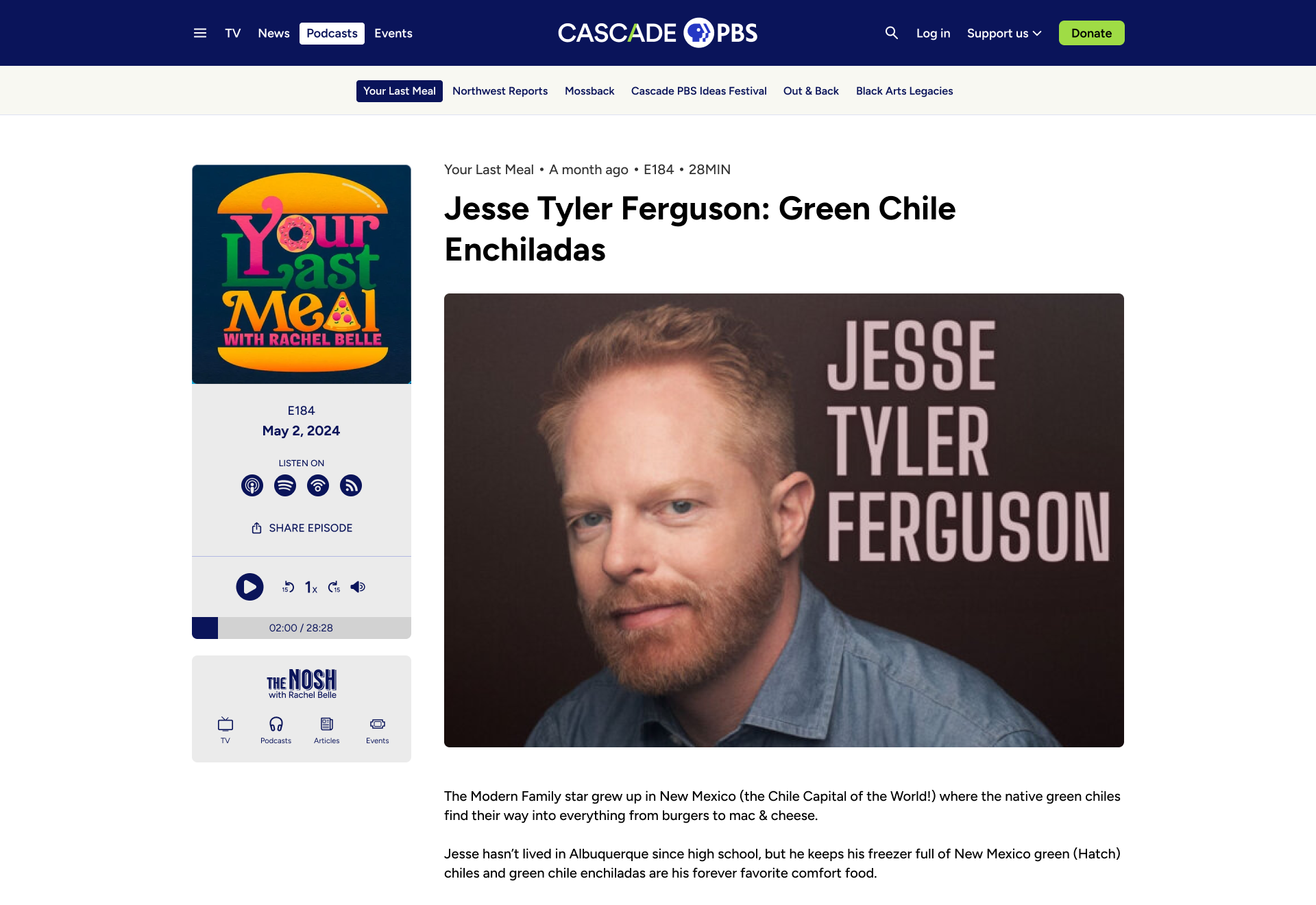
Briefs
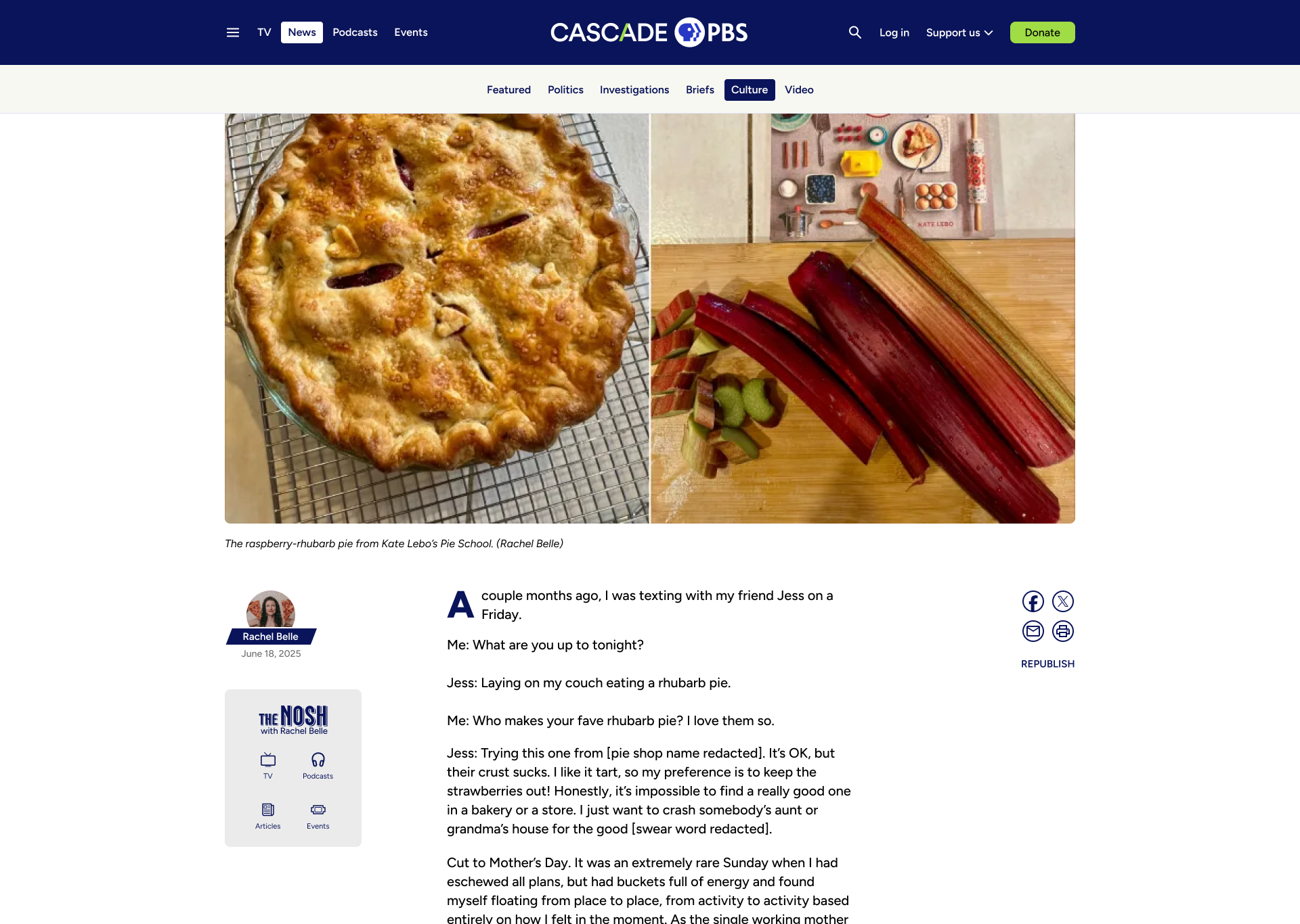
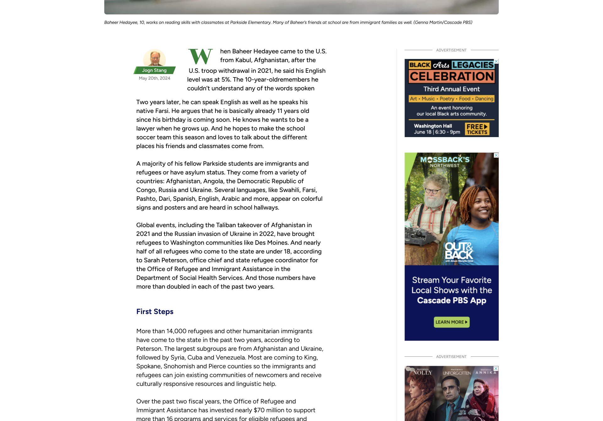
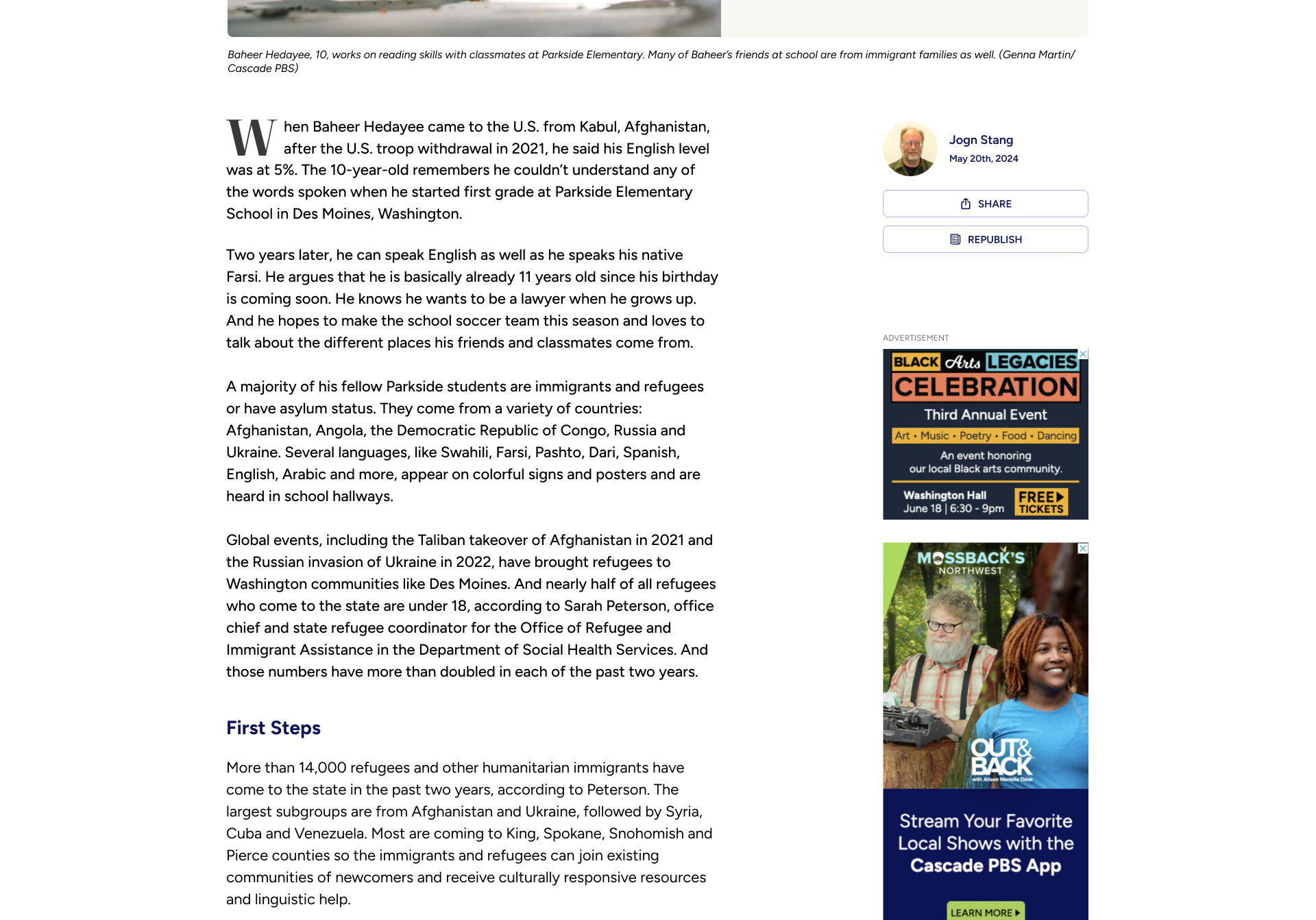
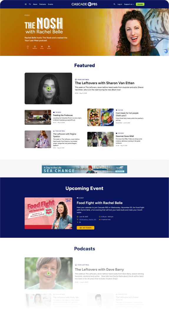
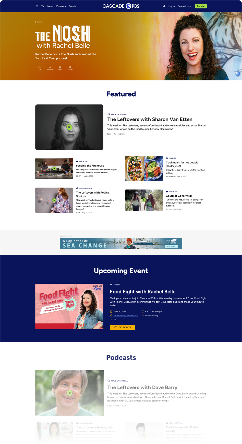
Briefs provide users with short blog-style articles that are written throughout the day. To design them, I wanted to bring some navigation into infinite scroll. I used a sticky list on the left side, allowing for quick navigation with the benefit or a scroll progress indicator.
With a glut of online news outlets fighting an amoral battle for attention, a value-driven news site like our needed to capitalize on every UX detail.
The entire Crosscut website needed a new home on Cascade PBS in a way that paid homage to its roots (reducing user surprise) while bringing new life and capability to the experience.
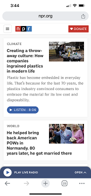
News homepage (desktop)
News article (mobile)
Provide an enjoyable experience for finding and consuming the most relevant local news
GOAL:

News
The TV part of the site on mobile
The TV part of the site on desktop
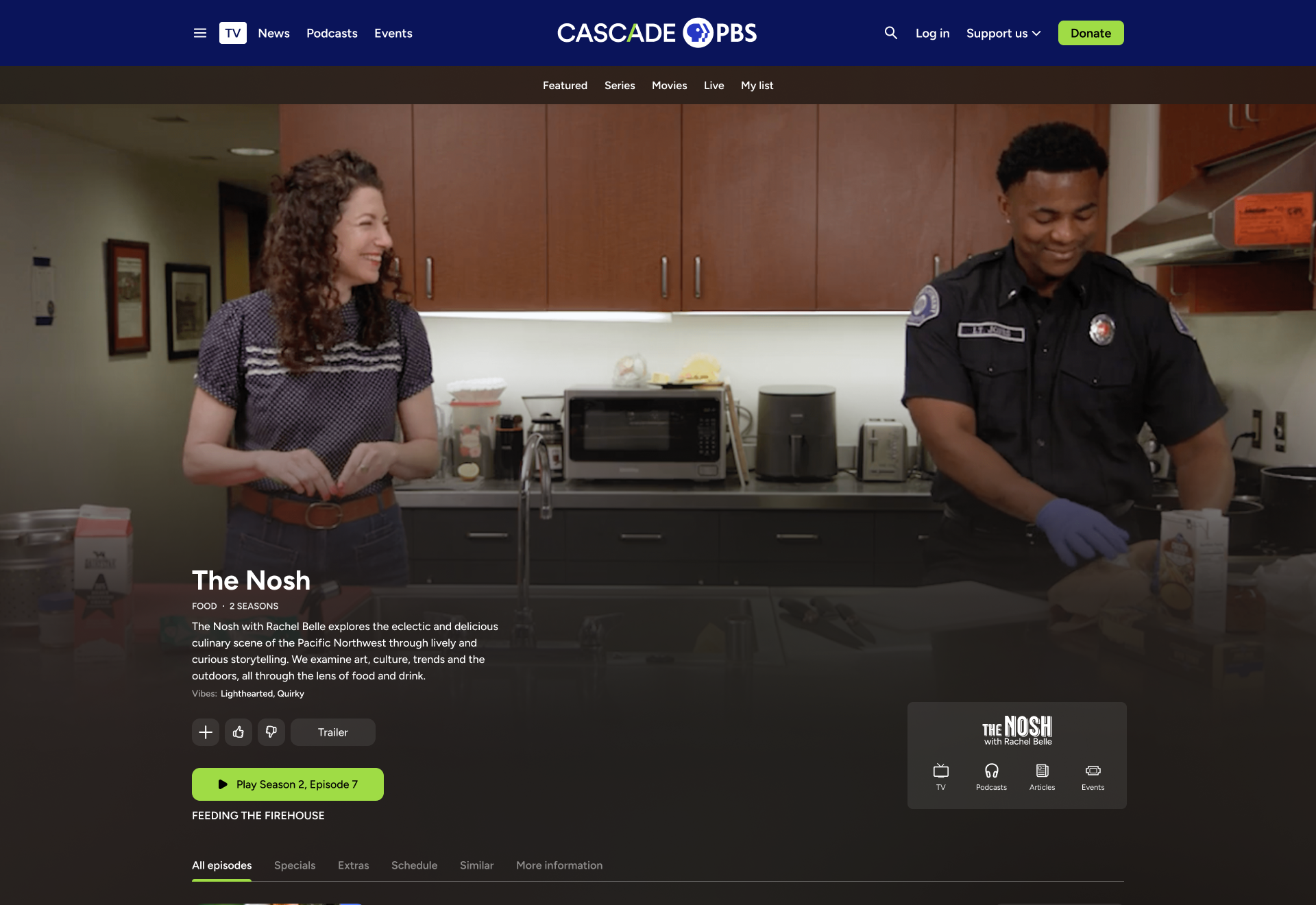
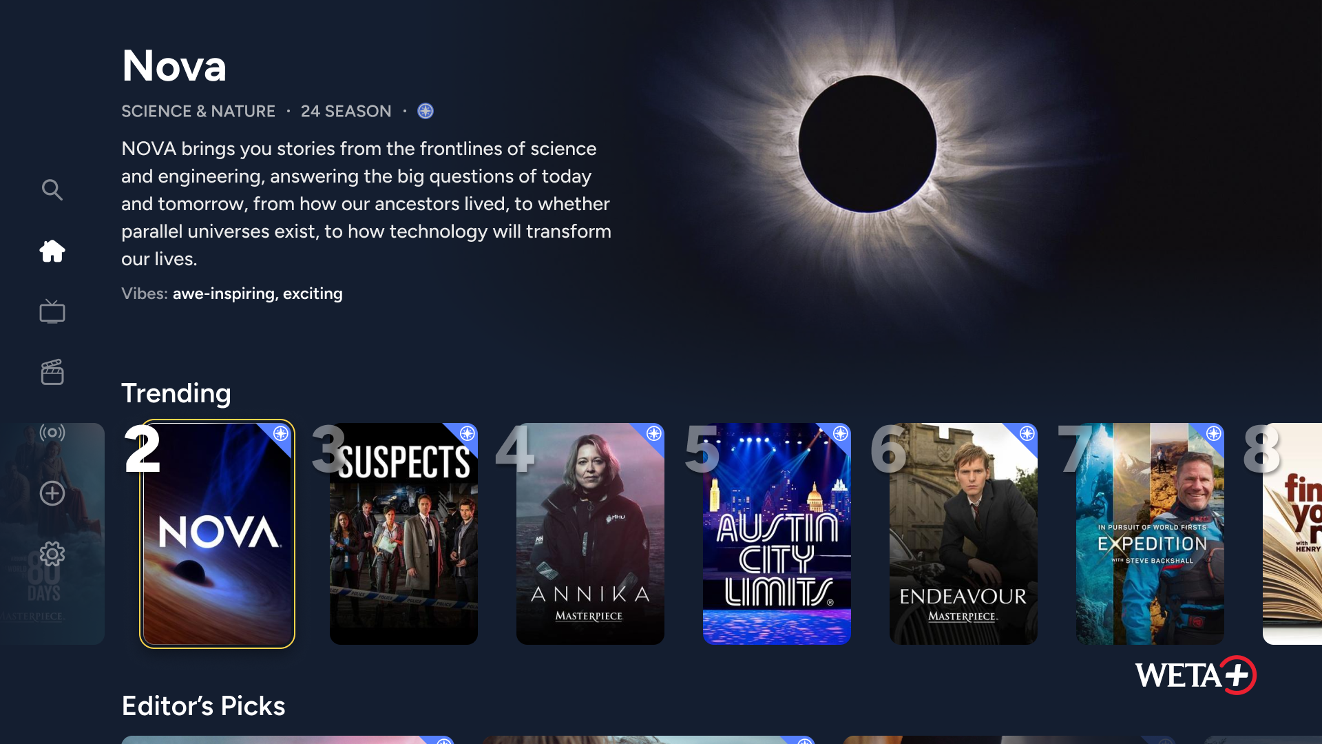
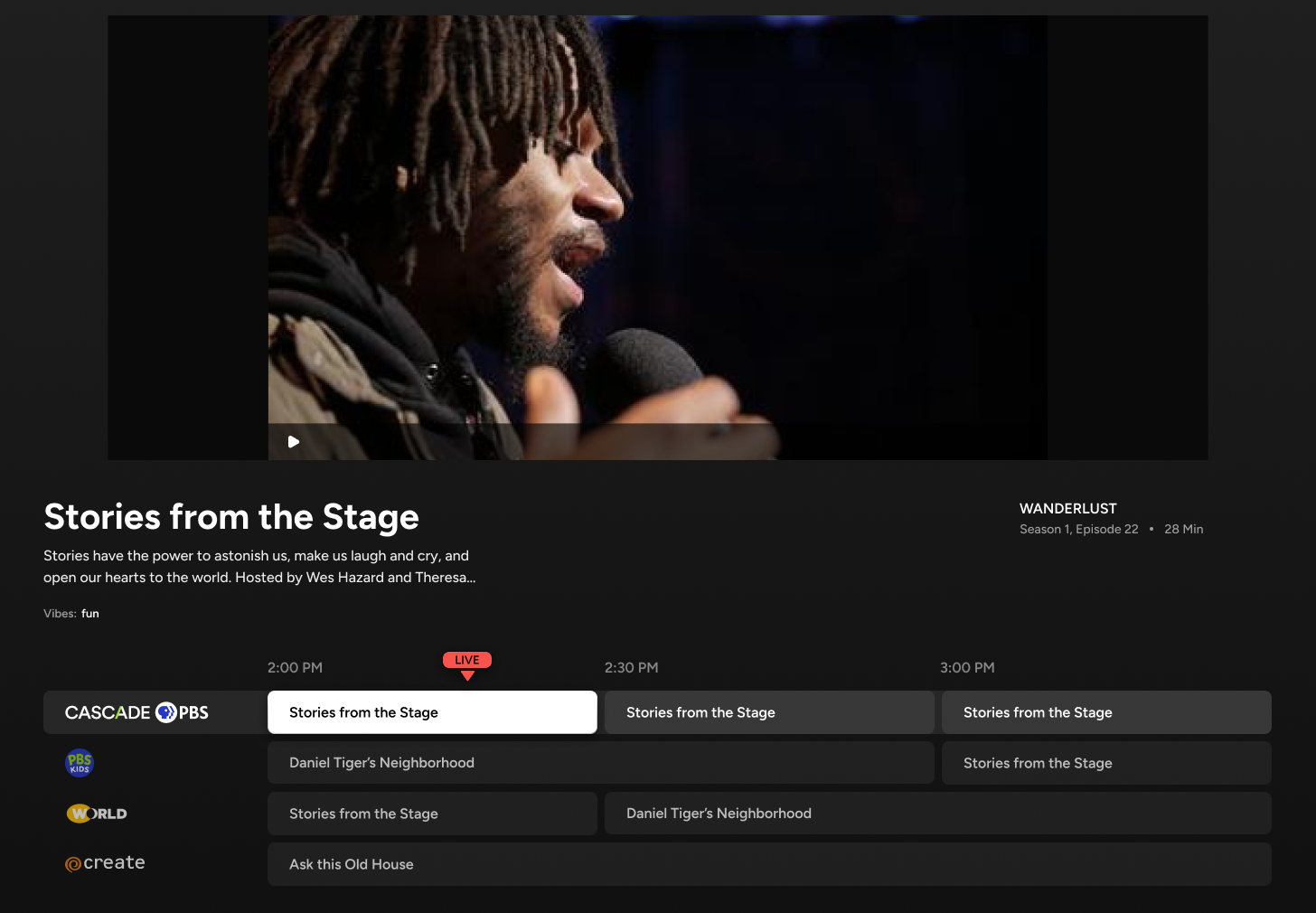
TV
Part of the Local Public project was integrating the streaming platform onto web, allowing our new site (and other station’s sites) reflect what was in the apps. I ensured the TV portion of the site fit with the rest of the site, while allowing TV components to live accross the rest of the site, like on the combined homepage.
Local Public project

Seemlessly integrate Local Public into the entire site, allowing TV content to natively mix with articles, events, and podcasts
GOAL:
Learn more about the Local Public project:

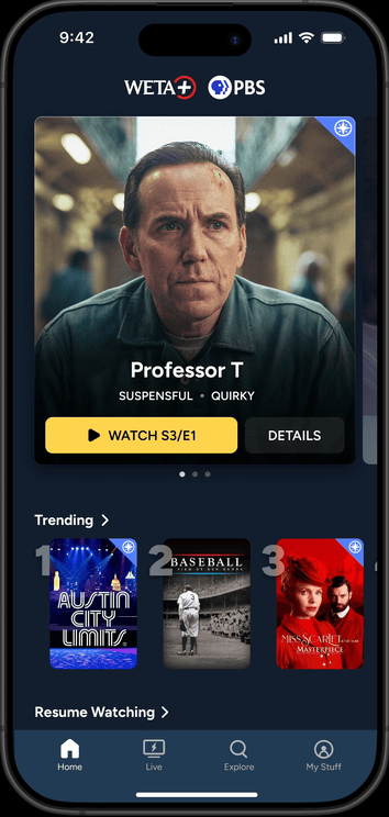
Designing a cross-platform streaming app, serving 15 PBS stations
Cross Pollinate content
The Local Originals landing pages highlight the intelligent way we designed different content types to play well together. The modularity in Local Originals is carried over to the rest of the site, including the homepage.
For website managers, they can determine three things:
- Which content types belong to a specific Local Original (TV, Podcasts, Articles, Events, Newsletters)
- Which blocks (modules) to include on the franchise page and which ordering
- Content-specific block
- Topic-specific block (mixed content types)
- Manually curated blocks
- Automatically populated blocks (reverse chronological, popular, relevant)
- Which types of blocks are used
- Grid
- Carousel
- Number of items
- Light or dark

Challenges to address:
1.
How to identify different content types for users?
- Icons/labels
- Other context clues like play buttons and the data displayed
2.
How to allow the different content types to be displayed in the same containers
- Images
- Data

Podcast episode
TV series


Event
Article

Local Original hub page


TV

Podcasts

Articles

Events
Interconnected navigation
- From any page by one of our Local Originals personalities, users can navigate to the hub page for that personality or to the specific
Feature testing
We are also testing a more sophisticated option to see how users respond.
In this option, a sticky popup button lives near the bottom of the page. When expanded, it provides a mini-hub for that Local Original
Since is usually reserved for AI chatbots or other message features, we want to make sure users won’t get confused by styling.
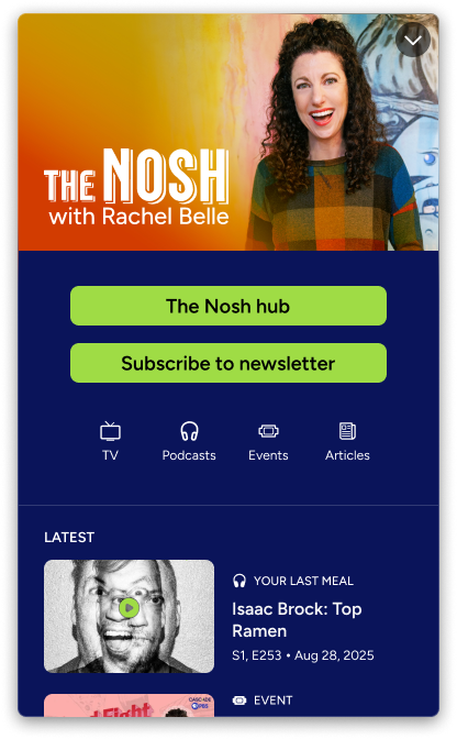


GOAL 2:
Build audience relationships with local personalities
GOAL 1:
Cross-pollinate content types without user confusion
Local Originals
(and content interconnectivity)

3. Results and Next Steps
The website has only just launched, but we have a history of tracked metrics from the previous two websites. We can compare this with the current website, and continue comparing as the site and matures.


Results
Average Daily Users
The jump in daily average users post-launch is a great initial sign.
We’ll need to monitor these statistics for months and years post-launch to ensure artificial excitement or general trends (like news cycles) didn’t cause the bump.Generally, the time of year that the website launched has lower news and TV consumption numbers, which is another good indicator for the new site.
The final good news is that a sizable portion of the new users have stuck around for multiple months.


7,500
5,000
2,500
0
AvG. Daily Users
New Website Launch
April ‘24
July ‘24
Oct ‘24
JAN ‘25
April ‘25
July ‘25
Oct ‘25

5,293
4,316
4,955
5,068
4,690
4,751

Combined Crosscut.com + KCTS 9.org users
CascadePBS.org

7,352
6,764

Passport Conversions
Passport memberships allow users to access the full library of video content.
The initial jump in Passport membership means users are not only visiting the new site, but they are following the funnel to donating and boosting revenue.
25k
20k
15k
10k
5k
0
Passport Convs.
FY 22
FY 23
FY 24
FY 25
Post Launch (6/25-10/25)
12,953
16,219
19,987
13,873
22,153
converted to yearly average
Learnings
I learned a lot throughout the course of this project, and would certainly approach the project in a different way if I were to start it again. Here’s one example of my learnings:
Evaluate which pages/features need to be meticulously planned before designing and which can be quickly conceived and later refined in an MVP-style approach:
Sometimes it’s better to ensure stakeholders are fully understood and users are listened to before working on designs.
For example, the Local Originals was redesigned post-launch when stakeholders felt it was lacking in some ways. With more foresight, we could have saved time and delivered a better product from the start.
Sometimes it’s better to quickly design something and fix it up later in order to not stall the project (be careful with this in order not to make too many non-researched decisions!)
For example, article designs have been established for awhile now with best practices established. Although it’s important to question some of the conventional wisdom, it’s probably not worth investing a lot of time into reinventing the wheel here. I think I could have saved a little time on these designs, which would have been better devoted on other areas of the site.

VS.

Next Steps
Reach out to users
To validate the decisions we’ve made, determine which features need improving, and understand which features need to be added, we have planned post-launch user research, including the following:
- Survey users
- Interview users
- Conduct usability studies
- A/B test new features
Refine website and continuously improve
Initial election results concept
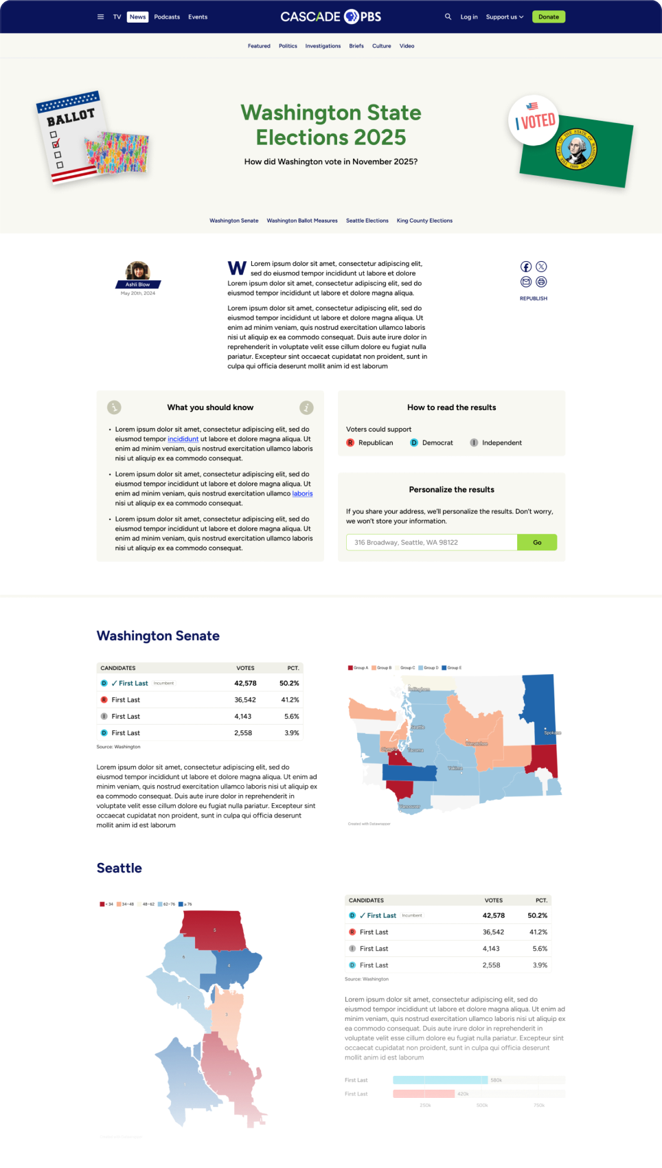
There is an abundance of follow up work for the website that can be sorted in three categories. Below are the categories with a few examples of the work to be done:
- Added features based off continuous post-launch user research
- Election Results
- Black Arts Legacies (a microsite that celebrates local black artists)
- Voter Guide
- Additional Local Originals
- Cascade PBS Ideas Festival 2026 (a microsite that hosts our yearly festival)
- Added features based on events and content creation throughout the year
- Improved TV schedule pages
- Improved TV guide page
- More from our continuous user research
- Added features that were saved for post-launch to complete the site in time
- Podcasts improvements
- NPR integration
- Live events integration
- More accessibility features for video player
- Membership pages
- Apps marketing page

My Other Case Studies


OTT

Mobile
WEB
Designing a cross-platform streaming app, serving 15 PBS stations
Frontend apps
BACKEND WEB ADMIN
Read case study
OTT
Mobile
WEB
Crafting a scalable, 1000 component atomic design system for 15 PBS stations and multiple device types.
Read case study

Copyright © 2025 | Designed and Built in Seattle, Washington


Designing a PBS video, news, podcast, and events website, serving 100,000+ members.
Jump to product screens
Visit site
Overview
Process
Product
Results
Top


1. Overview
For years, Cascade PBS was KCTS 9, the PBS station, and Crosscut, the local news organization. Internally, teams from the two brands worked together. Externally there were two websites, two branding styles, and two different audiences. There was confusion around our brands and the sites were dated and hard to use.


In 2024, we combined the brands to be one entity, Cascade PBS, and transitioned two sites into one over the following year. The goal was to have a modern yet recognizable site that didn’t alienate users of just one brand while encouraging new or more adventurous users to discover the other parts of our business.

Role
UX Design Lead
TEAM
In-house product team (4)
External teams: Outpost (7)
TIMELINE
July 2024 - Sept. 2025
END USERS
Cascade PBS audience (100,000+)
1.
Brand confusion
KCTS 9 and Crosscut appear as two separate entities even though their original content is produced by the same team. Users are unnecessarily siloed and missing out on content they would likely enjoy.

Problem
Provide a digital platform for migrating audiences
Provide a comprehensive streaming app that exceeds audience expectations. Make it available on a wide range of devices, including Roku, Apple TV, iOS, Android, and Fire TV.

Provide a digital platform for migrating audiences
Provide a comprehensive streaming app that exceeds audience expectations. Make it available on a wide range of devices, including Roku, Apple TV, iOS, Android, and Fire TV.
Goal
Success metrics
User adoption
Track the number of stations adopting the platform and the growth in active users.
Revenue growth
Monitor the increase in donations and memberships generated through the app, especially through features designed to enhance digital fundraising
2.
Poor usability
The existing sites are dated and plagued with design debt that manifests as inconsistency and lack of accessibility. Users struggle to retrieve content and lack the opportunity to discover the quality work that in-house teams produce. Additionally, a lot of richer functionality that could delight users is missing.
Problem
Build a backend portal for stations to exchange content
Provide stations a CMS where they can share content, tagging, and content surfacing. Also give them easy tools to customize their own apps, allowing them to establish unique branding, messaging, and revenue generation.
Goal
Station feedback
Collect and incorporate feedback from participating stations to ensure the platform effectively meets their needs.
Success metrics
Stakeholders
My role
As the lead UX designer for the project, I worked with a variety of stakeholders as shown in the diagram below.
Additionally, due to the large scope of the project and the other projects I was working on, I hired a freelance UX designer who I managed.
Operational team
(COO, directors of each department)
Marketing/graphic design
Sponsorhip
(Ad placement, sponsorships)
Product team
(project manager, product manager, developers)
Internal teams
Programming
(Original video content, other video content)
Editorial
(Articles, briefs)
Podcasts
Events
Content teams
Ghost and Outpost
(The platform we used)
Contracted team
2. Design Process
To establish an optimal website architecture and design, I studied our existing two websites and competitor’s websites, and conducted usability tests on prototype options.
Initial Considerations
Personas
Competitive Analysis
Pain Points
Concepts
Usability study of prototypes
Information Architecture
Initial Considerations
Previous websites
To avoid alienating and losing fans of either website, it’s important to carry over their legacies in certain ways. Even if the new site looks fresh and new, it should act and feel familiar.
To delight existing users and bring in new ones, it’s important to provide new discovery opportunities and modernize the new site through new capabilities and a cleaner look.

5000 daily unique users of both sites

2200 unique daily KCTS 9 users
What to bring from KCTS 9
- Have a dedicated TV section
- Use a similar carousel layout with a featured item
Issues with KCTS 9
- Featured show is too large and pushes content down
- Browsing is limited to the TV homepage
2800 unique daily Crosscut users
What to bring from Crosscut
- Have a dedicated news section
- Display similar data for articles
Issues with Crosscut
- Featured story is too large and pushes content down
- Hierarchy and organization is lacking -- all stories are contained in a single column
Gathering requirements
To understand the wants and needs of the site, I spoke with two groups.
First, I spoke with users of both sites, working to understand how they use the sites and what issues they have. I also asked how they consume content in general to grasp how we could combine the sites and add functionality that users would actually use.
Next, I spoke with internal stakeholder who produce and manage all our content. They shared how they would like to build content, how they would like their content to be displayed, and issues they have with the current sites.
Balancing all the needs was a challenge. Users often have needs that surpass our capabilities in terms of content production and internal teams often didn’t conceptualize how their part could fit in the whole.
Additionally, some internal internal team members weren’t familiar with patterns of contemporary digital products. Listening, teaching, and understanding were just as important as ideating.
Personas
(The different audiences)
A major challenge in this project was catering to the diverse user base without alienating any party. A benefit of the previous two sites was users could easily be catered to. Creating personas was important in this project to understand how different users approach the site.

1

PBS
Junkie
Kenny loves PBS. As a kid, he grew up watching Sesame Street. Now they enjoy the Masterpiece collection and let their children stream kids content.
PAGES visited
TV, News (occasional)
Devices used
Laptop, tablet
Frequency of use
Several times per week
Membership Status
Passport subscriber


2
Daily
News
Reader
Elizabeth mainly uses the site for keeping up on the news. She reads local political and investigative stories, and watches PBS News Hour and Frontline.
PAGES visited
News, TV (occasional)
Devices used
Laptop, tablet
Frequency of use
Daily
Membership Status
Occasional donor

3
Local
Event
Enthusiast
PAGES visited
Events, News, TV
Devices used
Laptop, mobile
Frequency of use
Weekly
Membership Status
Non-member
Amelia is actively involved in their community. Whether it’s a political rally or local artists’ show, they want to know what’s happening this weekend.


4
Browser
Homepage
User
Steve sets the site as his browser homepage where he can see local news, events, and content updates as he goes about his day
PAGES visited
Home, News, TV, Events
Devices used
Desktop, tablet
Frequency of use
Daily
Membership Status
Occasional donor

5
Podcast
Fanatic
Chris enjoys listening to podcasts when he’s commuting to work or taking care of chores. Occasionally, he’ll check in on the local news as well.
PAGES visited
Podcasts, News
Devices used
Mobile
Frequency of use
Several times per week
Membership Status
Non-member

Competitive Analysis
The scope of the project was larger than most other websites, making it challenging to find competitive offerings. To overcome this, I studied a variety of News, Podcast, and Video sites (direct competitors) as well as more aggregative websites (indirect competitors).


Current public media, like NPR and Rhode Island PBS, who just redesigned their site
Large scope landing sites, like Yahoo!
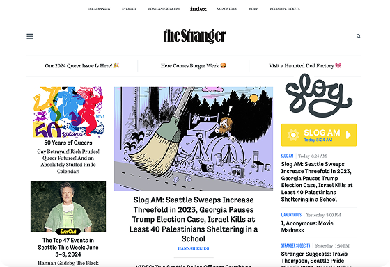
Other local offerings, like The Stranger
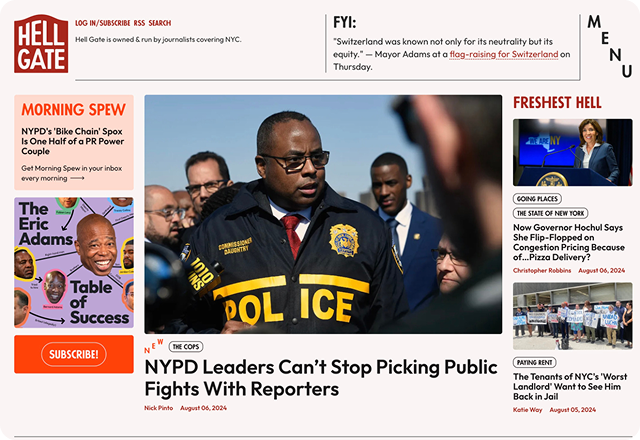
I worked with the team at Ghost to review their current customer’s sites, like The Lever and Hell Gate, and see what capabilities we should adopt
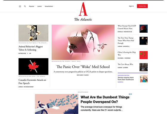
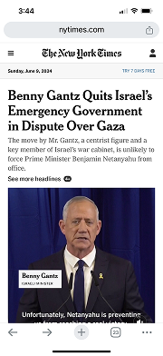
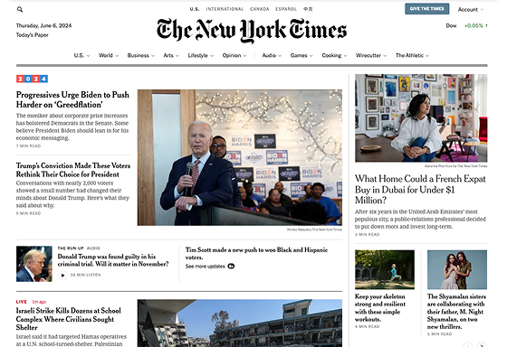
Popular news sites, like The New York Times and The Atlantic
Podcasts websites, like WGBH and Spotify
Video websites, like YouTube
Pain Points
Below are four pain points that represent a selection of what we uncovered after reaching out to our users. Some of the pain points we discovered were large (like difficulty with search), while others were small, concerning a certain feature or interaction (like difficulty reading Briefs).
- Collections of original content are spread across the two current sites and organized in different ways, making them hard to find and follow.
- Original content isn’t differentiated, making it easy to miss.
1.
Original content is hard to find
- The search experience is different on the two sites and messy overall.
- Search filters are overwhelming and complicated.
- Search is not smart, requiring users to use the filters or scan through unwanted results.
2.
Search is difficult
- Understanding how and where to play episodes is difficult.
- Podcast episodes have dedicated pages (similar to articles), but it’s hard to control the episode player while reading the article.
3.
The podcast listening experience is lacking
- Briefs, a microblog feature, are hard to read because they appear in an infinite list without any navigation or filtering.
- Since Briefs appear in an infinite list, individual ones are hard to share.
4.
Reading and sharing “Briefs” is challenging

Concepts
To begin design work, I created
- Lo-fi wireframes to share ideas and layouts
- Medium fidelity concepts to share styling and detail possibilities (see below)
- Medium fidelity prototypes to test ideas with users (see next section)
Testing Prototypes
To validate ideas in a low stakes manner and understand how users feel early in the project, I tested prototypes with existing users and employees; ideas concerning information architecture, navigation, pages vs. modals, and layouts. Below is one example.
Navigation Usability Study
Since the scope of the website is large with multiple different landing pages and content types, we needed to ensure navigation was intuitive and highly functional.
Our tests provided a few key learnings:
Although the side navigation options came with benefits (like the ability to stack items in a condensed space), the familiarity and orientation of having all navigation items at the top was more important to users.
However, we also learned that users appreciate a slide out menu (even on desktop) that gives the advantages of a side menu system (like being able to navigate anywhere on the site from any page).
Information Architecture
Below are the four main modes of navigation on the site.
- Use the top menu and/or hamburger menu to navigate between the four key sections of the site
- Navigate between different content types of a single brand, called a “Local original”
- Use tags to navigate between different content types of a singular topic
- Use search (AI will assist in surfacing the right content type, or one can use tabs to filter)
- News
- Podcasts
- Events
- TV
Home
Local originals


TV home
Series
Movies
Live
My list
Show page
Video page

Podcasts home
Podcast page
Podcast episode

Events home
Event page
News home
Briefs
Topics
Popular
Article
Author


Microsites
Donation
Search
Account
Newsletters
Misc.
Tag pages
Help, contact, Creative Works, etc.
Voter Guide, Ideas Festival, Black Arts Legacies, etc.

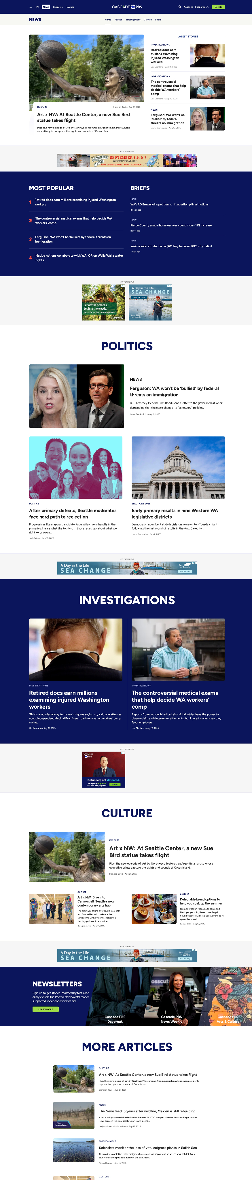
3. Final Product
To demonstrate the consideration of design throughout the project, I’ve selected four areas to highlight.
Home page
News
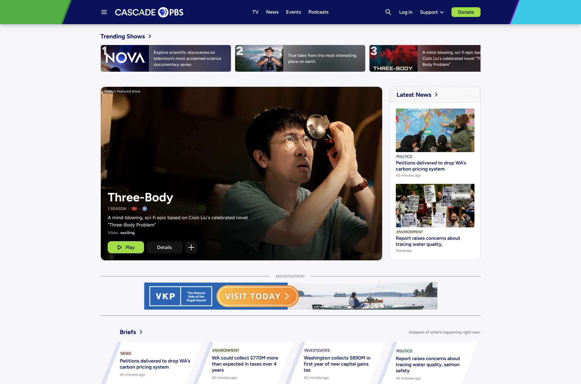
TV
Local Originals
Mixed content types for modules
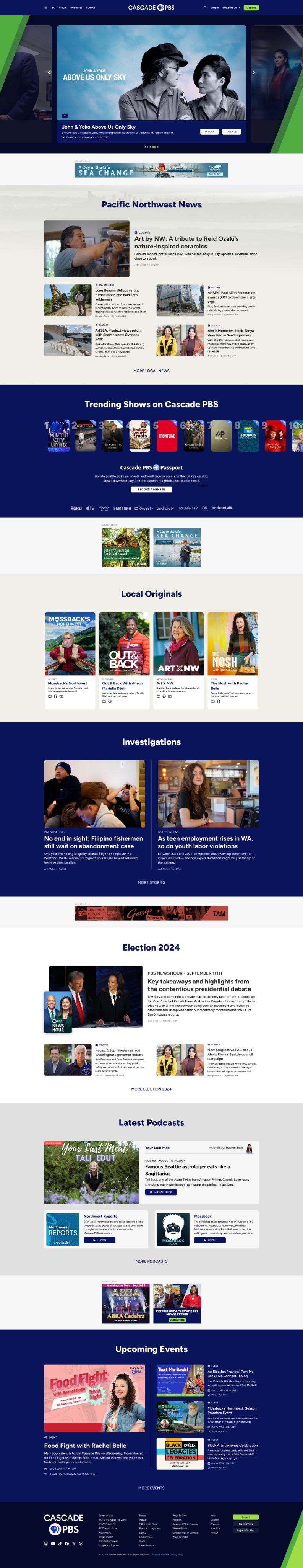
Modules come in a variety of layouts that all act and feel like they belong.For example, they can house a grid of the day’s top articles, a carousel of trending shows, or a grid of different content types relating to one topic.

Navigation
To accommodate our diverse audience, navigation is redundant yet simplistic.
Global navigation happens at the top of the website where existing users expect it. Both mobile and desktop also have a slide out menu that provides global and sub navigation.
Once users arrive on sub-pages, a sub navigation bar appears below the global navigation.
Advertisements
I worked with the ad team to prioritize ad universality, quantity, and visibility without sacrificing the user experience.
The site’s single column, module-based design allows ads to appear between modules, not in them. This leads to less user annoyance without sacrificing ad visibility.
This motif carries over to content pages where ads break up a story, rather than living beside it.
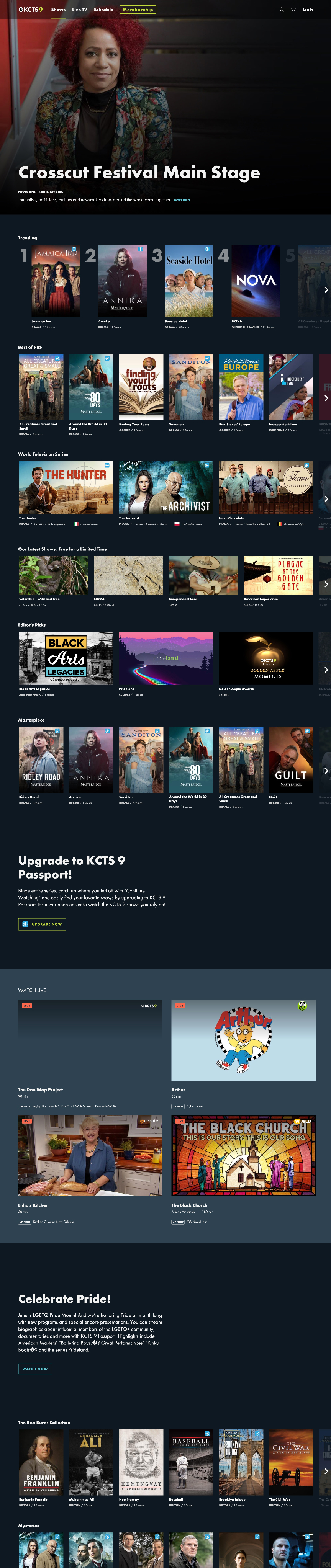
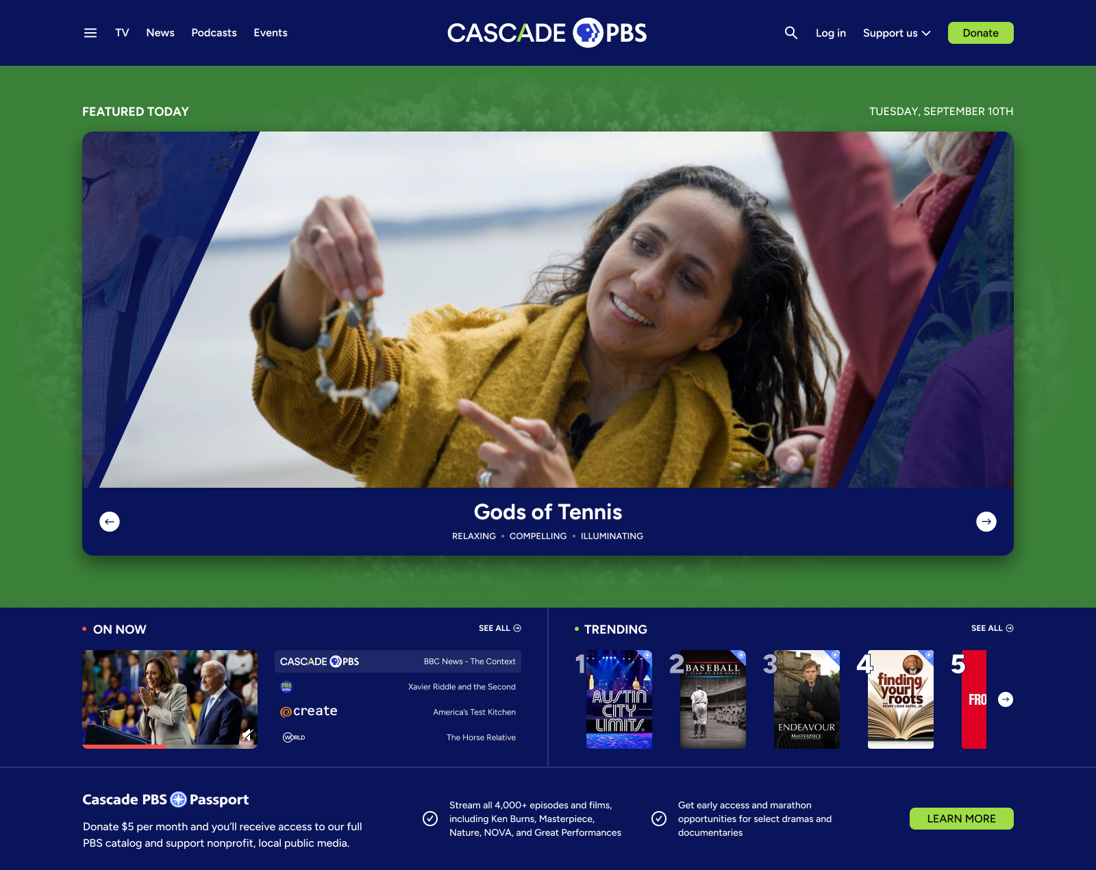
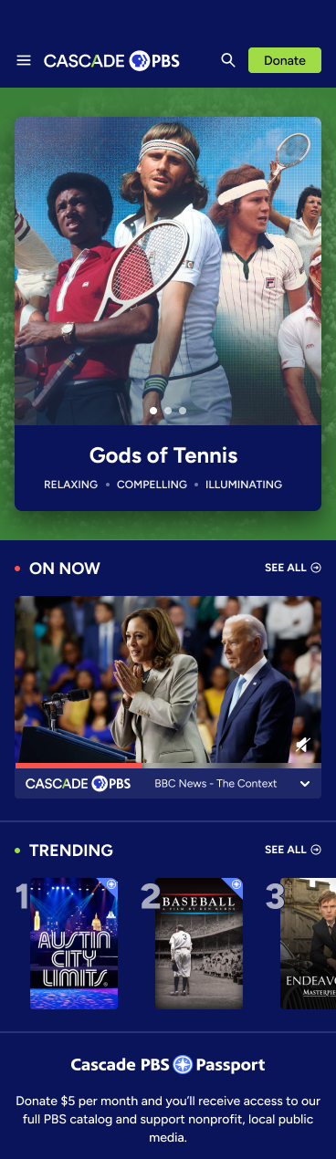
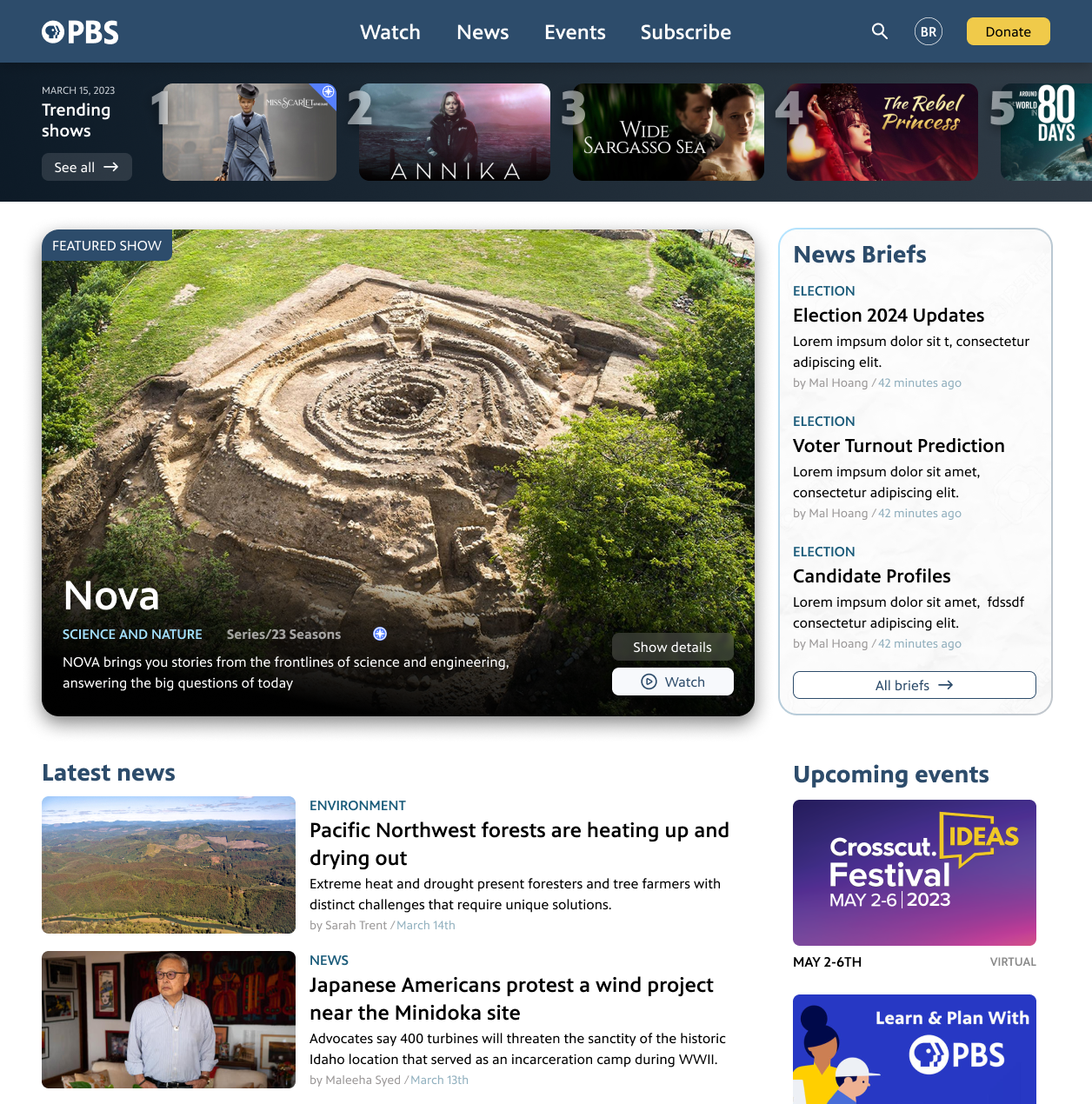
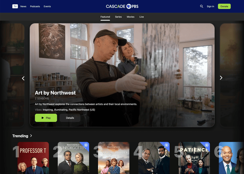
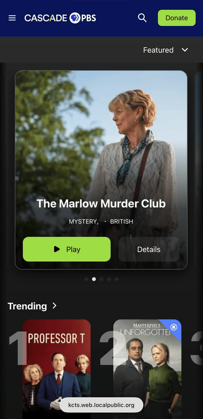
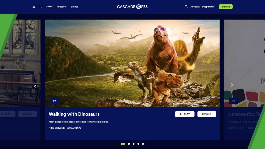
Hero carousel
The top of the homepage holds the moment’s most relevant content, whether it’s a new show, an upcoming event, or a voter guide.
Cards appear from behind the angled “ascents”, a fixture of the new Cascade PBS brand guide that reflects the colors and topography of the Pacific northwest while also acting as curtains unveiling the day’s content.
Modules
Below the hero carousel are carefully considered modules that give website managers exactly what they need: modular control with automated systems.
The modules accommodate different quantities and types of content, preventing the site from feeling “dead” when content publishing is slow.
The single column approach allows modules to easily be shifted up and down the page and ensures mobile is prioritized, an important factor given the growing mobile user base.


Combined homepage
To design the homepage, I worked with a variety of stakeholders, including content teams, advertising, leadership, and - of course - end users. The project required consistent communication, creative solutions, and some politics. Not everyone could get what they desired.
- Introduce users to content they would appreciate
- Accommodate the organization’s content output
GOALS:
Article Design
Title and image
We decided to use a stacked title and image at the top of the article, allowing for a large, impactful image, and a mobile-friendly layout. Below are two examples of other design options considered but not ultimately used, including a side by side option, which had the benefit of bringing the article body above the fold.
Stacked title and image (not used)
Side by side title and image (not used)
Body
We decided to use a single column body, which has the benefits of being mobile friendly, providing a distraction-free reading UX, and allowing ads to match the sizing and positioning of the rest of the site. Below are two examples of other design options considered but not ultimately used.
Other considerations for the body included text alignment (symmetry vs. readability), text width (readability vs. scrolling amount), in-article media type and sizing, in-article content promotion (engagement vs. article clarity).
Two column option 1 (not used)
Two column option 1 (not used)
End
The end of articles provides a great opportunity to nudge users into action, and the position of what immediately follows the article is critical. Therefore, we tested multiple options and gathered results
- Next read -- do we want users to continue reading articles? If so, should these be relevant to the current article, relevant to the user’s interests, or popular?
- Up next -- do we think users would switch consumption modes and consume different types of content from the same topic?
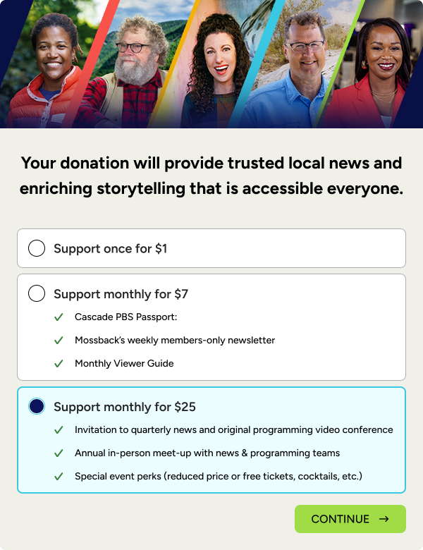
- Donation -- gathering donations is critical to the organization, and users are likelier to donate after consuming content they value.
Our data has pointed us to put the donation block immediately after articles, followed by “Next read”. However, at certain times we will change this positioning. For example, during an election we may immediately follow the article with an “up next” block that displays other content types for the election.
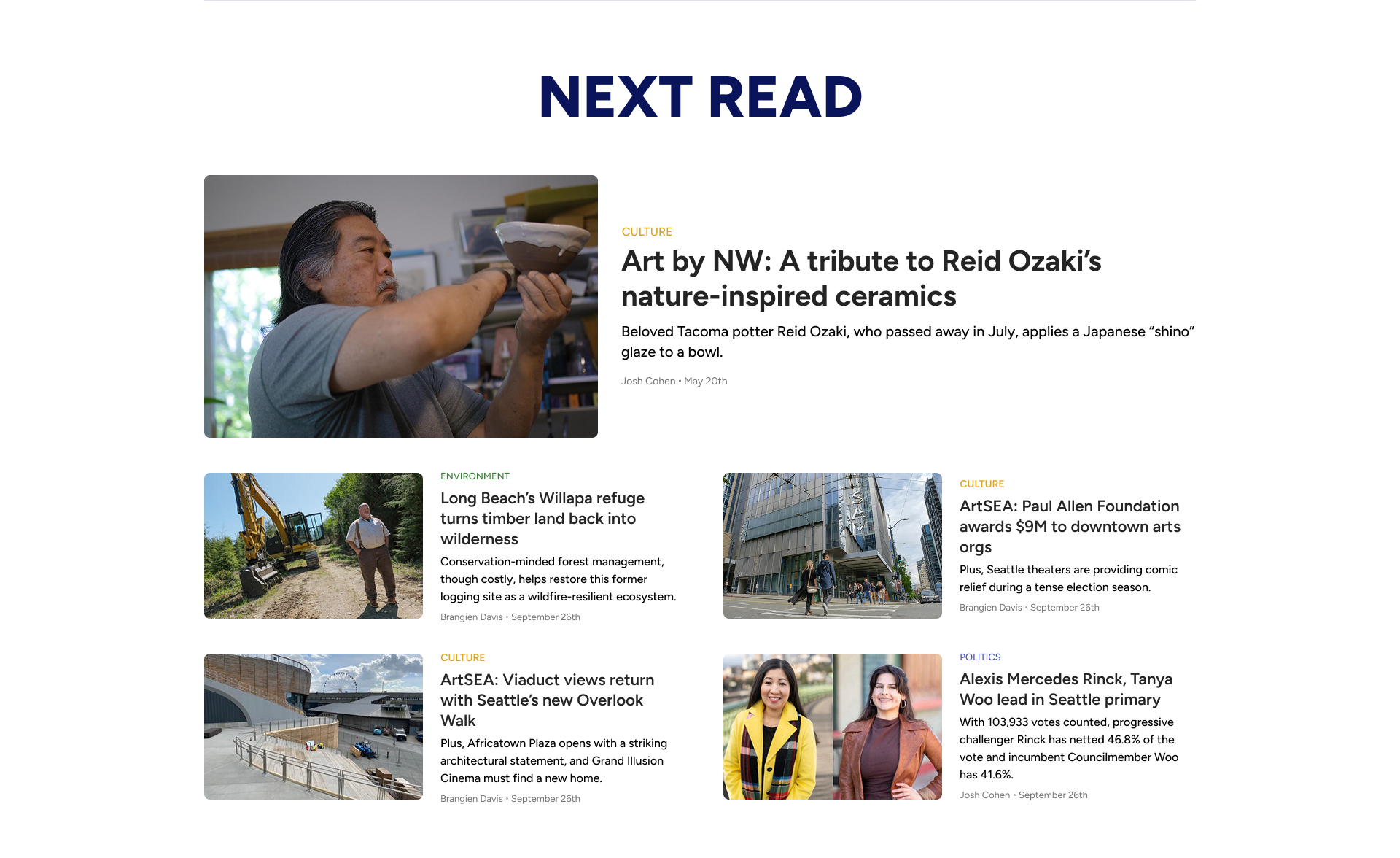
Next read module
Donation module


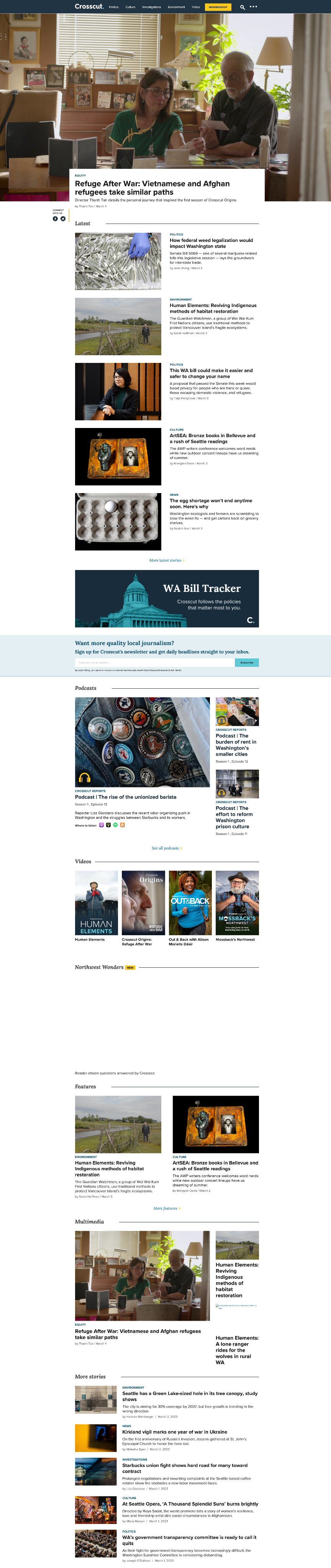
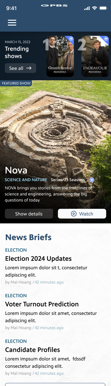
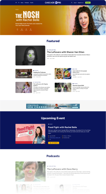
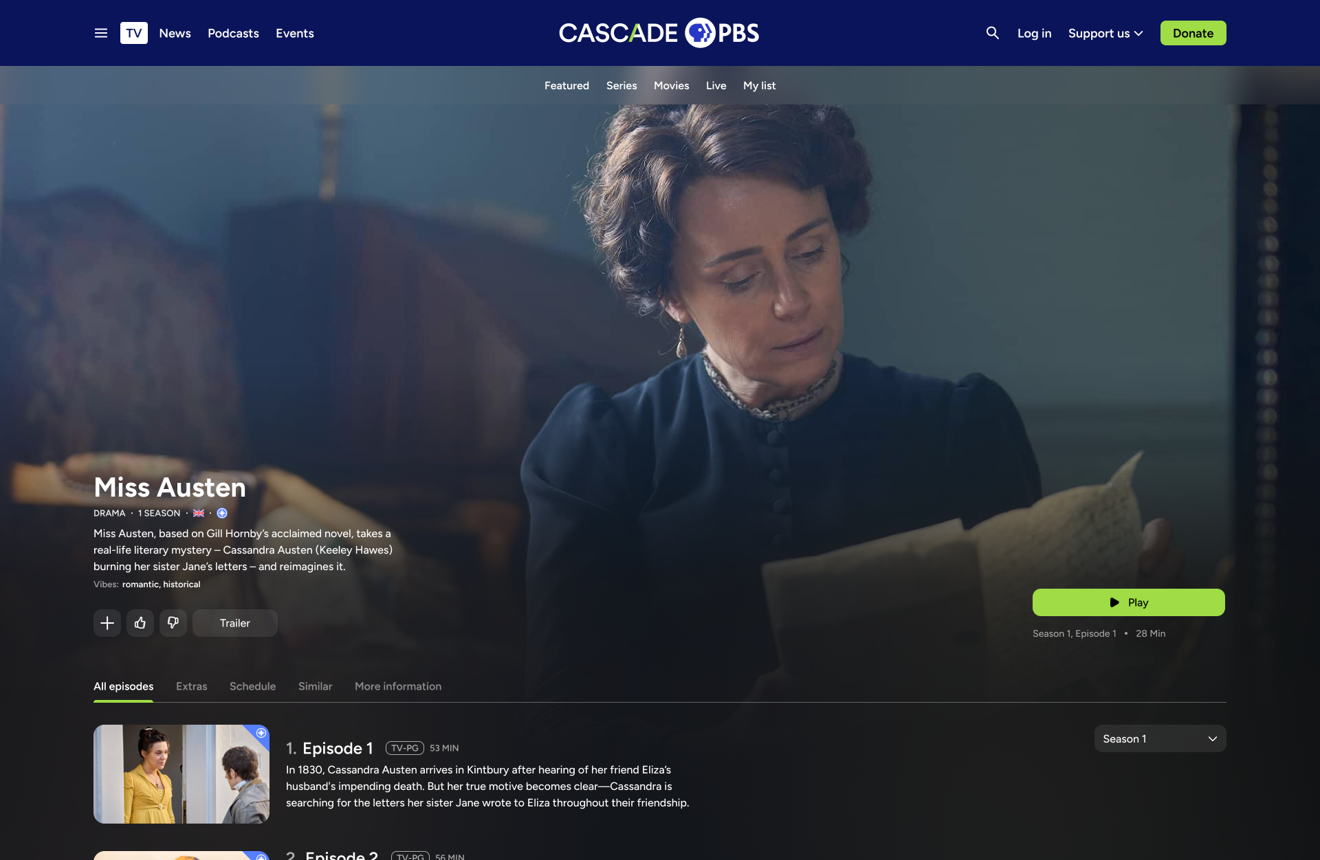
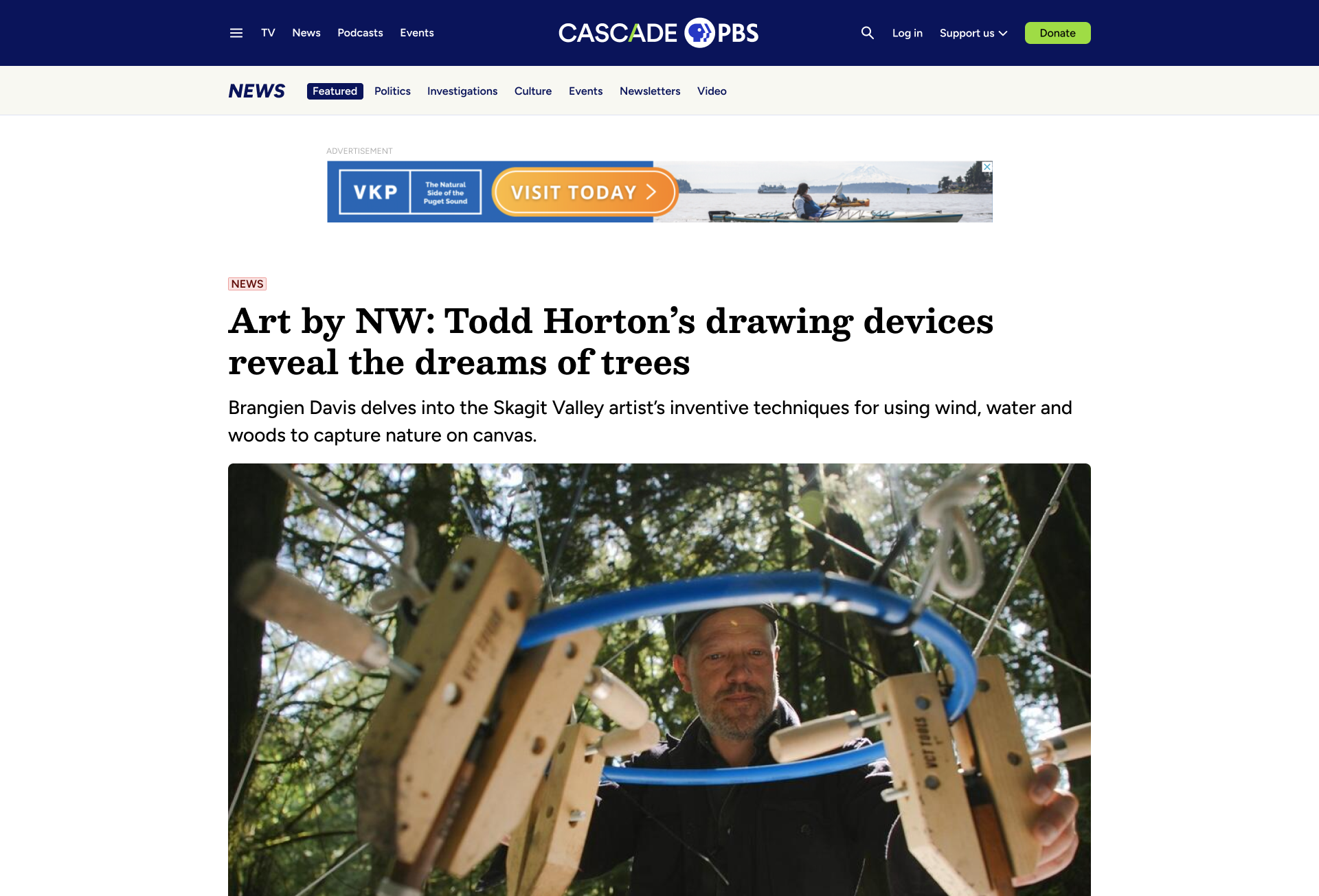
Briefs
Briefs provide users with short blog-style articles that are written throughout the day. To design them, I wanted to bring some navigation into infinite scroll. I used a sticky list on the left side, allowing for quick navigation with the benefit or a scroll progress indicator.
With a glut of online news outlets fighting an amoral battle for attention, a value-driven news site like our needed to capitalize on every UX detail.
The entire Crosscut website needed a new home on Cascade PBS in a way that paid homage to its roots (reducing user surprise) while bringing new life and capability to the experience.
News homepage (desktop)
News article (mobile)
Provide an enjoyable experience for finding and consuming the most relevant local news
GOAL:

News
The TV part of the site on mobile
The TV part of the site on desktop
TV
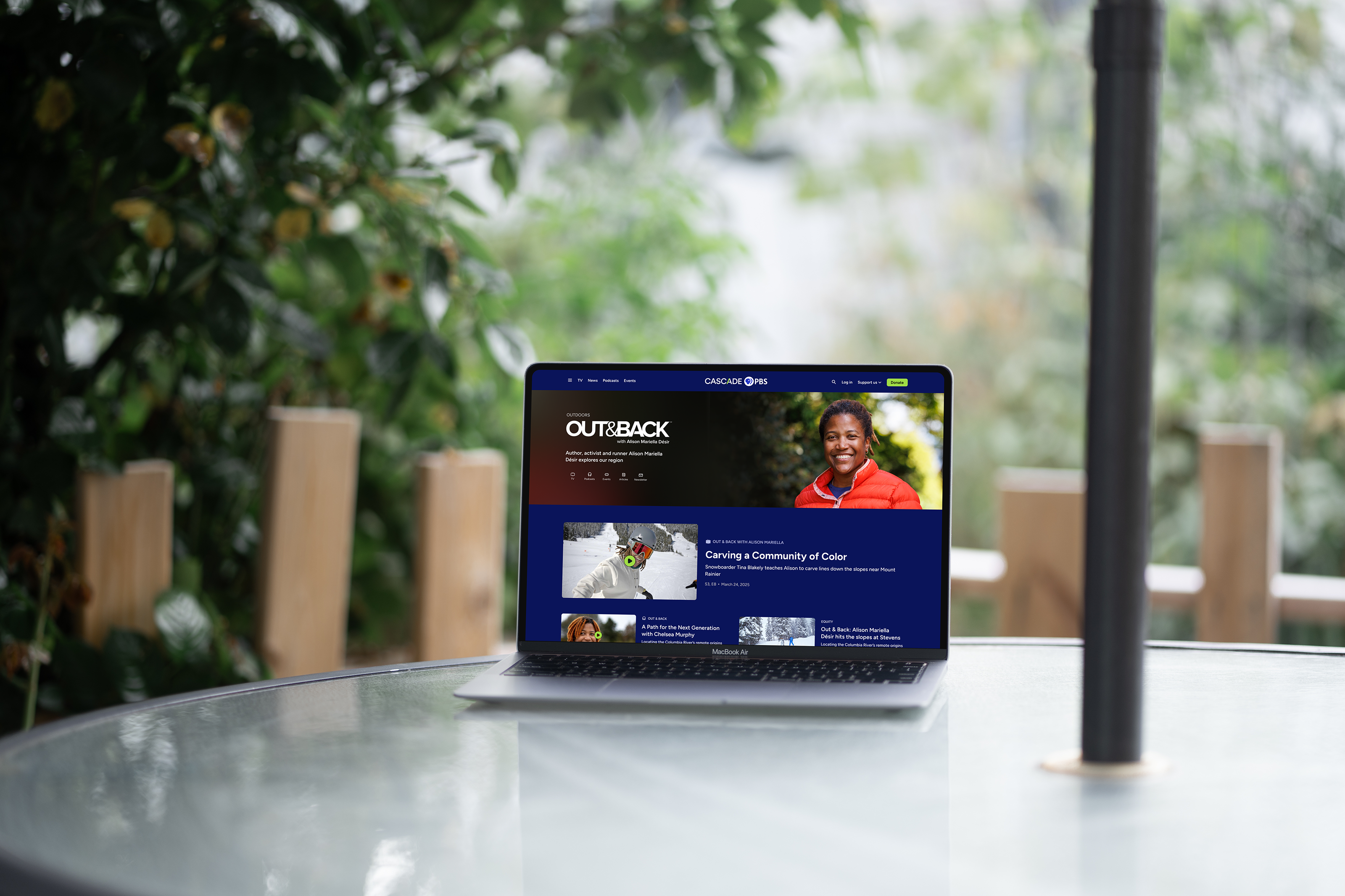
Part of the Local Public project was integrating the streaming platform onto web, allowing our new site (and other station’s sites) reflect what was in the apps. I ensured the TV portion of the site fit with the rest of the site, while allowing TV components to live accross the rest of the site, like on the combined homepage.
Local Public project

Seemlessly integrate Local Public into the entire site, allowing TV content to natively mix with articles, events, and podcasts
GOAL:
Learn more about the Local Public project:

Designing a cross-platform streaming app, serving 15 PBS stations
Cross Pollinate content
The Local Originals landing pages highlight the intelligent way we designed different content types to play well together. The modularity in Local Originals is carried over to the rest of the site, including the homepage.
For website managers, they can determine three things:
- Which content types belong to a specific Local Original (TV, Podcasts, Articles, Events, Newsletters)
- Which blocks (modules) to include on the franchise page and which ordering
- Content-specific block
- Topic-specific block (mixed content types)
- Manually curated blocks
- Automatically populated blocks (reverse chronological, popular, relevant)
- Which types of blocks are used
- Grid
- Carousel
- Number of items
- Light or dark
Challenges to address:
1.
How to identify different content types for users?
- Icons/labels
- Other context clues like play buttons and the data displayed
2.
How to allow the different content types to be displayed in the same containers
- Images
- Data

Podcast episode
TV series


Event
Article

Local Original hub page


TV
Podcasts
Articles
Events
Interconnected navigation
- From any page by one of our Local Originals personalities, users can navigate to the hub page for that personality or to the specific
Feature testing
We are also testing a more sophisticated option to see how users respond.
In this option, a sticky popup button lives near the bottom of the page. When expanded, it provides a mini-hub for that Local Original
Since is usually reserved for AI chatbots or other message features, we want to make sure users won’t get confused by styling.


GOAL 2:
Build audience relationships with local personalities
GOAL 1:
Cross-pollinate content types without user confusion
Local Originals
(and content interconnectivity)

3. Results and Next Steps
The website has only just launched, but we have a history of tracked metrics from the previous two websites. We can compare this with the current website, and continue comparing as the site and matures.
Results
Average Daily Users
The jump in daily average users post-launch is a great initial sign.
We’ll need to monitor these statistics for months and years post-launch to ensure artificial excitement or general trends (like news cycles) didn’t cause the bump.Generally, the time of year that the website launched has lower news and TV consumption numbers, which is another good indicator for the new site.
The final good news is that a sizable portion of the new users have stuck around for multiple months.


7,500
5,000
2,500
0
Average Daily Users
New Website Launch
April ‘24
July ‘24
Oct ‘24
JAN ‘25
April ‘25
July ‘25
Oct ‘25

5,293
4,316
4,955
5,068
4,690
4,751

Combined Crosscut.com + KCTS 9.org users
Total CascadePBS.org users

7,352
6,764

Passport Conversions
Passport memberships allow users to access the full library of video content.
The initial jump in Passport membership means users are not only visiting the new site, but they are following the funnel to donating and boosting revenue.
25k
20k
15k
10k
5k
0
Passport Conversions
FY 22
FY 23
FY 24
FY 25
Post Launch (6/25-10/25)
12,953
16,219
19,987
13,873
22,153
converted to yearly average
Learnings
I learned a lot throughout the course of this project, and would certainly approach the project in a different way if I were to start it again. Here’s one example of my learnings:
Evaluate which pages/features need to be meticulously planned before designing and which can be quickly conceived and later refined in an MVP-style approach:
Sometimes it’s better to ensure stakeholders are fully understood and users are listened to before working on designs.
For example, the Local Originals was redesigned post-launch when stakeholders felt it was lacking in some ways. With more foresight, we could have saved time and delivered a better product from the start.
Sometimes it’s better to quickly design something and fix it up later in order to not stall the project (be careful with this in order not to make too many non-researched decisions!)
For example, article designs have been established for awhile now with best practices established. Although it’s important to question some of the conventional wisdom, it’s probably not worth investing a lot of time into reinventing the wheel here. I think I could have saved a little time on these designs, which would have been better devoted on other areas of the site.

VS.

Next Steps
Reach out to users
To validate the decisions we’ve made, determine which features need improving, and understand which features need to be added, we have planned post-launch user research, including the following:
- Survey users
- Interview users
- Conduct usability studies
- A/B test new features
Refine website and continuously improve
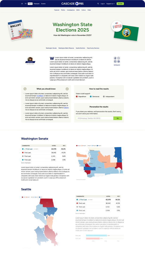
Initial election results concept
There is an abundance of follow up work for the website that can be sorted in three categories. Below are the categories with a few examples of the work to be done:
- Added features based off continuous post-launch user research
- Election Results
- Black Arts Legacies (a microsite that celebrates local black artists)
- Voter Guide
- Additional Local Originals
- Cascade PBS Ideas Festival 2026 (a microsite that hosts our yearly festival)
- Added features based on events and content creation throughout the year
- Improved TV schedule pages
- Improved TV guide page
- More from our continuous user research
- Added features that were saved for post-launch to complete the site in time
- Podcasts improvements
- NPR integration
- Live events integration
- More accessibility features for video player
- Membership pages
- Apps marketing page

My Other Case Studies
Designing a cross-platform streaming app, serving 15 PBS stations
Crafting a scalable, 1000 component atomic design system for 15 PBS stations and multiple device types.


Copyright © 2025 | Designed and Built in Seattle, Washington


Designing a PBS video, news, podcast, and events website, serving 100,000+ members.
Jump to product screens
Visit site
Back to top
Overview
Design Process
Final Product
Results and Next Steps

Local Public
Design System
Resume


1. Overview
For years, Cascade PBS was KCTS 9, the PBS station, and Crosscut, the local news organization. Internally, teams from the two brands worked together. Externally there were two websites, two branding styles, and two different audiences. There was confusion around our brands and the sites were dated and hard to use.


In 2024, we combined the brands to be one entity, Cascade PBS, and transitioned two sites into one over the following year. The goal was to have a modern yet recognizable site that didn’t alienate users of just one brand while encouraging new or more adventurous users to discover the other parts of our business.

Role
UX Design Lead
TEAM
In-house product team (4)
External teams: Outpost (7)
TIMELINE
July 2024 - Sept. 2025
END USERS
Cascade PBS audience (100,000+)
Brand confusion
KCTS 9 and Crosscut appear as two separate entities even though their original content is produced by the same team. Users are unnecessarily siloed and missing out on content they would likely enjoy.

Problem

Provide a digital platform for migrating audiences
Provide a comprehensive streaming app that exceeds audience expectations. Make it available on a wide range of devices, including Roku, Apple TV, iOS, Android, and Fire TV.

Goal

User adoption
Track the number of stations adopting the platform and the growth in active users.
Revenue growth
Monitor the increase in donations and memberships generated through the app, especially through features designed to enhance digital fundraising
Success metrics
Poor usability
The existing sites are dated and plagued with design debt that manifests as inconsistency and lack of accessibility. Users struggle to retrieve content and lack the opportunity to discover the quality work that in-house teams produce. Additionally, a lot of richer functionality that could delight users is missing.
Problem
Build a backend portal for stations to exchange content
Provide stations a CMS where they can share content, tagging, and content surfacing. Also give them easy tools to customize their own apps, allowing them to establish unique branding, messaging, and revenue generation.
Goal
Station feedback
Collect and incorporate feedback from participating stations to ensure the platform effectively meets their needs.
Success metrics
Stakeholders
My role
As the lead UX designer for the project, I worked with a variety of stakeholders as shown in the diagram below.
Additionally, due to the large scope of the project and the other projects I was working on, I hired a freelance UX designer who I managed.
Operational team
(COO, directors of each department)
Marketing/graphic design
Sponsorhip
(Ad placement, sponsorships)
Product team
(project manager, product manager, developers)
Internal teams
Programming
(Original video content, other video content)
Editorial
(Articles, briefs)
Podcasts
Events
Content teams
Ghost and Outpost
(The platform we used)
Contracted team

2. Design Process
To establish an optimal website architecture and design, I studied our existing two websites and competitor’s websites, and conducted usability tests on prototype options.
Initial Considerations
Personas
Competitive Analysis
Pain Points
Concepts
Usability study of prototypes
Information Architecture
Initial Considerations
Previous websites
To avoid alienating and losing fans of either website, it’s important to carry over their legacies in certain ways. Even if the new site looks fresh and new, it should act and feel familiar.
To delight existing users and bring in new ones, it’s important to provide new discovery opportunities and modernize the new site through new capabilities and a cleaner look.

2200 unique daily KCTS 9 users
What to bring from KCTS 9
- Have a dedicated TV section
- Use a similar carousel layout with a featured item
Issues with KCTS 9
- Featured show is too large and pushes content down
- Browsing is limited to the TV homepage
2800 unique daily Crosscut users
What to bring from Crosscut
- Have a dedicated news section
- Display similar data for articles
Issues with Crosscut
- Featured story is too large and pushes content down
- Hierarchy and organization is lacking -- all stories are contained in a single column
5000 daily unique users of both sites


Gathering requirements
To understand the wants and needs of the site, I spoke with two groups.
First, I spoke with users of both sites, working to understand how they use the sites and what issues they have. I also asked how they consume content in general to grasp how we could combine the sites and add functionality that users would actually use.
Next, I spoke with internal stakeholder who produce and manage all our content. They shared how they would like to build content, how they would like their content to be displayed, and issues they have with the current sites.
Balancing all the needs was a challenge. Users often have needs that surpass our capabilities in terms of content production and internal teams often didn’t conceptualize how their part could fit in the whole.
Additionally, some internal internal team members weren’t familiar with patterns of contemporary digital products. Listening, teaching, and understanding were just as important as ideating.
Personas
(The different audiences)
A major challenge in this project was catering to the diverse user base without alienating any party. A benefit of the previous two sites was users could easily be catered to. Creating personas was important in this project to understand how different users approach the site.

1

PBS
Junkie
Kenny loves PBS. As a kid, he grew up watching Sesame Street. Now they enjoy the Masterpiece collection and let their children stream kids content.
PAGES visited
TV, News (occasional)
Devices used
Laptop, tablet
Frequency of use
Several times per week
Membership Status
Passport subscriber


2
Daily
News
Reader
Elizabeth mainly uses the site for keeping up on the news. She reads local political and investigative stories, and watches PBS News Hour and Frontline.
PAGES visited
News, TV (occasional)
Devices used
Laptop, tablet
Frequency of use
Daily
Membership Status
Occasional donor

3
Local
Event
Enthusiast
PAGES visited
Events, News, TV
Devices used
Laptop, mobile
Frequency of use
Weekly
Membership Status
Non-member
Amelia is actively involved in their community. Whether it’s a political rally or local artists’ show, they want to know what’s happening this weekend.

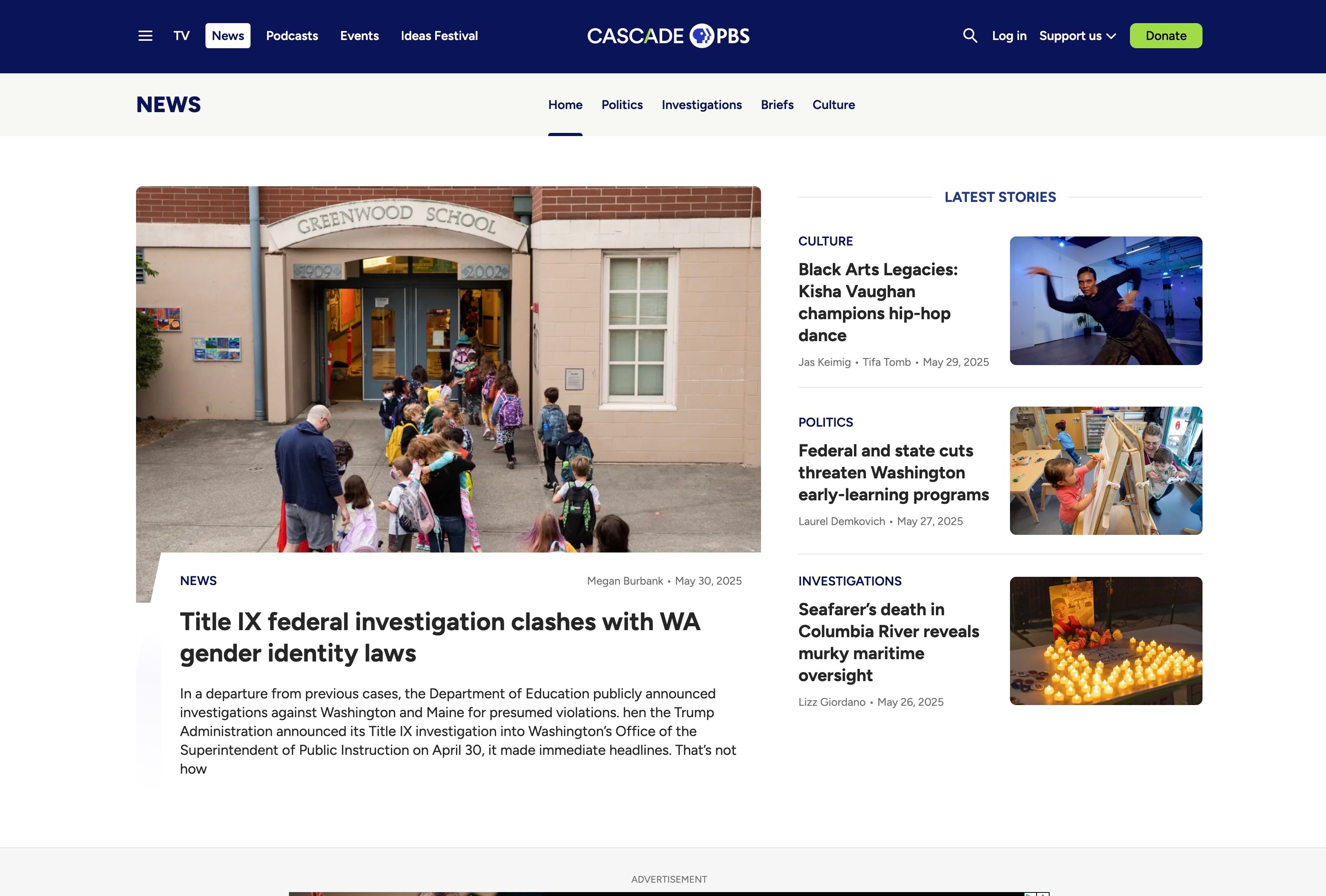
4
Browser
Homepage
User
Steve sets the site as his browser homepage where he can see local news, events, and content updates as he goes about his day
PAGES visited
Home, News, TV, Events
Devices used
Desktop, tablet
Frequency of use
Daily
Membership Status
Occasional donor

5
Podcast
Fanatic
Chris enjoys listening to podcasts when he’s commuting to work or taking care of chores. Occasionally, he’ll check in on the local news as well.
PAGES visited
Podcasts, News
Devices used
Mobile
Frequency of use
Several times per week
Membership Status
Non-member

Competitive Analysis
The scope of the project was larger than most other websites, making it challenging to find competitive offerings. To overcome this, I studied a variety of News, Podcast, and Video sites (direct competitors) as well as more aggregative websites (indirect competitors).


Large scope landing sites, like Yahoo!
Current public media, like NPR and Rhode Island PBS, who just redesigned their site
Other local offerings, like The Stranger
I worked with the team at Ghost to review their current customer’s sites, like The Lever and Hell Gate, and see what capabilities we should adopt
Popular news sites, like The New York Times and The Atlantic
Podcasts websites, like WGBH and Spotify
Video websites, like YouTube
Pain Points
Below are four pain points that represent a selection of what we uncovered after reaching out to our users. Some of the pain points we discovered were large (like difficulty with search), while others were small, concerning a certain feature or interaction (like difficulty reading Briefs).
- Collections of original content are spread across the two current sites and organized in different ways, making them hard to find and follow.
- Original content isn’t differentiated, making it easy to miss.
1.
Original content is hard to find
- The search experience is different on the two sites and messy overall.
- Search filters are overwhelming and complicated.
- Search is not smart, requiring users to use the filters or scan through unwanted results.
2.
Search is difficult
- Understanding how and where to play episodes is difficult.
- Podcast episodes have dedicated pages (similar to articles), but it’s hard to control the episode player while reading the article.
3.
The podcast listening experience is lacking
- Briefs, a microblog feature, are hard to read because they appear in an infinite list without any navigation or filtering.
- Since Briefs appear in an infinite list, individual ones are hard to share.
4.
Reading and sharing “Briefs” is challenging

Concepts
To begin design work, I created
- Lo-fi wireframes to share ideas and layouts
- Medium fidelity concepts to share styling and detail possibilities (see below)
- Medium fidelity prototypes to test ideas with users (see next section)
Testing Prototypes
To validate ideas in a low stakes manner and understand how users feel early in the project, I tested prototypes with existing users and employees; ideas concerning information architecture, navigation, pages vs. modals, and layouts. Below is one example.
Navigation Usability Study
Since the scope of the website is large with multiple different landing pages and content types, we needed to ensure navigation was intuitive and highly functional.
Our tests provided a few key learnings:
Although the side navigation options came with benefits (like the ability to stack items in a condensed space), the familiarity and orientation of having all navigation items at the top was more important to users.
However, we also learned that users appreciate a slide out menu (even on desktop) that gives the advantages of a side menu system (like being able to navigate anywhere on the site from any page).
Information Architecture
Below are the four main modes of navigation on the site.
- Use the top menu and/or hamburger menu to navigate between the four key sections of the site
- Navigate between different content types of a single brand, called a “Local original”
- Use tags to navigate between different content types of a singular topic
- Use search (AI will assist in surfacing the right content type, or one can use tabs to filter)
- News
- Podcasts
- Events
- TV
Home
Local originals


TV home
Series
Movies
Live
My list
Show page
Video page

Podcasts home
Podcast page
Podcast episode

Events home
Event page
News home
Briefs
Topics
Popular
Article
Author


Microsites
Donation
Search
Account
Newsletters
Misc.
Tag pages
Help, contact, Creative Works, etc.
Voter Guide, Ideas Festival, Black Arts Legacies, etc.

3. Final Product
To demonstrate the consideration of design throughout the project, I’ve selected four areas to highlight.
Home page
News
TV
Local Originals
Mixed content types for modules
Modules come in a variety of layouts that all act and feel like they belong.For example, they can house a grid of the day’s top articles, a carousel of trending shows, or a grid of different content types relating to one topic.

Navigation
To accommodate our diverse audience, navigation is redundant yet simplistic.
Global navigation happens at the top of the website where existing users expect it. Both mobile and desktop also have a slide out menu that provides global and sub navigation.
Once users arrive on sub-pages, a sub navigation bar appears below the global navigation.
Advertisements
I worked with the ad team to prioritize ad universality, quantity, and visibility without sacrificing the user experience.
The site’s single column, module-based design allows ads to appear between modules, not in them. This leads to less user annoyance without sacrificing ad visibility.
This motif carries over to content pages where ads break up a story, rather than living beside it.
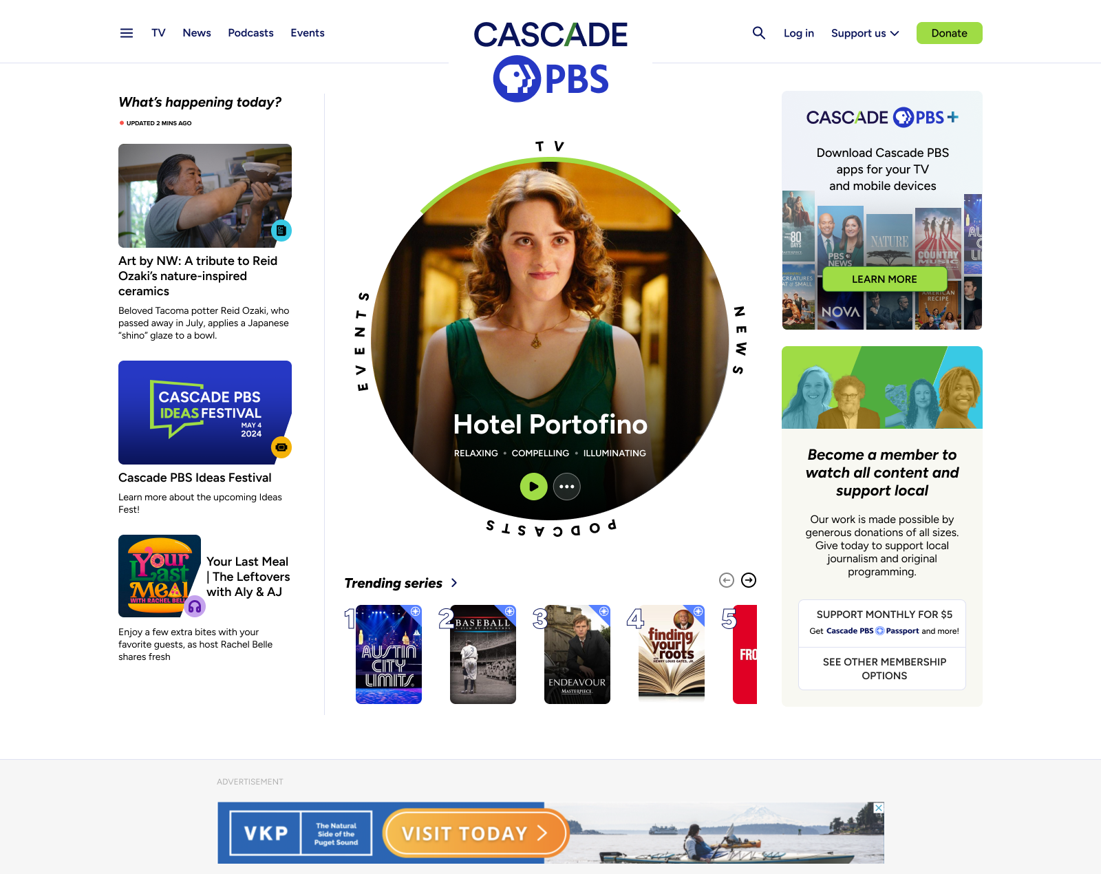
Hero carousel
The top of the homepage holds the moment’s most relevant content, whether it’s a new show, an upcoming event, or a voter guide.
Cards appear from behind the angled “ascents”, a fixture of the new Cascade PBS brand guide that reflects the colors and topography of the Pacific northwest while also acting as curtains unveiling the day’s content.
Modules
Below the hero carousel are carefully considered modules that give website managers exactly what they need: modular control with automated systems.
The modules accommodate different quantities and types of content, preventing the site from feeling “dead” when content publishing is slow.
The single column approach allows modules to easily be shifted up and down the page and ensures mobile is prioritized, an important factor given the growing mobile user base.


Combined homepage
To design the homepage, I worked with a variety of stakeholders, including content teams, advertising, leadership, and - of course - end users. The project required consistent communication, creative solutions, and some politics. Not everyone could get what they desired.

- Introduce users to content they would appreciate
- Accommodate the organization’s content output
GOALS:
Article Design
Title and image
We decided to use a stacked title and image at the top of the article, allowing for a large, impactful image, and a mobile-friendly layout. Below are two examples of other design options considered but not ultimately used, including a side by side option, which had the benefit of bringing the article body above the fold.
Stacked title and image (not used)
Side by side title and image (not used)
Body
We decided to use a single column body, which has the benefits of being mobile friendly, providing a distraction-free reading UX, and allowing ads to match the sizing and positioning of the rest of the site. Below are two examples of other design options considered but not ultimately used.
Other considerations for the body included text alignment (symmetry vs. readability), text width (readability vs. scrolling amount), in-article media type and sizing, in-article content promotion (engagement vs. article clarity).
Two column option 1 (not used)
Two column option 1 (not used)
End
The end of articles provides a great opportunity to nudge users into action, and the position of what immediately follows the article is critical. Therefore, we tested multiple options and gathered results
- Next read -- do we want users to continue reading articles? If so, should these be relevant to the current article, relevant to the user’s interests, or popular?
- Up next -- do we think users would switch consumption modes and consume different types of content from the same topic?
- Donation -- gathering donations is critical to the organization, and users are likelier to donate after consuming content they value.
Our data has pointed us to put the donation block immediately after articles, followed by “Next read”. However, at certain times we will change this positioning. For example, during an election we may immediately follow the article with an “up next” block that displays other content types for the election.
Next read module
Donation module


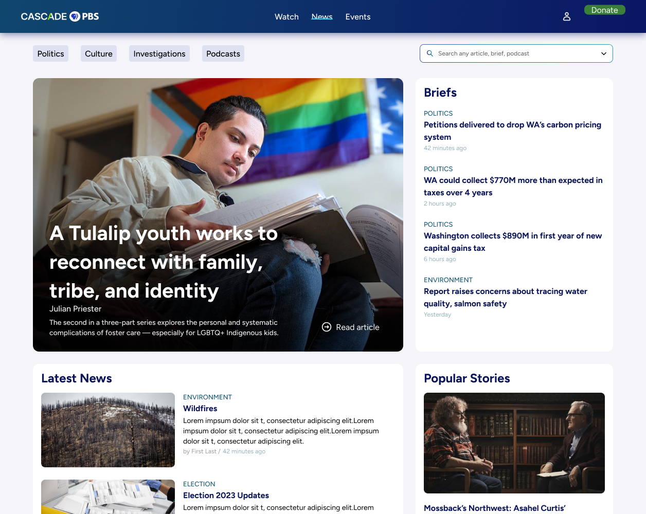
Briefs
Briefs provide users with short blog-style articles that are written throughout the day. To design them, I wanted to bring some navigation into infinite scroll. I used a sticky list on the left side, allowing for quick navigation with the benefit or a scroll progress indicator.
With a glut of online news outlets fighting an amoral battle for attention, a value-driven news site like our needed to capitalize on every UX detail.
The entire Crosscut website needed a new home on Cascade PBS in a way that paid homage to its roots (reducing user surprise) while bringing new life and capability to the experience.
News homepage (desktop)
News article (mobile)
Provide an enjoyable experience for finding and consuming the most relevant local news
GOAL:
News
The TV part of the site on mobile
The TV part of the site on desktop
TV
Part of the Local Public project was integrating the streaming platform onto web, allowing our new site (and other station’s sites) reflect what was in the apps. I ensured the TV portion of the site fit with the rest of the site, while allowing TV components to live accross the rest of the site, like on the combined homepage.
Local Public project

Seemlessly integrate Local Public into the entire site, allowing TV content to natively mix with articles, events, and podcasts
GOAL:
Learn more about the Local Public project:

Designing a cross-platform streaming app, serving 15 PBS stations
Cross Pollinate content
The Local Originals landing pages highlight the intelligent way we designed different content types to play well together. The modularity in Local Originals is carried over to the rest of the site, including the homepage.
For website managers, they can determine three things:
- Which content types belong to a specific Local Original (TV, Podcasts, Articles, Events, Newsletters)
- Which blocks (modules) to include on the franchise page and which ordering
- Content-specific block
- Topic-specific block (mixed content types)
- Manually curated blocks
- Automatically populated blocks (reverse chronological, popular, relevant)
- Which types of blocks are used
- Grid
- Carousel
- Number of items
- Light or dark
Challenges to address:
1.
How to identify different content types for users?
- Icons/labels
- Other context clues like play buttons and the data displayed
2.
How to allow the different content types to be displayed in the same containers
- Images
- Data


TV

Podcasts

Articles

Events
Interconnected navigation
- From any page by one of our Local Originals personalities, users can navigate to the hub page for that personality or to the specific
Feature testing
We are also testing a more sophisticated option to see how users respond.
In this option, a sticky popup button lives near the bottom of the page. When expanded, it provides a mini-hub for that Local Original
Since is usually reserved for AI chatbots or other message features, we want to make sure users won’t get confused by styling.
Podcast episode
TV series
Event
Article
Local Original hub page
GOAL 2:
Build audience relationships with local personalities
GOAL 1:
Cross-pollinate content types without user confusion
Local Originals
(and content interconnectivity)

3. Results and Next Steps
The website has only just launched, but we have a history of tracked metrics from the previous two websites. We can compare this with the current website, and continue comparing as the site and matures.
Results
Average Daily Users
The jump in daily average users post-launch is a great initial sign.
We’ll need to monitor these statistics for months and years post-launch to ensure artificial excitement or general trends (like news cycles) didn’t cause the bump.Generally, the time of year that the website launched has lower news and TV consumption numbers, which is another good indicator for the new site.
The final good news is that a sizable portion of the new users have stuck around for multiple months.

7,500
5,000
2,500
0
Average Daily Users
New Website Launch
April ‘24
July ‘24
Oct ‘24
JAN ‘25
April ‘25
July ‘25
Oct ‘25
5,293
4,316
4,955
5,068
4,690
4,751
Combined Crosscut.com + KCTS 9.org users
Total CascadePBS.org users
7,352
6,764
25k
20k
15k
10k
5k
0
Passport Conversions
FY 22
FY 23
FY 24
FY 25
Post Launch (6/25-10/25)
12,953
16,219
19,987
13,873
22,153
converted to yearly average
Passport Conversions
Passport memberships allow users to access the full library of video content.
The initial jump in Passport membership means users are not only visiting the new site, but they are following the funnel to donating and boosting revenue.
Learnings
I learned a lot throughout the course of this project, and would certainly approach the project in a different way if I were to start it again. Here’s one example of my learnings:
Evaluate which pages/features need to be meticulously planned before designing and which can be quickly conceived and later refined in an MVP-style approach:
Sometimes it’s better to ensure stakeholders are fully understood and users are listened to before working on designs.
For example, the Local Originals was redesigned post-launch when stakeholders felt it was lacking in some ways. With more foresight, we could have saved time and delivered a better product from the start.
Sometimes it’s better to quickly design something and fix it up later in order to not stall the project (be careful with this in order not to make too many non-researched decisions!)
For example, article designs have been established for awhile now with best practices established. Although it’s important to question some of the conventional wisdom, it’s probably not worth investing a lot of time into reinventing the wheel here. I think I could have saved a little time on these designs, which would have been better devoted on other areas of the site.

VS.

Next Steps
Reach out to users
To validate the decisions we’ve made, determine which features need improving, and understand which features need to be added, we have planned post-launch user research, including the following:
- Survey users
- Interview users
- Conduct usability studies
- A/B test new features
Refine website and continuously improve
Initial election results concept
There is an abundance of follow up work for the website that can be sorted in three categories. Below are the categories with a few examples of the work to be done:
- Added features based off continuous post-launch user research
- Election Results
- Black Arts Legacies (a microsite that celebrates local black artists)
- Voter Guide
- Additional Local Originals
- Cascade PBS Ideas Festival 2026 (a microsite that hosts our yearly festival)
- Added features based on events and content creation throughout the year
- Improved TV schedule pages
- Improved TV guide page
- More from our continuous user research
- Added features that were saved for post-launch to complete the site in time
- Podcasts improvements
- NPR integration
- Live events integration
- More accessibility features for video player
- Membership pages
- Apps marketing page
My Other Case Studies
Designing a cross-platform streaming app, serving 15 PBS stations
Crafting a scalable, 1000 component atomic design system for 15 PBS stations and multiple device types.
Copyright © 2025 | Designed and Built in Seattle, Washington


Designing a PBS video, news, podcast, and events website, serving 100,000+ members.
Jump to product screens
Visit site

Back to top
Local Public
Design System
Resume

Overview
Design Process
Final Product
Results and Next Steps