

1. Overview
As audiences shift from broadcast TV to digital streaming services, PBS stations across the country are suffering lost viewership and revenue. Meanwhile, national PBS released an app lacking fundamental features and content, and is undercutting their symbiotic relationship with local stations by directly hosting content on commercial platforms like Amazon Prime.

PBS national
- Hosts content produced by the individual stations
Local PBS stations
- Produces content for local and national audiences
- Broadcasts content


The content cycle between national PBS and individual stations is breaking, hurting stations and eventually national PBS.
To solve the viewership problem and expand local public media, we worked with stations to create a multi-platform streaming service that empowers individual PBS stations with tools, including extensive content management, custom branding, and direct audience communication pathways.

Role
UX Design Lead
TIMELINE
Jan. 2023 - Sept. 2025
TEAM
In-house product team (10)
External teams: Oxagile (7), Phase 2 Technologies (8)
END USERS
PBS stations (15)
PBS stations’ audiences (180,000)
Audiences are migrating away from linear TV
Audiences are rapidly shifting from traditional broadcast to digital platforms, making it increasingly difficult for stations to attract new donors and sustain revenue goals.

Problem

Provide a digital platform for migrating audiences
Provide a comprehensive streaming app that exceeds audience expectations. Make it available on a wide range of devices, including Roku, Apple TV, iOS, Android, and Fire TV.

Provide a digital platform for migrating audiences
Provide a comprehensive streaming app that exceeds audience expectations. Make it available on a wide range of devices, including Roku, Apple TV, iOS, Android, and Fire TV.
Goal

Success metrics
User adoption
Track the number of stations adopting the platform and the growth in active users.
Revenue growth
Monitor the increase in donations and memberships generated through the app, especially through features designed to enhance digital fundraising
Current digital PBS offerings are confusing and dated
PBS content is spread across different platforms causing audiences confusion. Additionally, the public media apps that exist have dated UX and lacking feature sets. Viewers expect seamless, multi-platform experiences.
Problem
Build a unified platform with an intuitive user experience
Deliver a modern, intuitive interface that enables users to easily discover and watch all PBS content on any device using one app.
Goal
User engagement
Measure user interaction with the app, including average watch time, use of recommendation features, and engagement with local content.
Success metric
Stations don’t have the resources to manage a unique digital presence
Stations are oriented towards programming linear TV and don’t have teams available to build and maintain digital experiences. They need a low-effort, high capability solution for digital streaming.
Problem
Build a backend portal for stations to exchange content
Provide stations a CMS where they can share content, tagging, and content surfacing. Also give them easy tools to customize their own apps, allowing them to establish unique branding, messaging, and revenue generation.
Goal
Station feedback
Collect and incorporate feedback from participating stations to ensure the platform effectively meets their needs.
Success metric
Stakeholders
My role
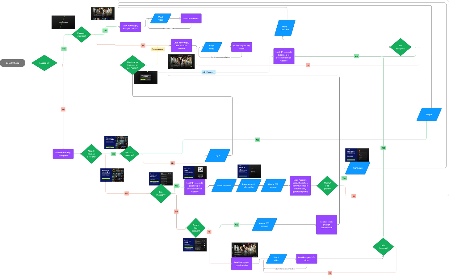
As the lead UX designer for the project, I worked with a variety of stakeholders as shown in the diagram below (hover over the labels).
During the second half of the project, I contracted two other designers who I managed and supported.
Two target audiences
- Audience end users
Each station’s app has a set of users browsing content, viewing videos, and receiving messaging on various devices.
- Station backend app managers
Each station has a set of users curating content, customizing branding, and delivering messaging for their app.


Product Team
UX designer
Digital director
Product manager
Internal developers
Project manager

Advertisers
Community partners
Marketing and communications
Audience
Partner stations
Cascade PBS leadership
Contracted teams
Participating Stations


Timeline
It took over two years to get from conception to product launch. During that time, my focus was either entirely on the project (like during design phases) or split between supporting the build process and other projects.
Jan 2023
JUNE 2023
NOV 2023
APRIL 2024
SEPT 2024
FEB 2025
JULY 2025
Coordinating with stations and PBS
Information architecture
Ott designs
CMS designs
Work with second contracted team begins
App refinement with developers and stations
Web refinement work with developers
Continued launches and improvement
Foundational research
Design exploration and testing
Work with first contracted team
Web app designs
Mobile designs
Beta testing of OTT and mobile apps
Initial public launches for all stations


TV
End User App
Apple TV
Google TV
Fire TV
Roku
LG TV
Samsung TV
Mobile
End User App
iOS
iPadOS
Android
Web
End User App
Backend CMS
Responsive
Platforms
To provide a complete service that meets audiences where they are, we designed cross-platform compatibility across all major streaming devices. Additionally, we designed a custom backend content management system for stations to use on the web.


2. Design Process
After coordinating with PBS national and individual stations to launch the project and secure funding, I identified our audience, discovered pain points, leveraged secondary research, audited the competition, established the information architecture, and worked on initial concepts.
Target Audience
Pain Points
Competitive Analysis
Leveraging Secondary Research
Information Architecture
Concepts
Target Audience:
Ages 18-85
(skewing older)
All genders
Philanthropists
(community-minded folks)
Documentary fans
(science, art, and history nerds)
International content fans
(film and TV connoisseurs)
Parents and their children
Businesses with TVs
(Gyms, lobbies, airports, etc.)
Nostalgic PBS Millenials
Those with different abilities
(including those who struggle with tech)
Non English speakers
Using data collected from our existing user base and surveys from participating stations, we identified our target audience.
The chart represents some of the different groups our app serves and some of their overlaps, but is not an exact representation.
Pain Points
To understand the issues stations and audiences encounter with the current PBS app and other streaming apps, we interviewed both groups. Below are four of the pain points we uncovered.
Audience Pain Point
1.
Browsing for content is a struggle
- Browsing is slow since it’s hard to know what a show really is about until you open its page or start watching it.
- Carousels are very basic, leading to a lot of content being hidden or not relevant.
- Besides the homepage, there aren’t more sophisticated ways to browse.
Audience Pain Point
2.
Current streaming offerings feel lifeless
- Part of the appeal of PBS is its non-profit, community feel. Linear TV provides this liveliness through interstitials, live programming, and two-way communication using phone or web. The current streaming apps only display rows of outdated, stale content.
Station Pain Point
3.
Content metadata is rigid
- Stations receive content from PBS national with locked-in tags. Tagging is limited and often not specific enough, limiting the degree to which stations can sort and display content.
- Stations lack granular control they desire like choosing which show images are featured and how episodes are organized.
Station Pain Point
4.
Managing a streaming service is impractical
- Stations have limited resources, especially the smaller ones, and don’t have capacity to curate and operate a streaming service.
- Besides the homepage, there aren’t more sophisticated ways to browse.
Ideas to Model:
- Emulate some of the information architecture to prevent users from being overwhelmed by the new app

Issues with Current App:
- Challenging navigation (too many moves to get around)
- Accessibility and legibility issues
- Lack of visual hierarchy (visual overload)
- Dated visuals (iconography, component design)
- Lack of expected features
- Lack of interactive and delightful design (animations, user feedback)
Current streaming offering
PBS app/original prototype app

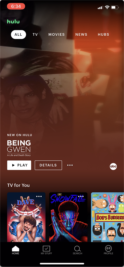
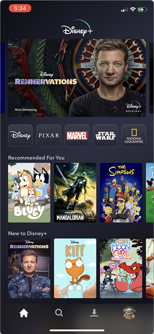
Direct competitors
Netflix, Hulu, Disney +, Apple +, Google TV, Tubi
Ideas to Model:
- General structure of homepage, including a featured show and selection of carousels to foster familiarity
- Expected and time-tested navigation: side menu for TV, bottom menu for mobile, and top menu for web
Areas for improvement:
- Provide browsing pages that let stations feature timely content
- Create a communal feel by letting stations communicate with users
- Infuse station branding where appropriate to give a less sanitized feel and increase recognizability
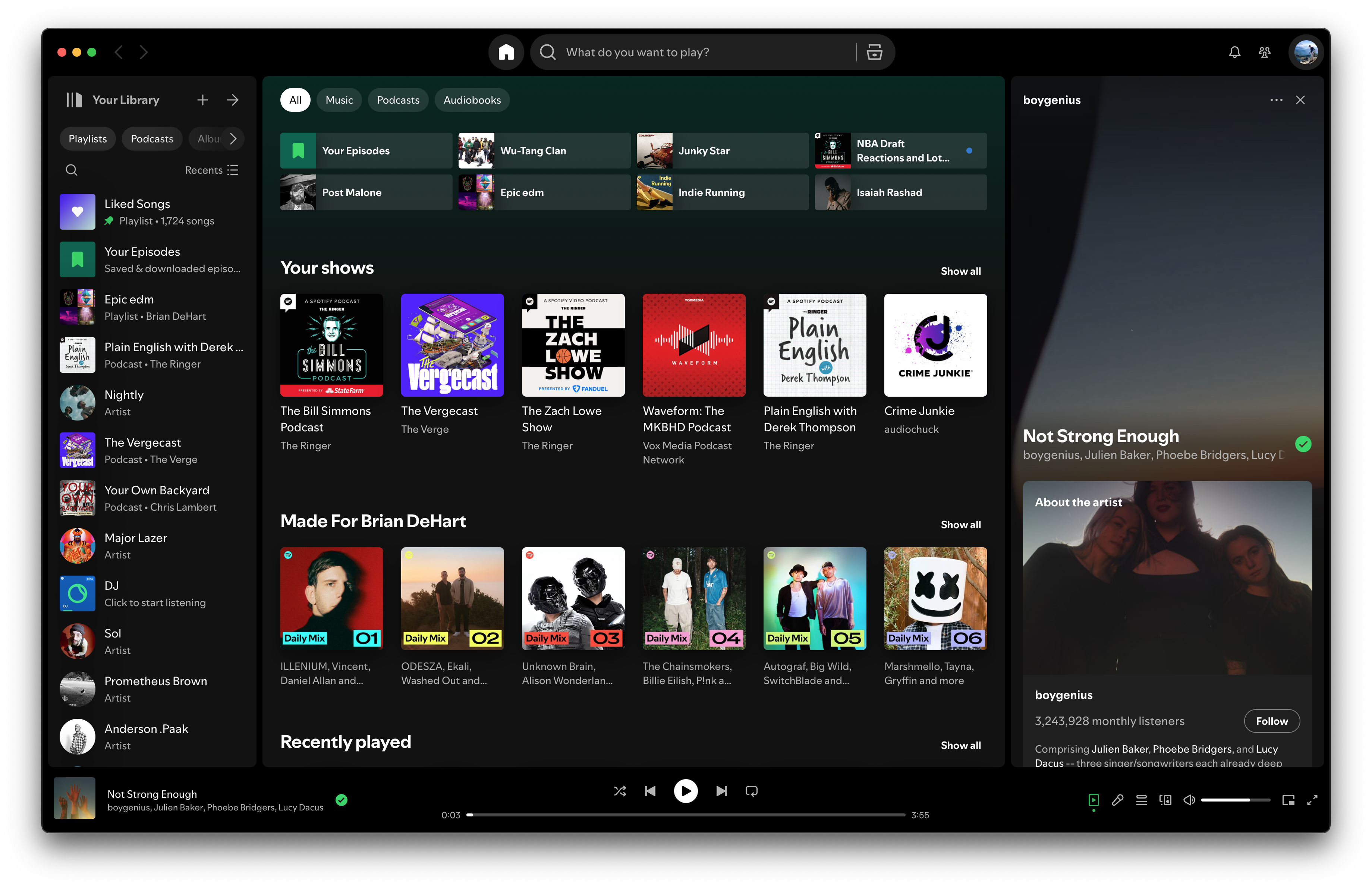
Indirect competitors
Comcast Xfinity, Spotify, YouTube
Ideas to Model:
- Could use the “now playing” feature on Spotify
- EPG from cable offerings that older audience is used to
- Could incorporate some of the YouTube community aspects for a communal feel
Gaps In offerings:
- Improved browse pages that allow users to
- Messaging users directly for a local vibe
- Infuse a little bit of branding and colors for stations to be recognizable and stand out
Competitive Analysis
Leveraging Secondary Research
Having limited resources, it was imperative for me to find and study established research, which could supplement the primary research I conducted using our audience. Using the research I found, I learned how users search (especially on TV with a less optimal typing experience), how they browse, and what content grabs their attention.
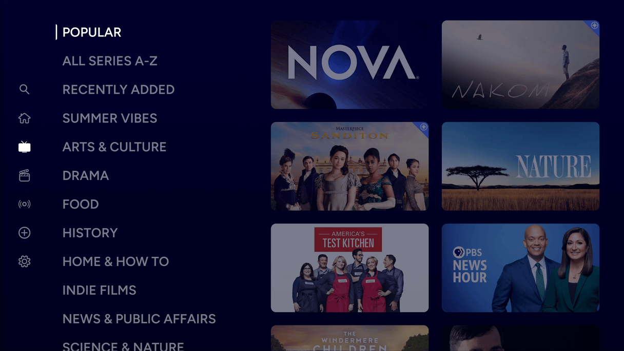
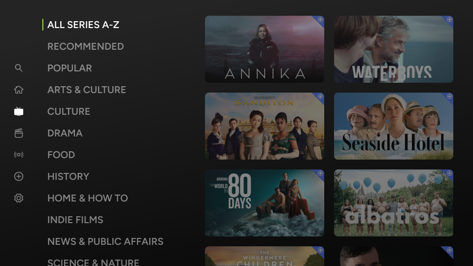
Information Architecture
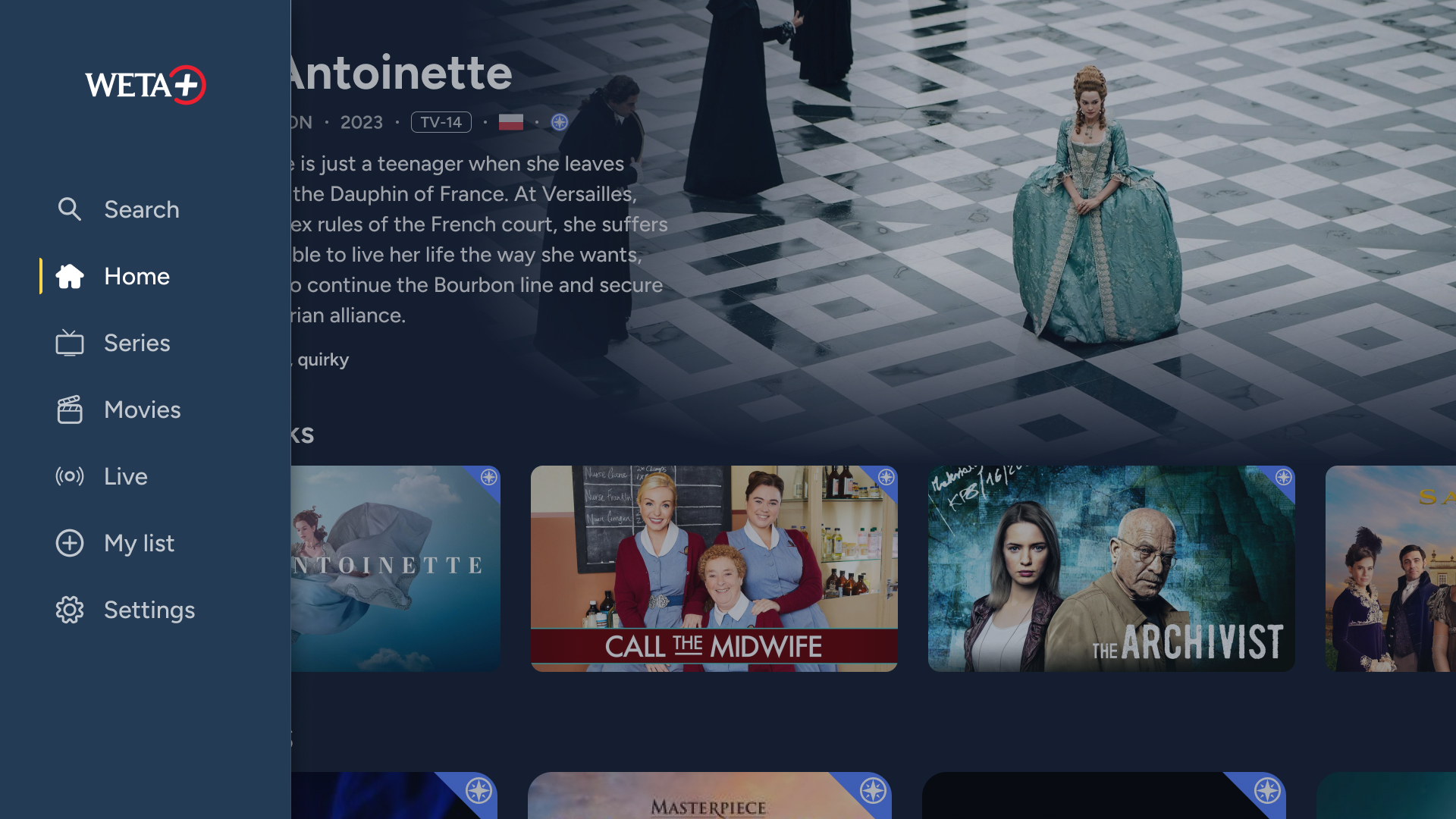
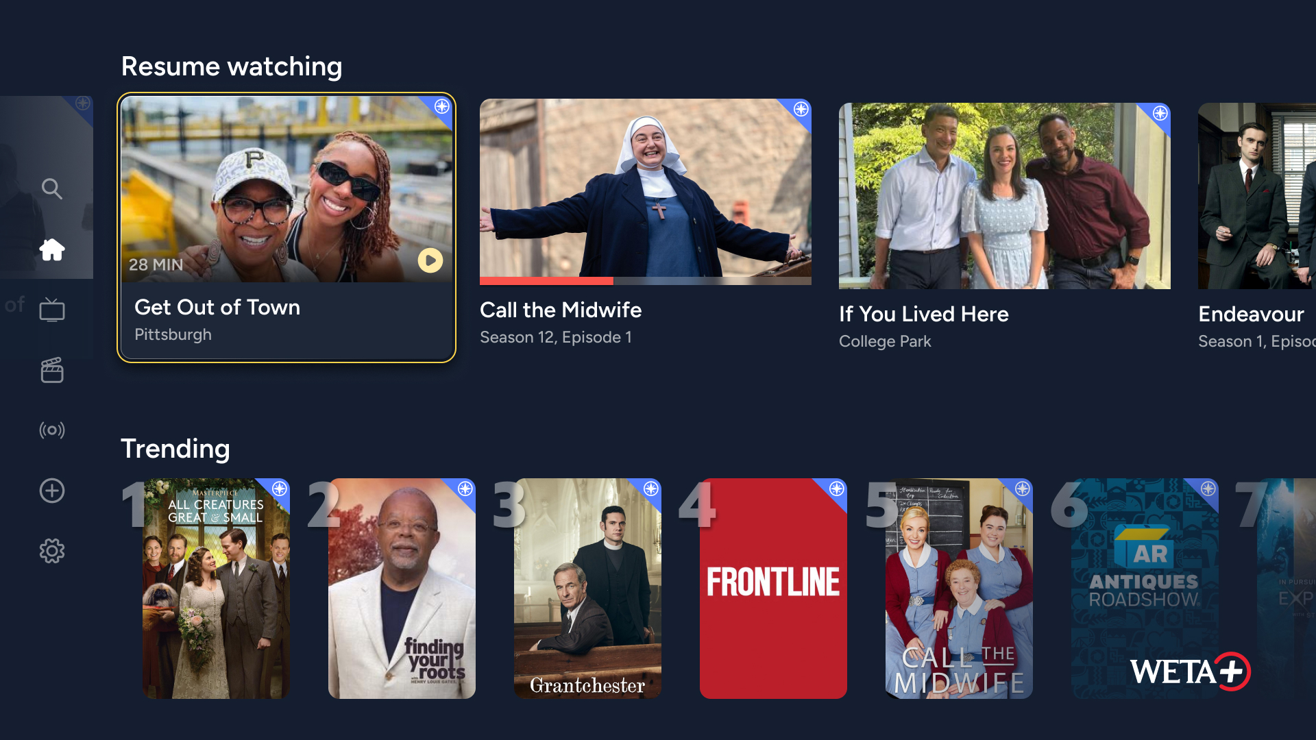
Carousels: resume watching, trending, custom, automatic, mixed


Hero carousel
Messaging
Live TV
Promos
Future browsing and messaging
Search
Trending searches
Search input
Browse series
Browse movies
All A-Z
Recommended
Popular
By genre
Seasonal, etc. (future)
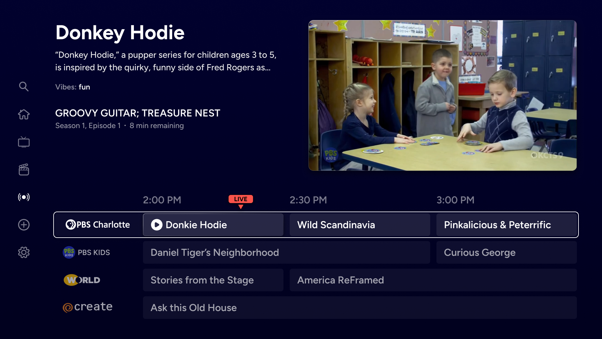
Live TV
Channels
My List
Recommended
My List
Watch history
Other future (watch later, shared with)
Settings
Passport (if non-member
Home
Account
Help
Contact
About
Sponsor
Main Menu
Sub Pages

The main considerations in designing the information architecture were
- Keeping navigation as familiar and intuitive for our tech-challenged audience
- Building a replicable foundation, allowing users to easily hand-off from one device to the next
The following helped in achieving the main considerations:
- Navigation requires the fewest moves possible
- Menus and other components emerge on the edges of screens to establish context (see the TV content page, for example)
- Device strengths are leveraged while keeping the platform unified and familiar
- Features can be added and improvements made without major interface changes
“One move away”


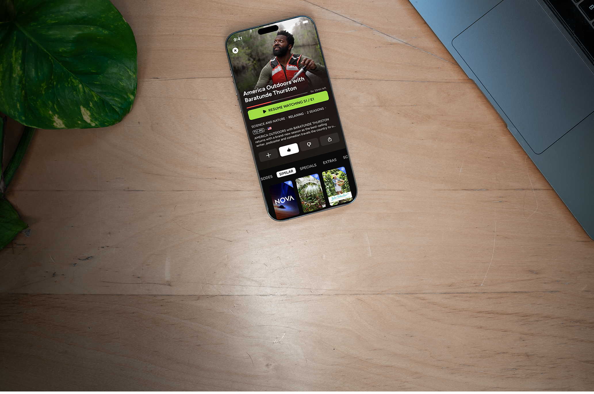
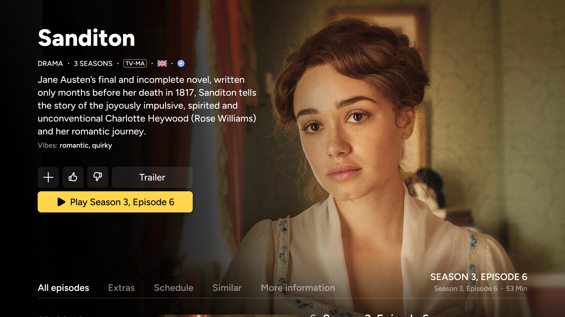
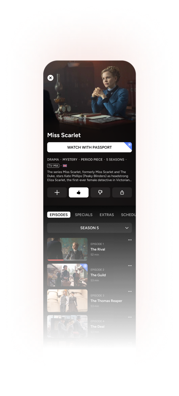
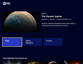
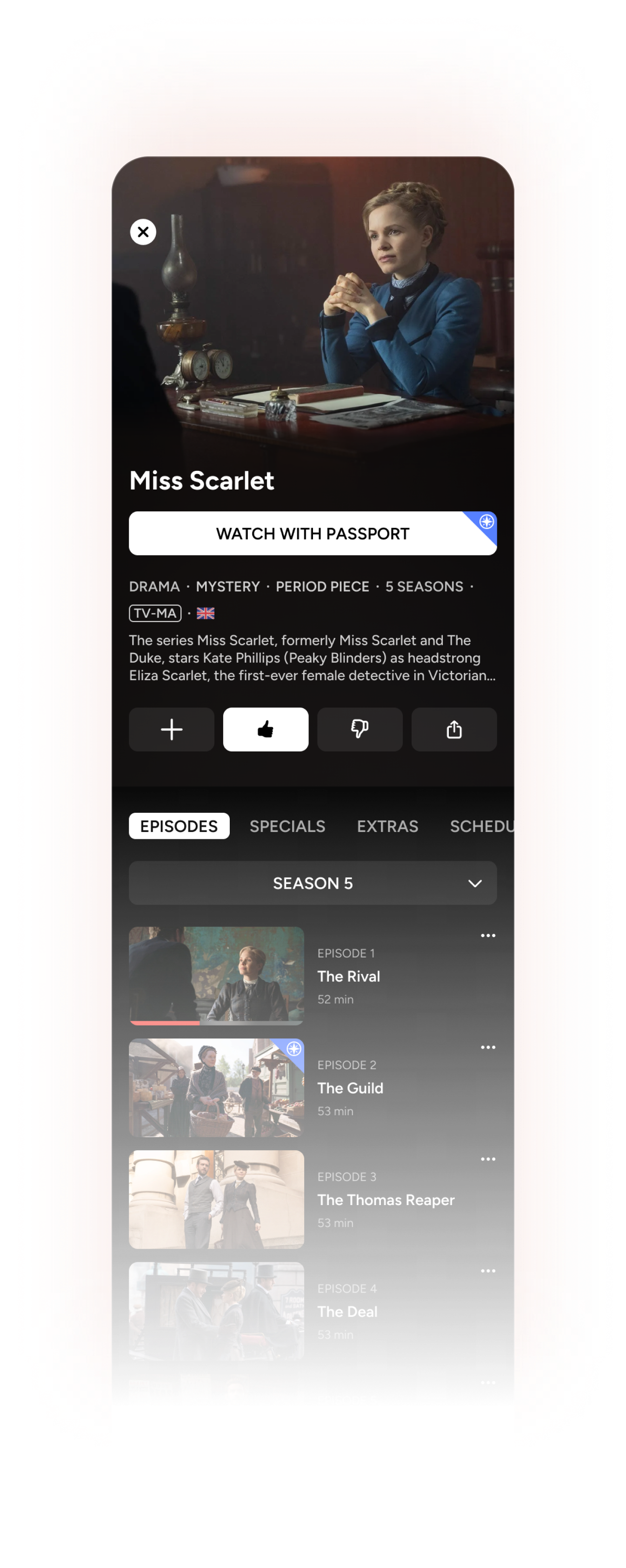
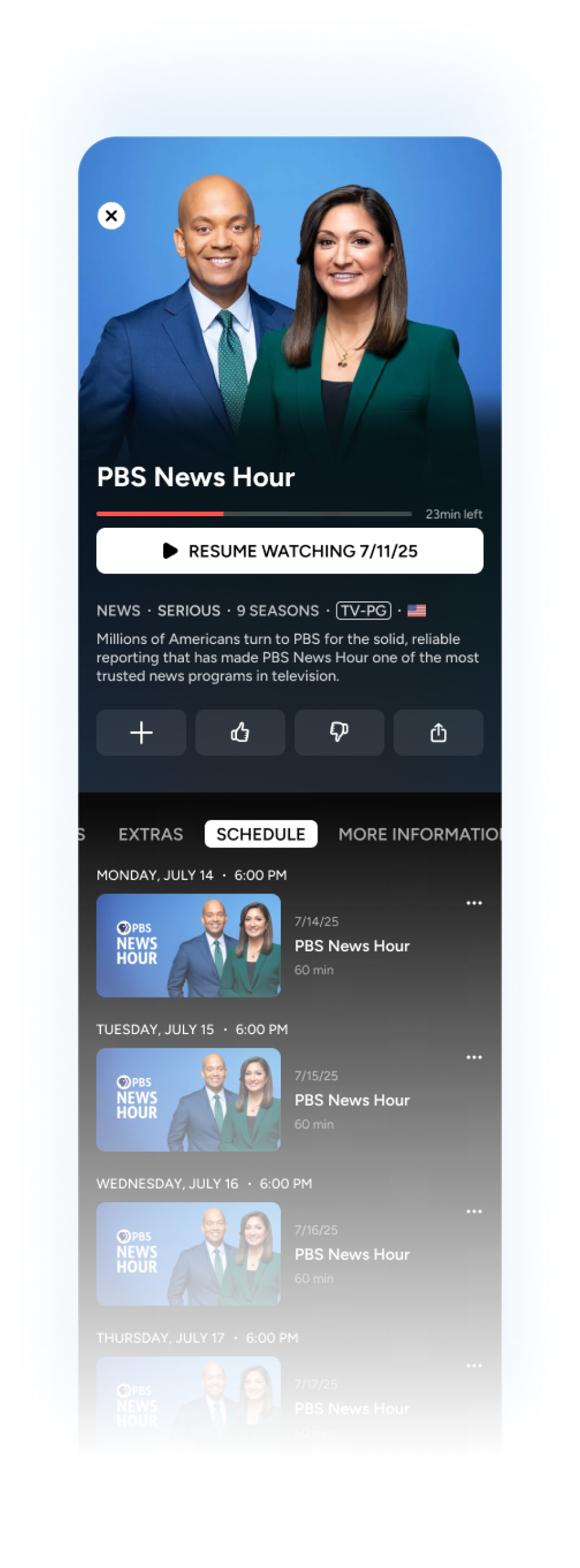
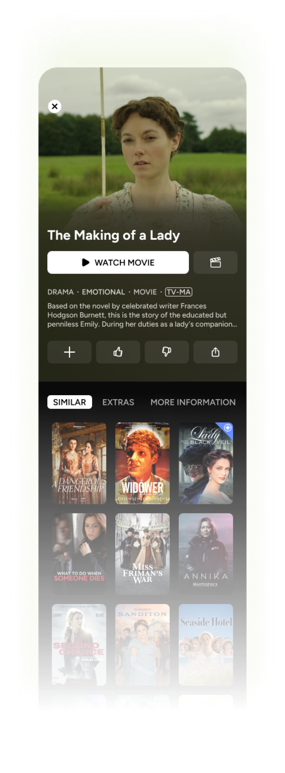
Details (Series or Movie Page)
various content types use different combinations of these


Details (play episode/movie)
All episodes
Specials
Extras
Schedule
Similar
More info
Trailer
Return to Add
Return to All Episodes
Like
Dislike
Add
Future: share, gift, save for later
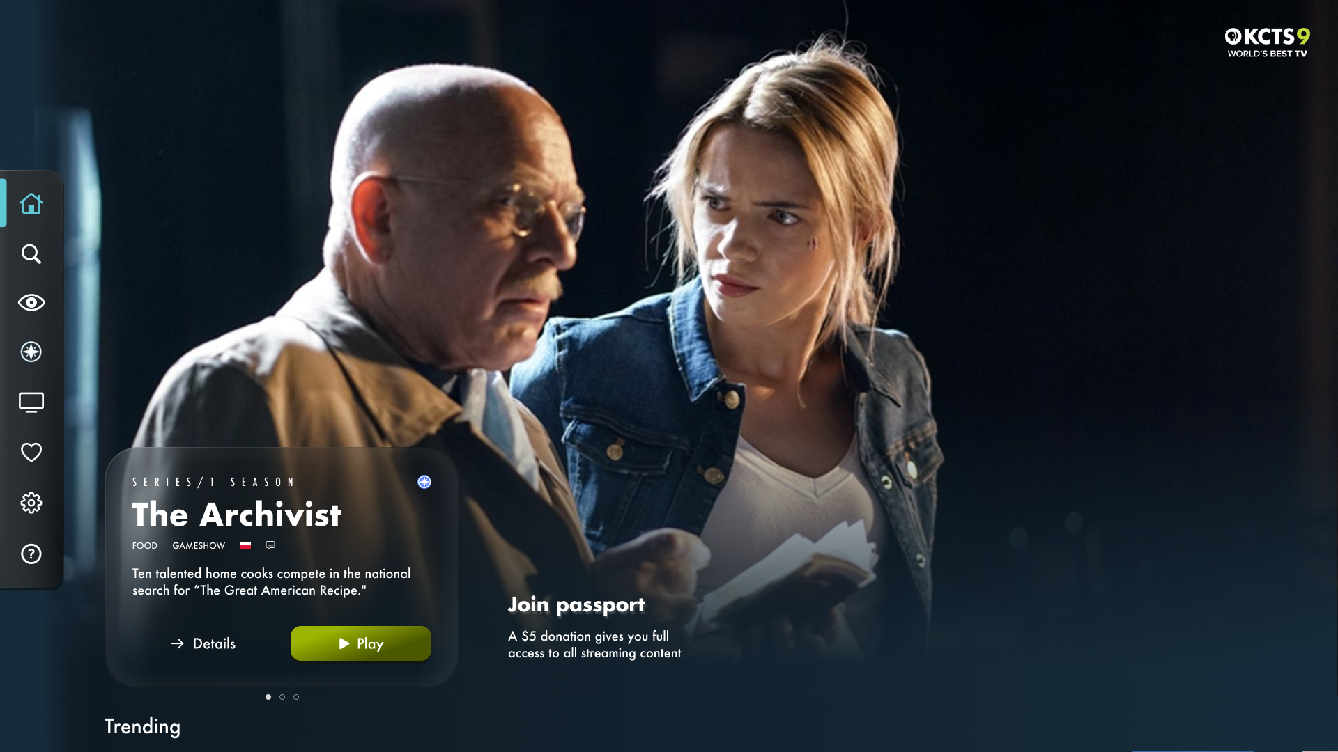
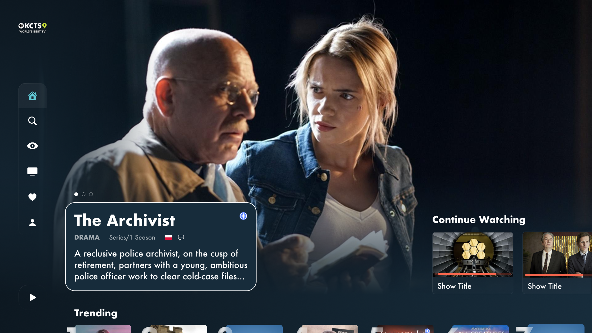
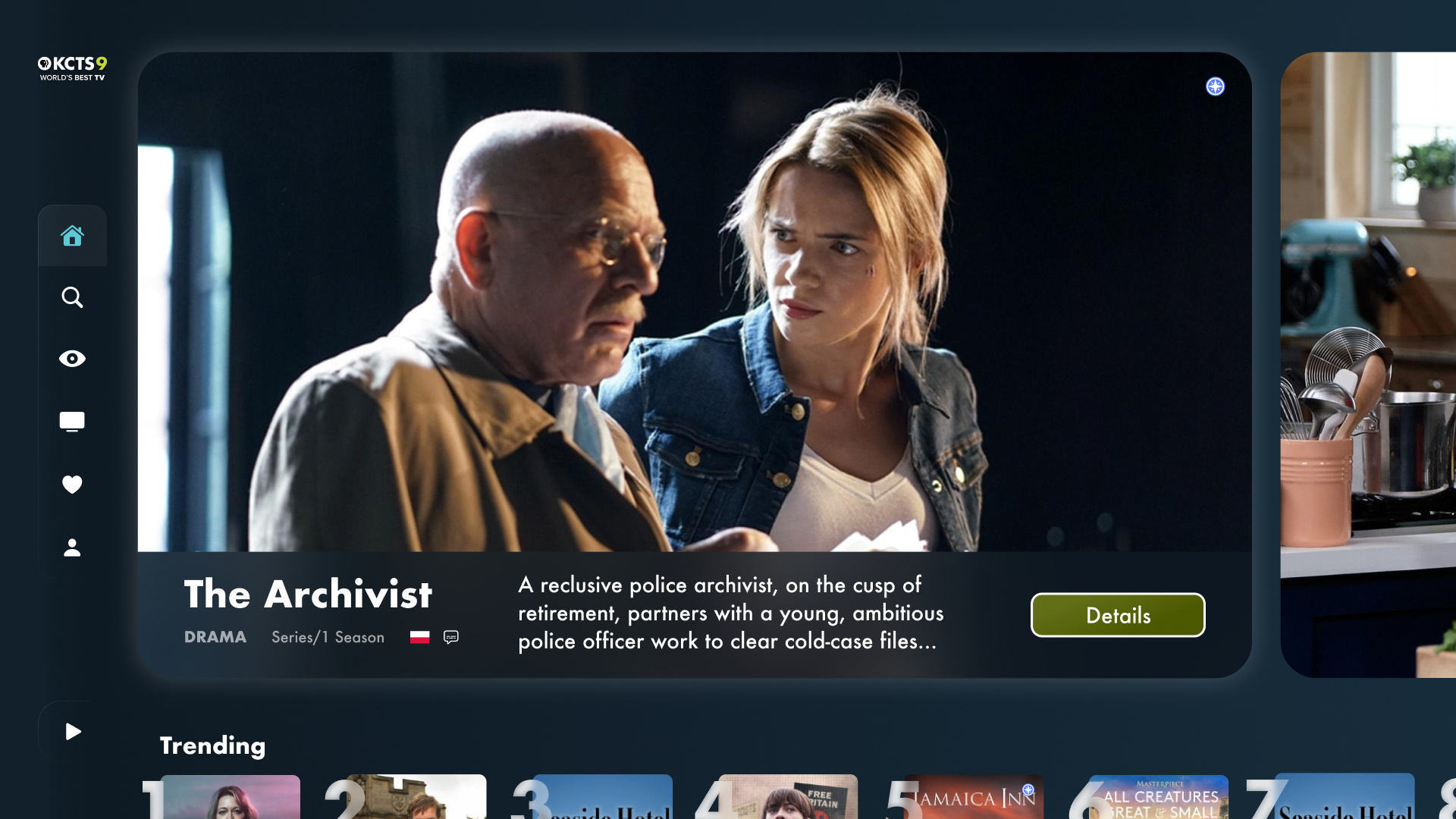
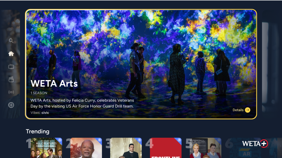
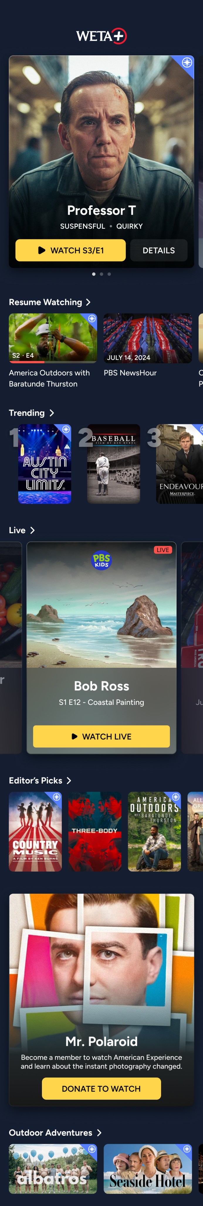
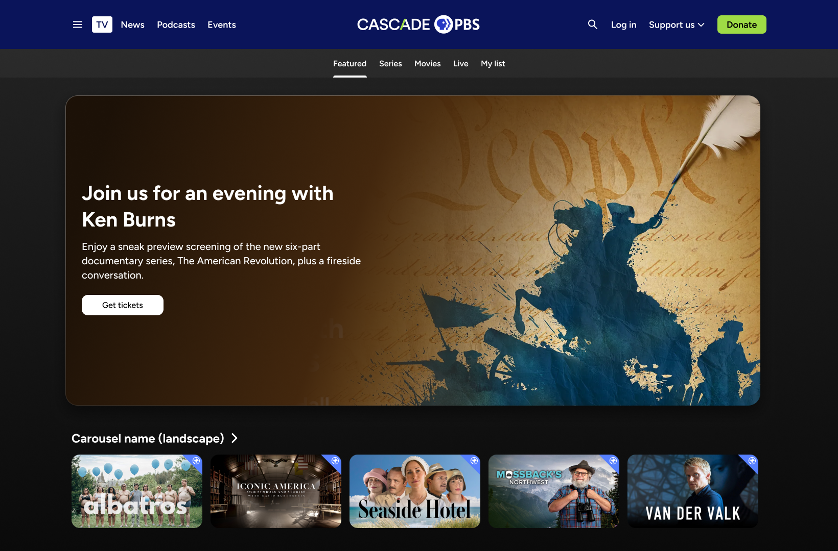
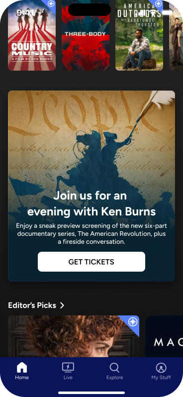
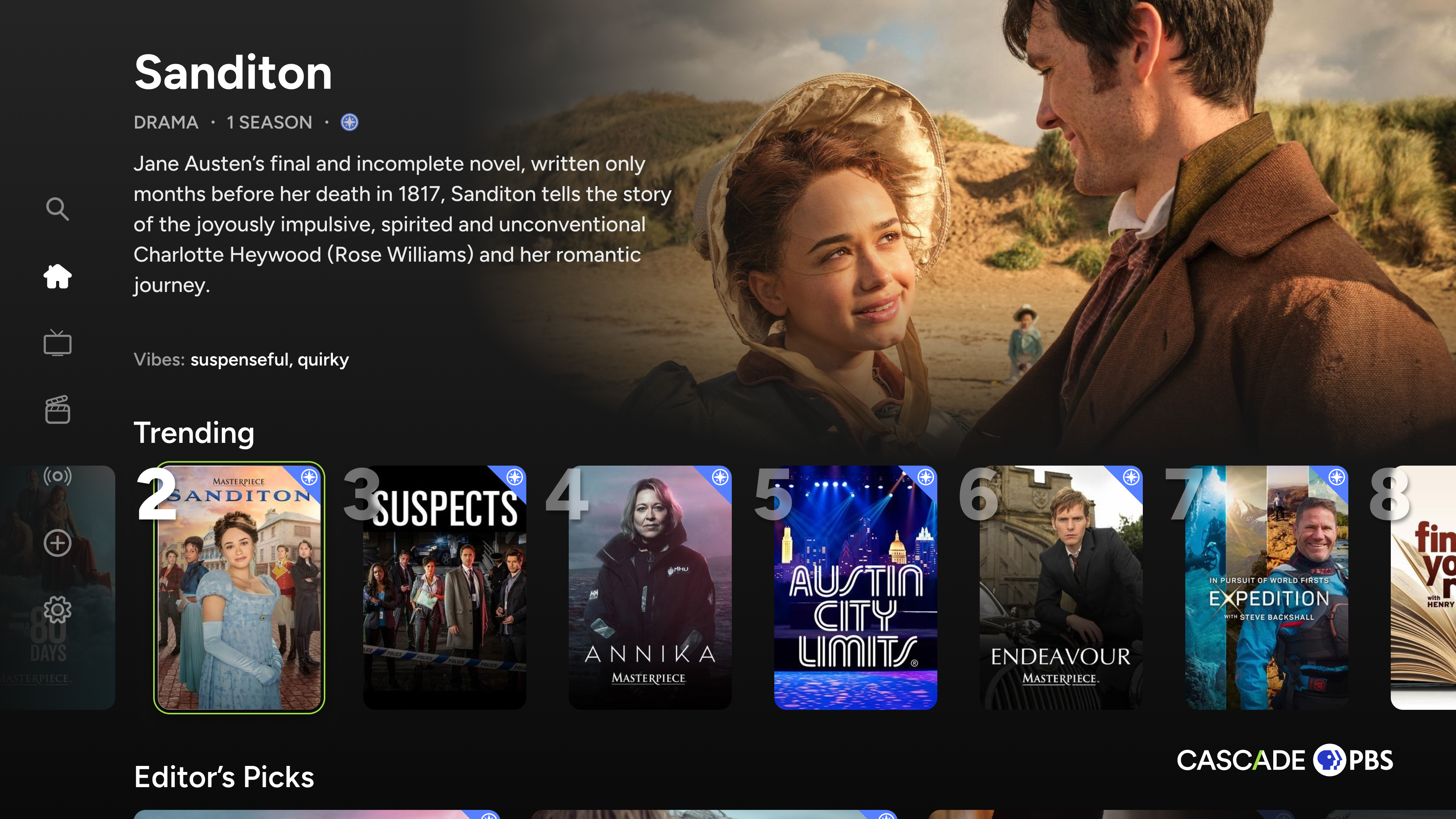
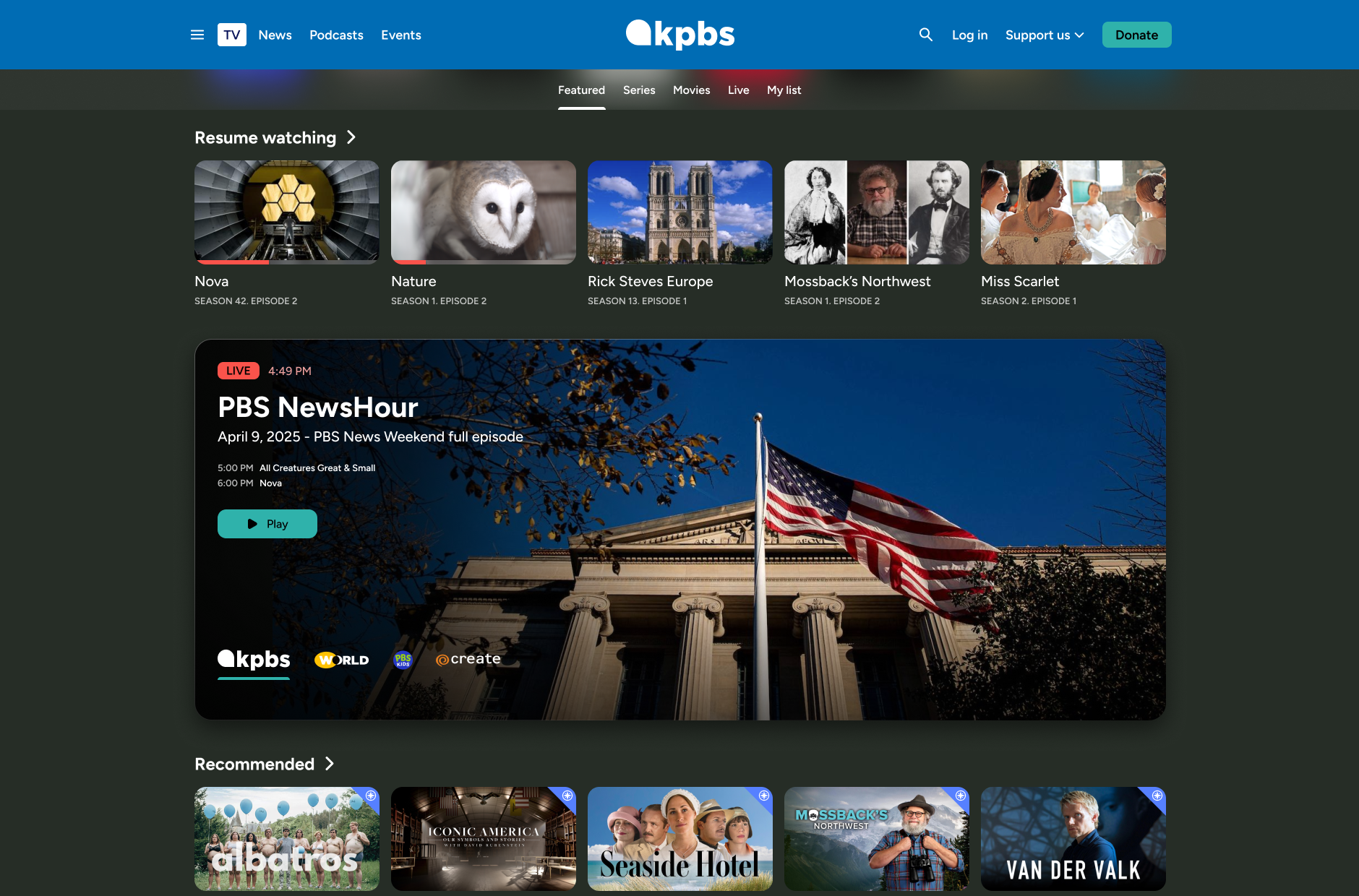
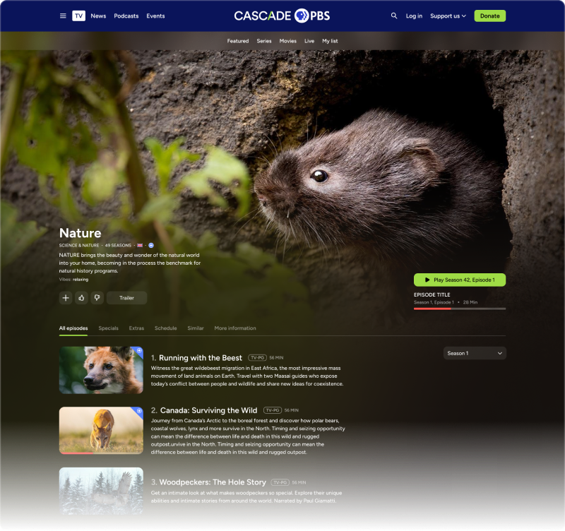
Stations can fully order and manage their homepages using the CMS.

Home
Live
Details


Concepts
To begin design work, I created wireframes for stakeholders to understand potential layouts as well as medium fidelity concepts for them to see styling possibilities.
Sketches
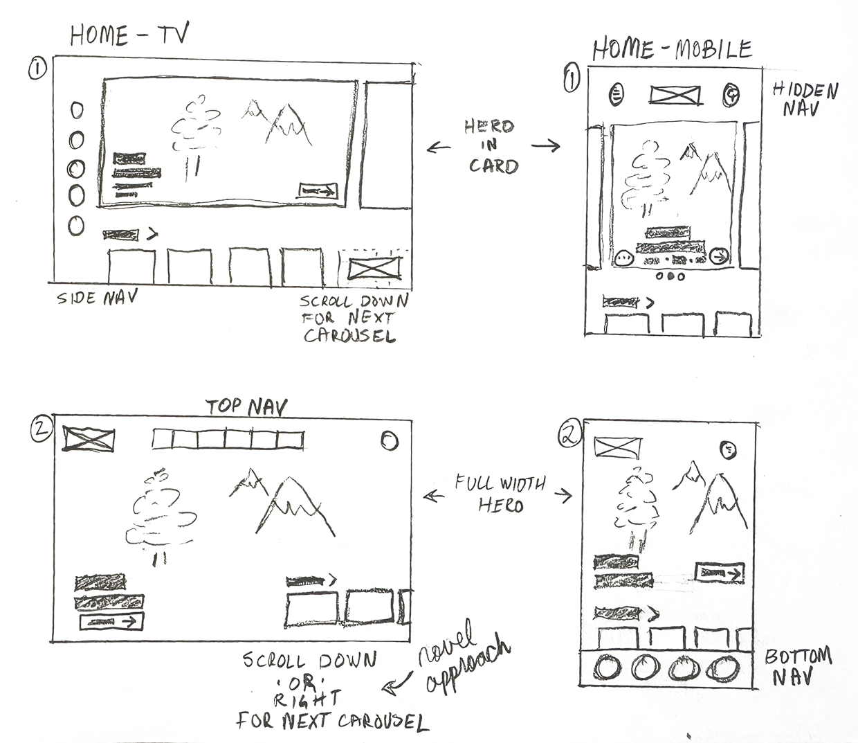

Medium fidelity exploration
Early concepts allowed me to experiment with out of the box ideas and styling approaches. We bounced the ideas off our internal groups and stations to get see what emotions were evoked. I used this feedback to incorporate ideas that were received favorably, and dialed back layout ideas that would be too out of the ordinary for users.
Home
Live
Details


3. Final Product
To demonstrate the consideration of design throughout the project, I’ve selected four areas to highlight and a gallery of screens.
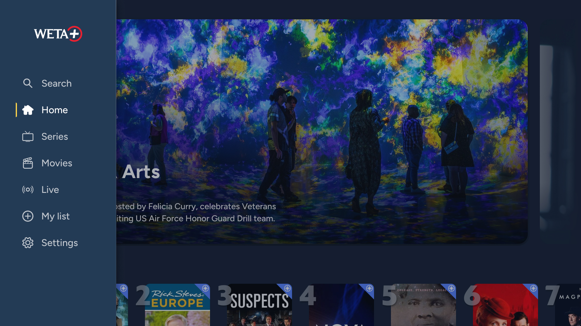
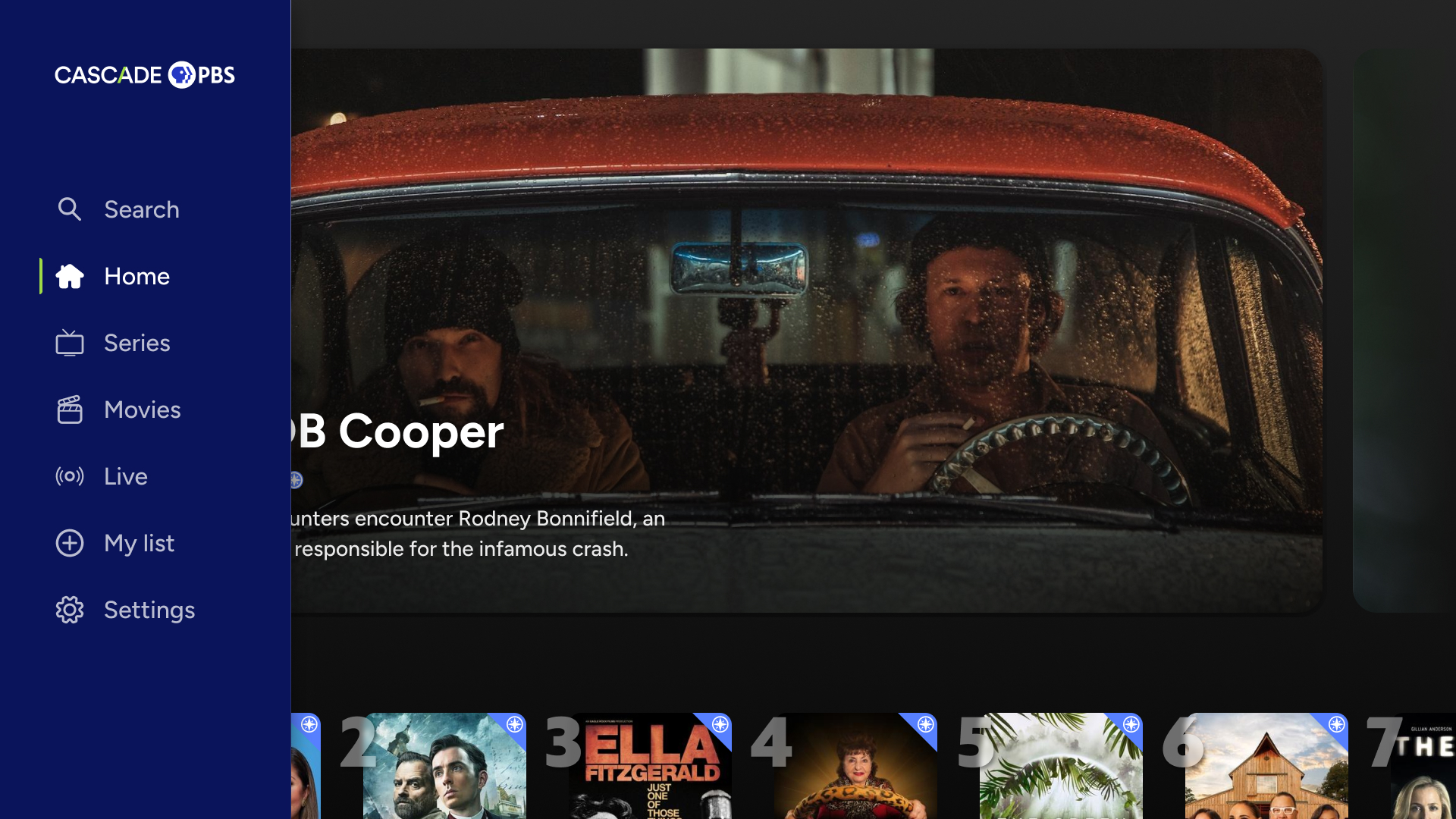
Individual station branding
Content pages
Management of apps through CMS
Pioneering a better browsing experience
Gallery

Individual station branding
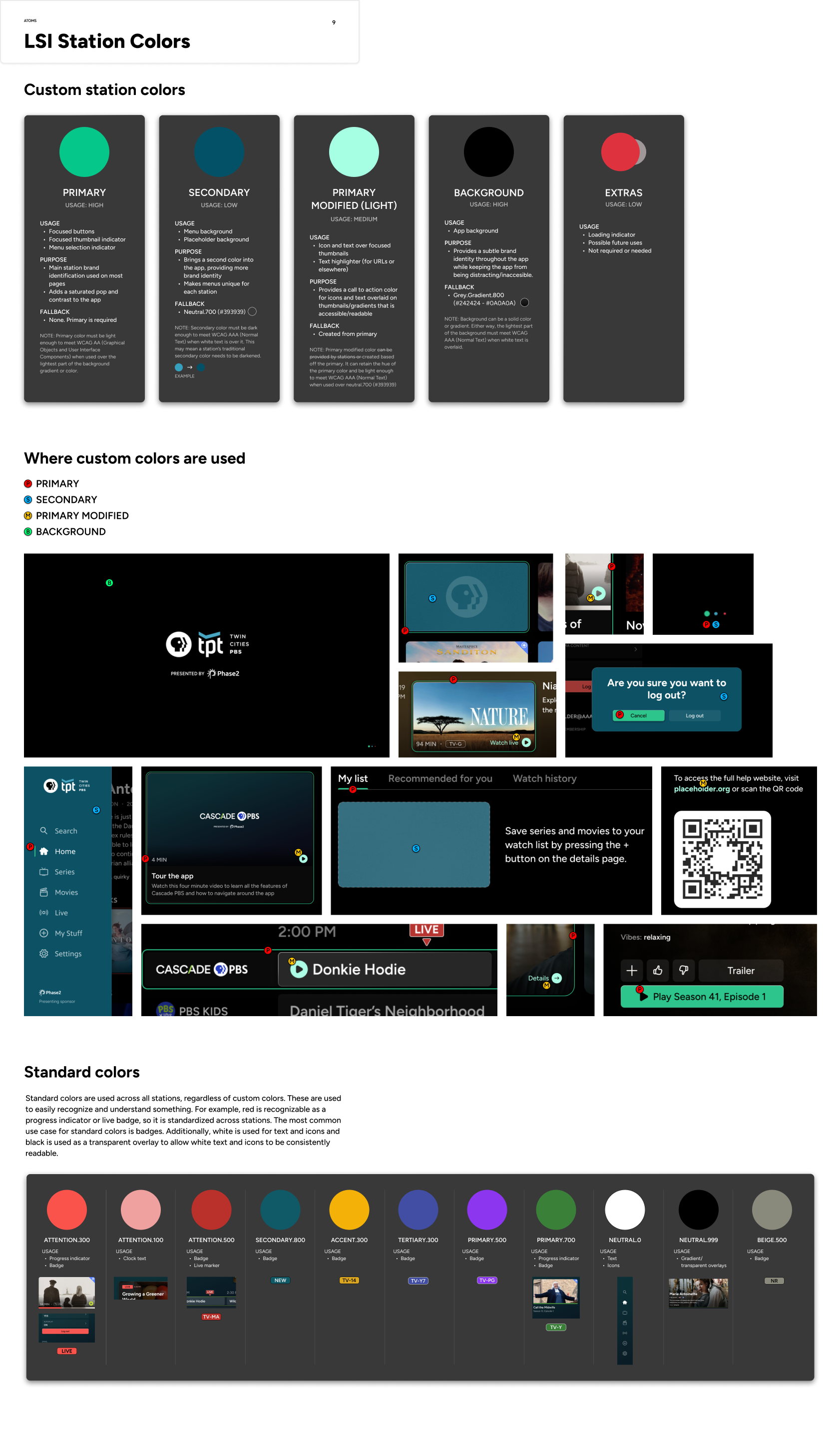
After identifying patterns in color palettes across all stations, I worked with each station to establish primary, secondary, and background colors guaranteed to work well together. The challenge was to accommodate all stations while keeping screens accessible and not detracting from the content imagery. A key decision was to use transparent whites and blacks to expand color palettes while keeping branding consistent.

Highlight station identities while retaining clean and accessible design
GOAL:
Exemplifying five stations to highlight branding across platforms:
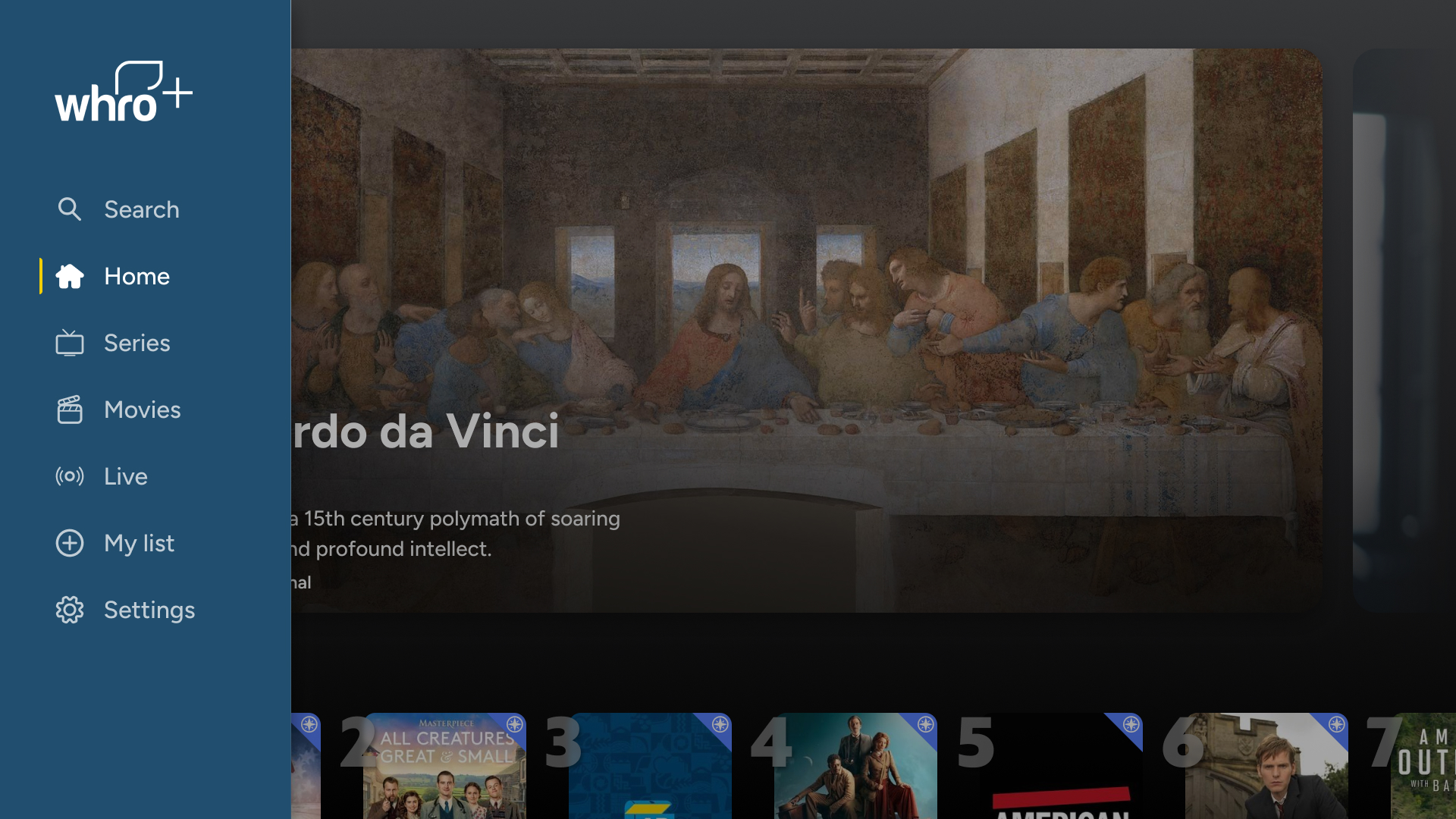
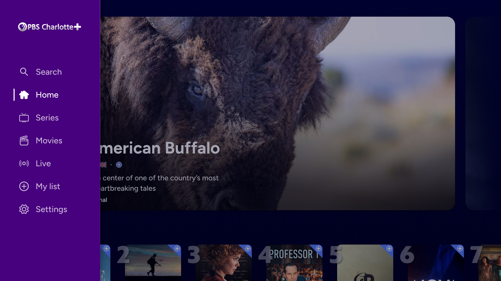
TV
Mobile
Web


TV
Mobile
Web


Primary.100


SECONDARY.500


Primary.500


Background
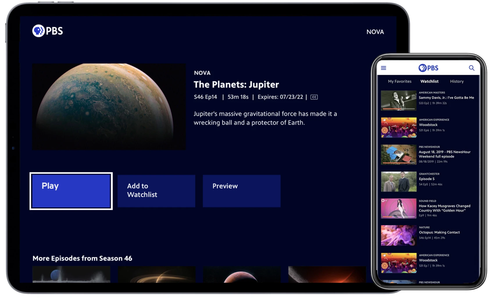
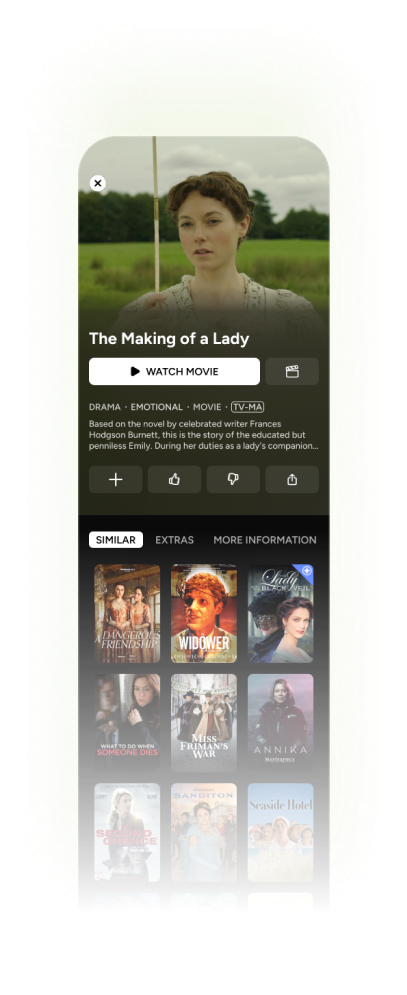
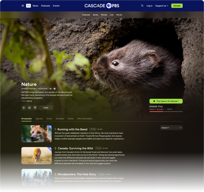
Content Pages
GOAL 1:
Make layouts intuitive regardless of device: establish a cohesive feel while leveraging device strengths
GOAL 2:
Accommodate many different types of content while highlighting content identities and branding
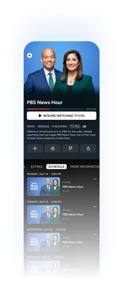
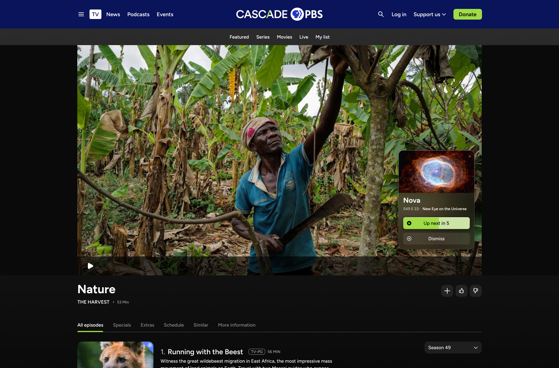
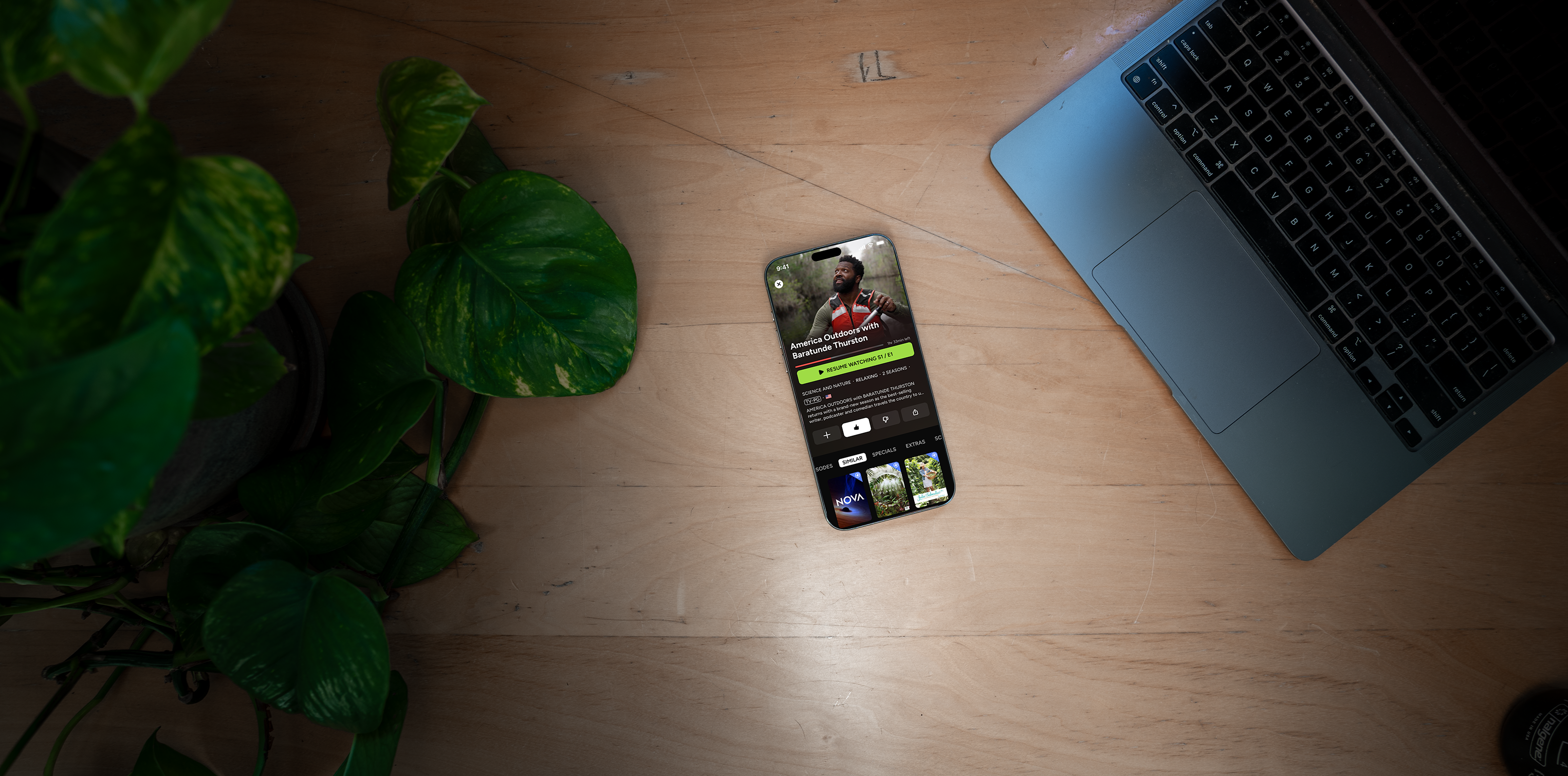
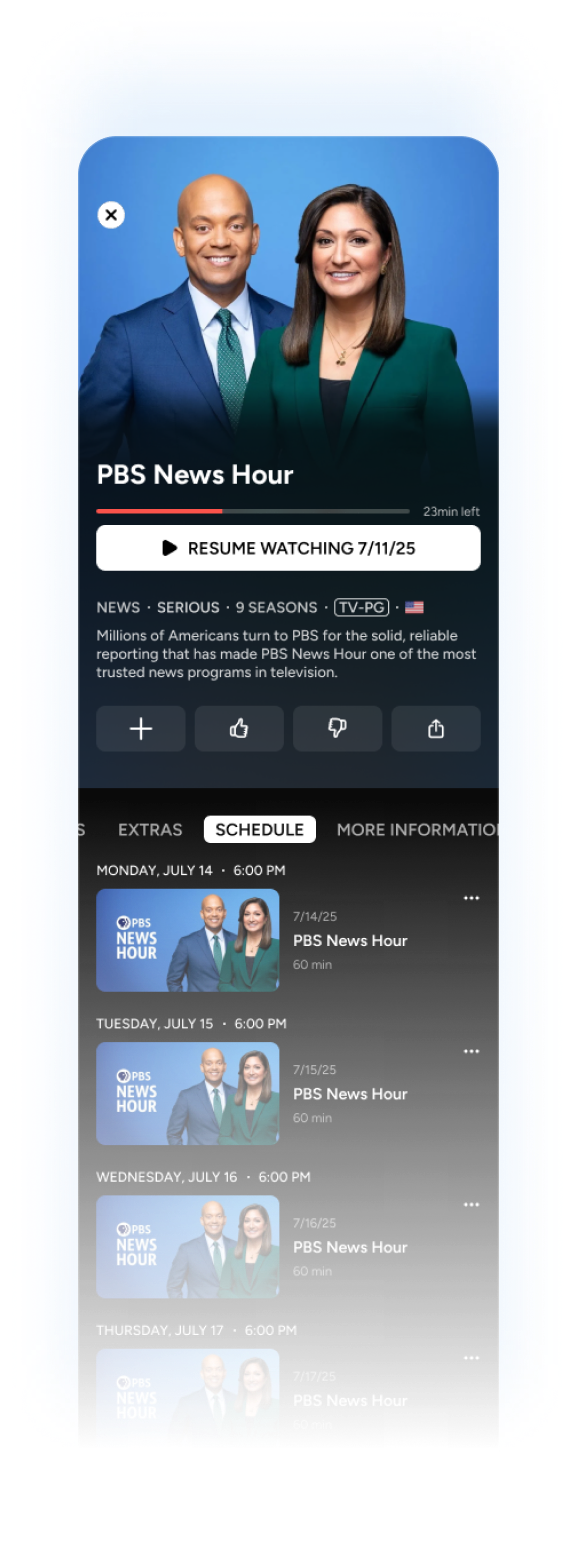
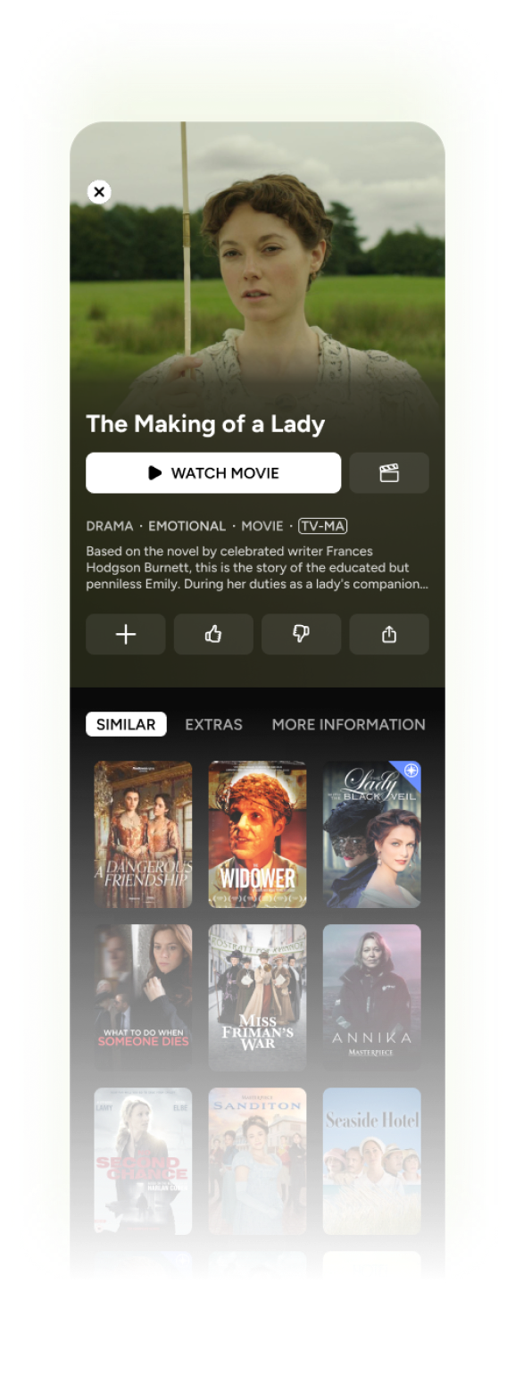
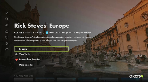
Navigating a TV content page
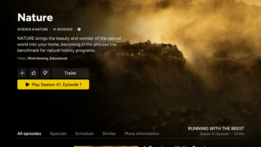
Interaction
- Condensed buttons when not focused
- Menu content pokes above the fold so users are contextually aware of where they are
- Delightful, in-button animations,
- Overlays on posters when focused to show relevant information when needed
Integration
- Live content integrated into schedule view -- open the live player right from the details page or set a reminder of when the show goes live
- Content states remain the same across devices
Highlighting content identity
- Full page background imagery of the selected video that highlights the focal point and uses a masked blur effect to create an immersive feel
Example of a web content page
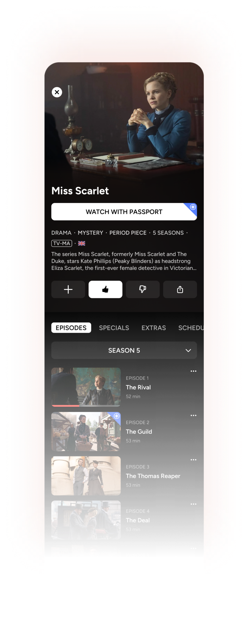
Modularity
- All content types can be injected into a content page without sacrifice:
- Episodes are properly ordered depending on content type (e.g. latest episode for news, oldest episode for episodic)
- Menu adapts based on content type
- TV, mobile, and web have similar layouts, adapted to take advantage of input methods
Future proofing
- Future updates can implement features without UI overhauls.
- Example 1: the “More information” tab can expand to feature cast and crew
- Example 2: a “Gift episode” button can be added to the button cluster.
- Content titles to be replaced with content logos eventually
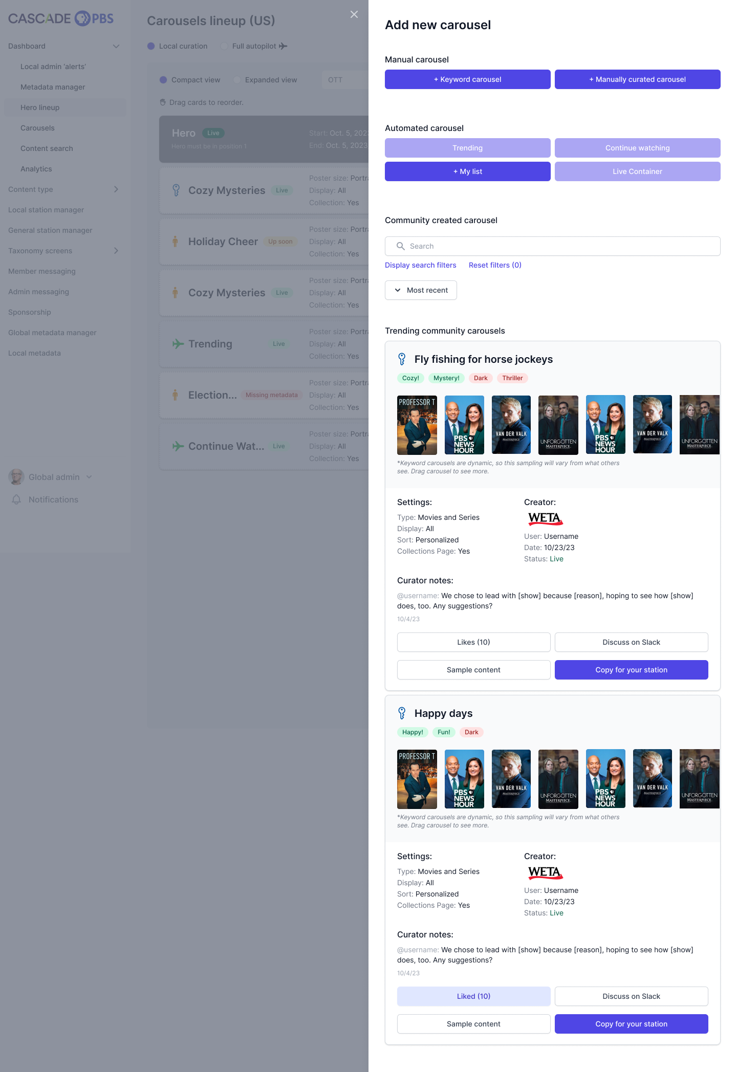
Management of apps through CMS
In addition to the frontend apps, I designed the backend content management system (CMS). Each frontend feature required careful backend consideration:
- How much control do stations want?
- How much automation should we incorporate?
Ultimately, we provided robust manual controls that could also be automated. Additionally, we let stations share setups so that more resourced stations could pave the way for others.
For a peak into the CMS design, I’ve provided two examples items stations can manage.

Allow stations to easily edit and curate content, share with each other, and communicate with their audiences
GOAL:


Example 1: Homepage customization

Building a homepage
Station admins can build and order their homepages using as many of components as they like. They can choose carousels made by other stations, schedule when lineups will change, and decide which carousels can be expanded to collection pages. They can even decide to adjust their homepages based on device type.

Backend CMS
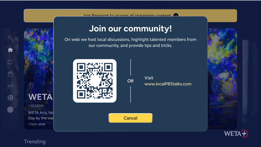
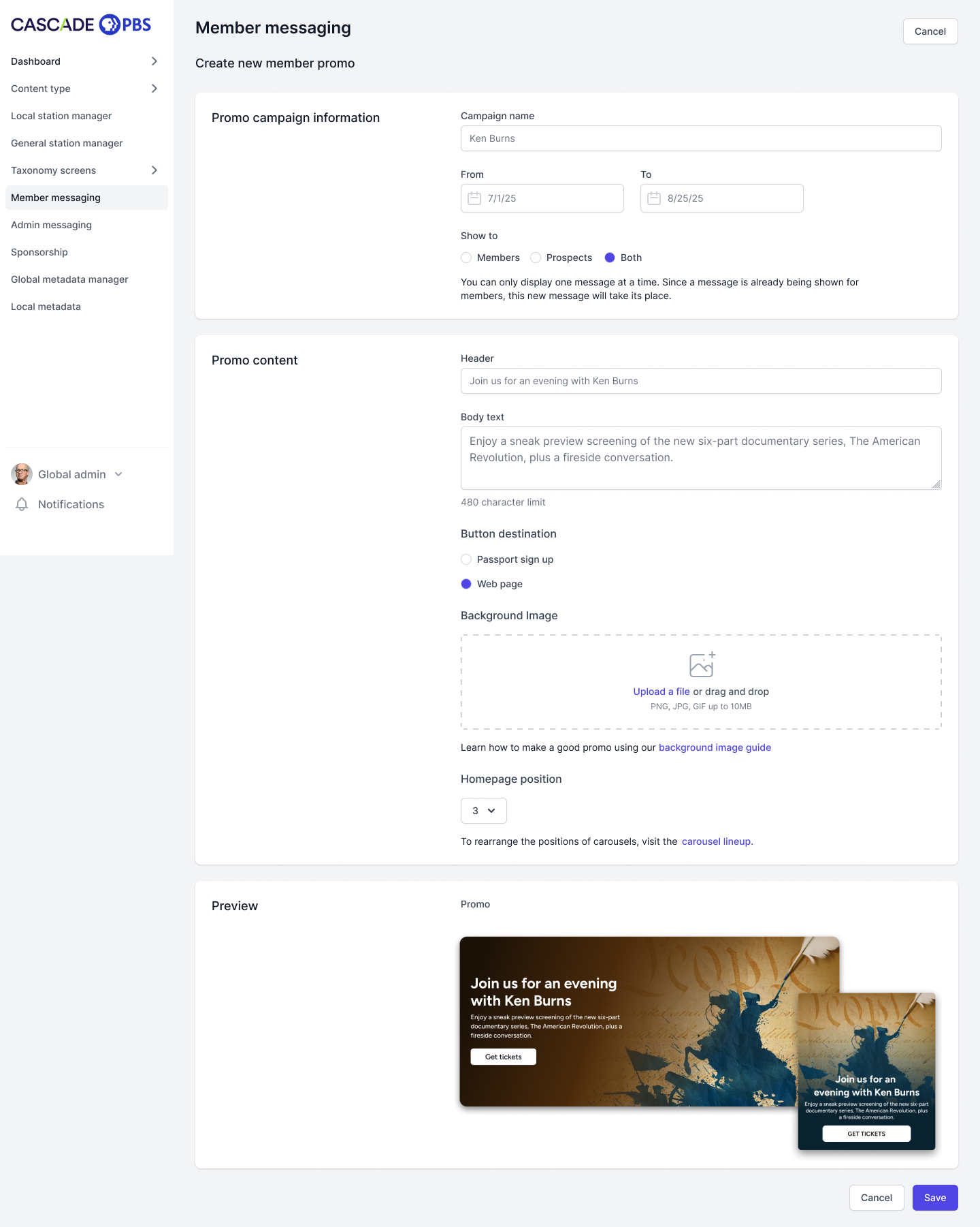
Example 2: Member messaging
To accommodate two scenarios, stations can communicate to their audiences on the homepage in the following ways:
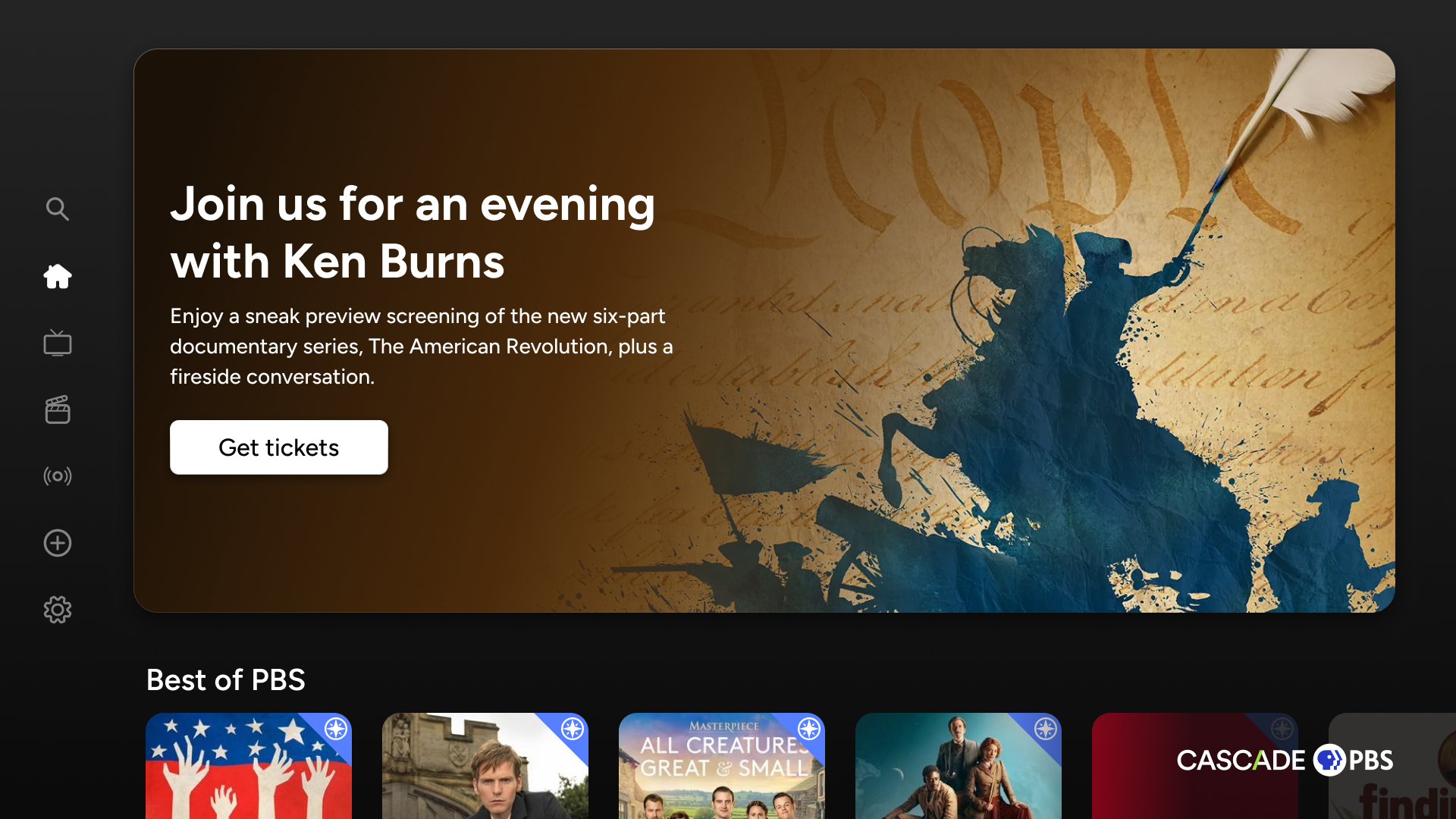
- Promos (pictured)
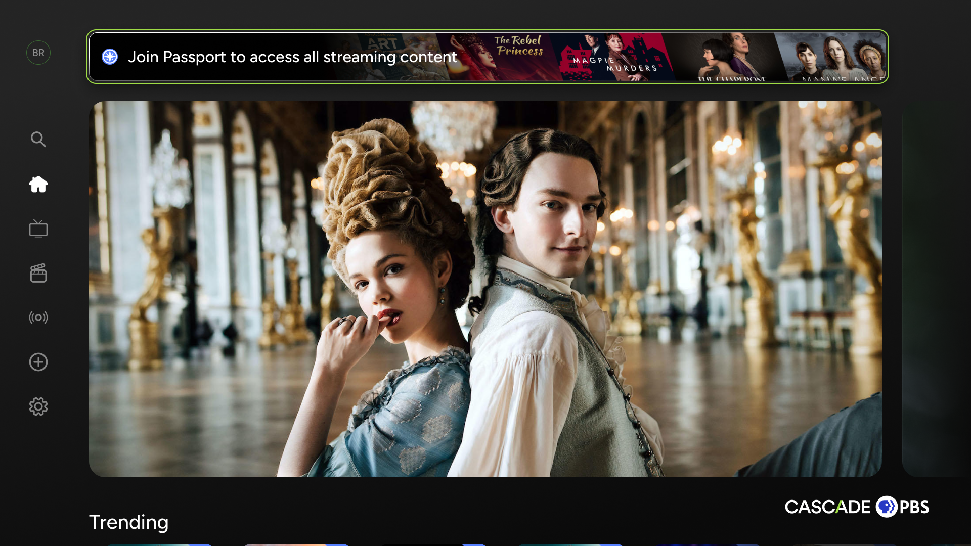
Promos are visually appealing cards stations can design and place anywhere on the homepage, giving them both branding and messaging control (within determined bounds).
We wanted these messages be visual, so we gave stations the ability to upload their own images. To accommodate text and button overlays, we provided guidelines. In the future, we would like to implement automatic systems that apply gradients over images, letting smaller stations make beautiful promos quickly.
- Messages (not pictured)
Messages are slim, text-only cards that can be opened to read more and scan QR codes/see URLs.
We wanted these messages to be quick and to-the-point, allowing stations to communicate with their audience at the top of the homepage where their message won’t be missed, but won’t be distracting.
Balancing customization with ease of use
Some stations have full staffs of designers and content programmers. Others have small, multi-role staffs. To accommodate both, the messaging features can be quickly made or more deliberately customized.
Pioneering a better browsing experience
When users are looking for content to watch, they fall somewhere on a spectrum of knowing the exact title they want to see and having no idea what interests them. The search page serves their needs for the former and the homepage serves their needs for the latter. But what about the in-between?
To meet this need, I trialed several designs before creating an original concept that balances several challenges:
- TV layouts need to be simple to read and navigate (not too many elements)
- Users need to see enough content options at one time to not feel “claustrophobic” while browsing
- Users need to understand each piece of content without leaving the page to ensure quick browsing

Allow users to discover interesting content whether they have no idea what to watch or some idea what to watch.
GOAL:
User has no idea what they want to watch. Stations curate the homepage to surface content they think their users will appreciate.
User has a general idea of what they want to watch, but no specific piece of content in mind. The Series and Movies pages fill this gap using a unique layout.
User exactly knows what they want to watch. The search page begins surfacing content as keystrokes are inputted.
Unbounded browsing
precise searching
Homepage
Browse pages (series and movies)
Search page
This is the browsing problem I needed to solve

The spectrum of user browsing precision
State 1: browsing the sorting list
State 2: browsing the content within list
The list has three tiers, invisible to the user, but carefully ordered. Filtering these tiers would add unnecessary complexity and decision-fatigue, especially on TV:
- Automatic
- Popular
- Recent
- Recommended
- Alphabetical
- Station-curated
- Seasonal
- Local
- Event-based
- Whatever they feel like!
- Genres
- Arts & Culture
- Drama
- Food
- etc.
When the user moves right, the list shrinks down providing space above for the information for each focused item to display. This let’s users quickly learn about each show without going to its content page. To properly execute this experience and make it intuitive, the animations, transparencies, and sizing of each element was carefully considered.
Gallery
TV, PBS Charlotte, Live
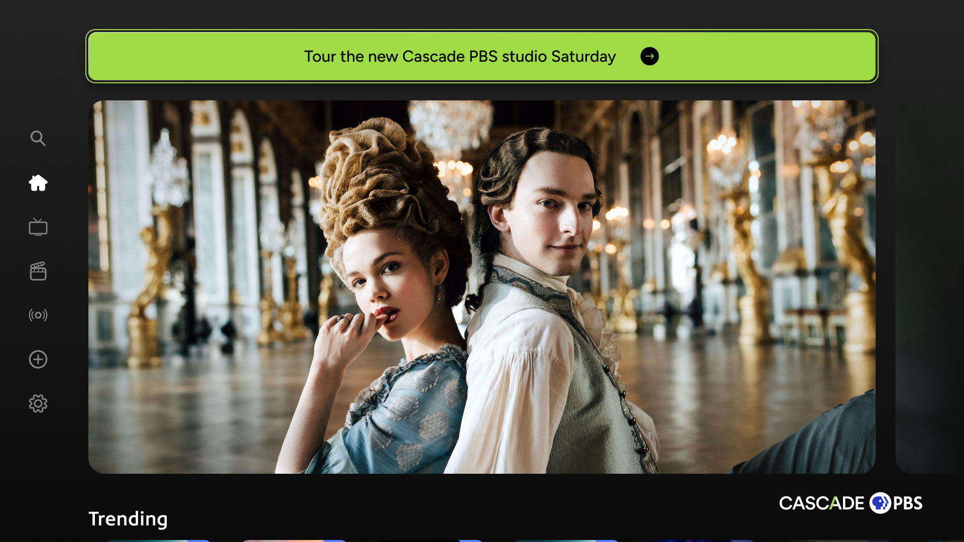
TV, Cascade PBS, Home (carousel with top shelf)
Mobile, Weta+, Onboarding
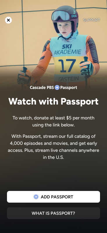
Mobile, PBS KVIE, Passport Gate
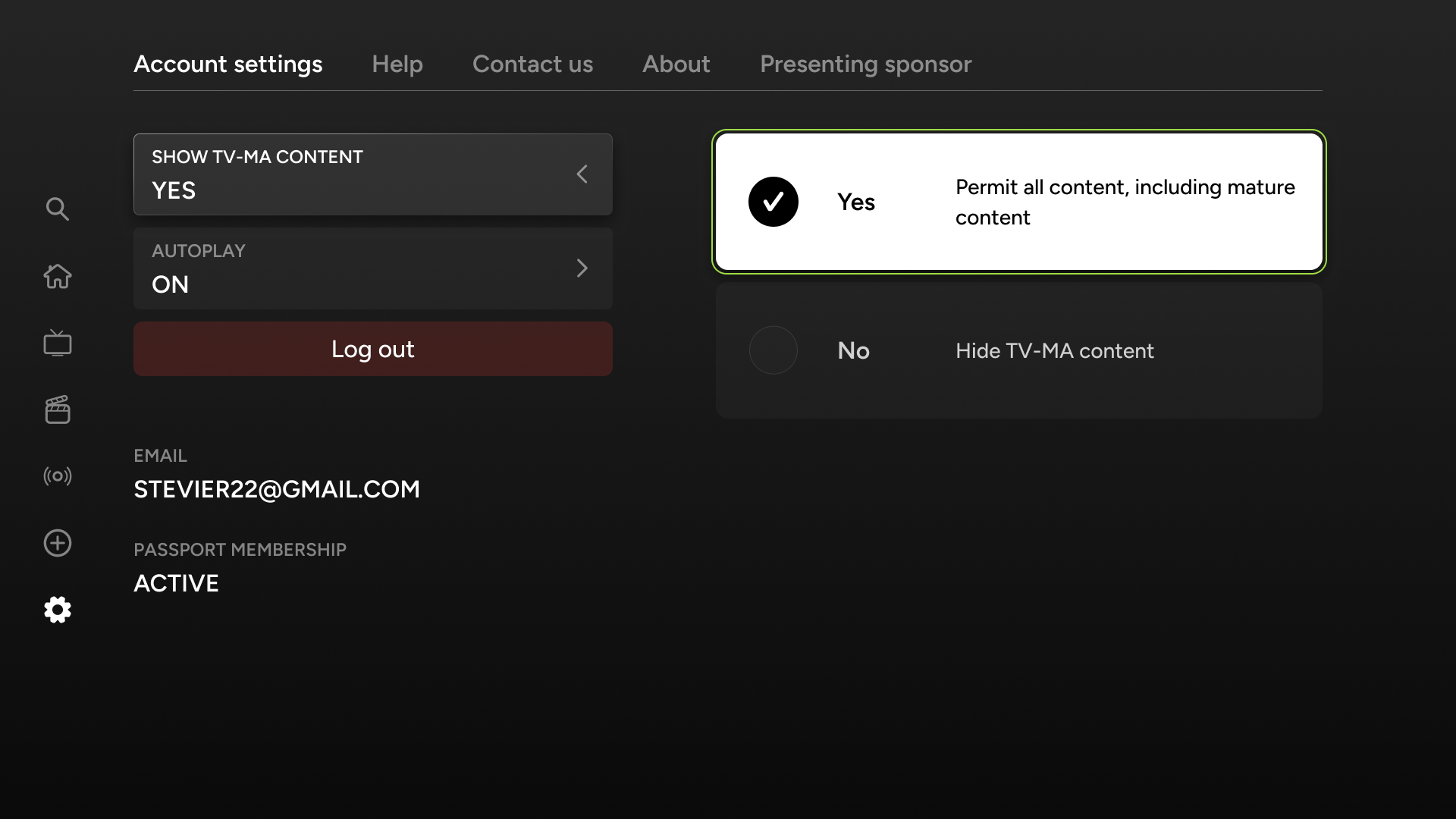
TV, Cascade PBS, Account Settings
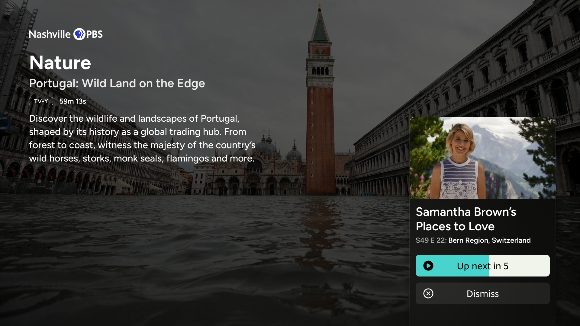
TV, Nashville PBS, Video Player
TV, Cascade PBS, Home (top message)
Web, Cascade PBS, Video player
Web, KPBS, Home (scrolled down)
TV, Rocky Mountain PBS, Home (video carousel)

3. Results and Next Steps
Since launching apps, we’ve gathered initial data and surveyed our users. As the apps and user base matures, we will gather further data to analyze and help guide decision making.
Results
Next Steps
Results
With the help of the Washington, D.C. station, WETA, we surveyed users following the launch of the apps.
Based on 136 survey responses, there was strong user satisfaction with generally positive ratings across all categories. However, several issues were identified that could improve the user experience and app adoption.
Additionally, shortly after launch, CEOs of participating stations met and provided glowing reviews of the product.
73%
of users rated overall experience
"Excellent"
or
"Very Good"
Beyond surveying users, we looked at hard-data, including retention.
The retention rate of the apps has been high after the first few months post-launch. Continuing to track retention will be important as the apps mature and their newness-factor reduces.
61%
of users use the apps
three times a week
or more.
Excellent
Very good
Good
Fair
Poor
32%
30%
18%
9%
11%
Finding what I want to watch
Learning about things I may want to watch
29%
30%
20%
10%
11%
Playing what I want to watch
37%
27%
18%
6%
11%
User app ratings
This is how I rate...
Positive feedback from users
“More modern, more swim lanes, better search results. More recommendations.”
“The content seems so much more vast on the new platform!”
“I absolutely love the format on this app! There are so many things to find , it's like being in candy store! And I love that I can watch live , which I couldn't before. I am HAPPY! HAPPY! HAPPY! with everything on this app!!!”
“I didn't expect the app to be very useful, but we are using it almost daily. Easy to find unexpected local content without wading thru all those PBS series.”
“Much better organized than the existing PBS app. The breakdown categories made certain shows more appealing.”
“I find the new site extensive and curated extremely well. It made it easy to identify some Walter Presents shows previously awkward to find, for example. I like that the categories are so varied. It’s like finding a treasure trove of forgotten programming available to watch. Very impressive!”
“This app is much better than the old one - quicker/more responsive, cleaner interface, faster loading. Really good!”
Issues based on survey results
Problem: Multiple users struggled with sign-in, password resets, and account confusion between PBS Passport and WETA+.
"Will not take my WETA password and my Roku password is different"
"I have both a WETA password and a PBS password...Not sure why I had two passwords"
Potential Action Items
- Implement unified authentication with PBS Passport
- Create clearer password reset instructions
- Develop one-time passcode email authentication option
1.
Authentication & Password Management

Problem: Difficulty finding subtitles and poor visual indicators for navigation
"I had difficulty finding the option to turn on subtitles"
"Please make it MUCH easier to identify which option is highlighted"
Potential Action Items
- Make subtitle/closed caption settings more prominent
- Improve visual contrast for selected menu items
- Add persistent subtitle settings across episodes
- Enhance accessibility features for visually impaired users
2.
Accessibility and Usability

Problem: Limited live TV guide functionality and scheduling information
"I wish you could use the right arrow button to see what is coming on in later hours"
"I could not find a Guide for Live TV shows”
Potential Action Items
- Improve program discriptions
- Add extended schedule viewing
- Consider DVR-like features for live content
3.
Live TV Features

Next Steps
Add stations
As the apps have rolled out, interest has grown from stations who wanted to see a proof of concept before committing themselves. I’m currently working with several stations to onboard them and optimize their branding and styling.
With the rate of stations signing up increasing, I’m working with a developer to automate some of the station onboarding.
Additionally, we’re working on a feature that could bundle several smaller stations into a single app. The image on the right depicts how this will work with stations across Texas.
Conduct further user research
Beyond the initial surveys we performed post-launch, I would like to continue conducting user research:
- Survey all stations
- Work with stations to survey their audiences
- Conduct usability studies
- A/B test new features
Refine app and CMS UX
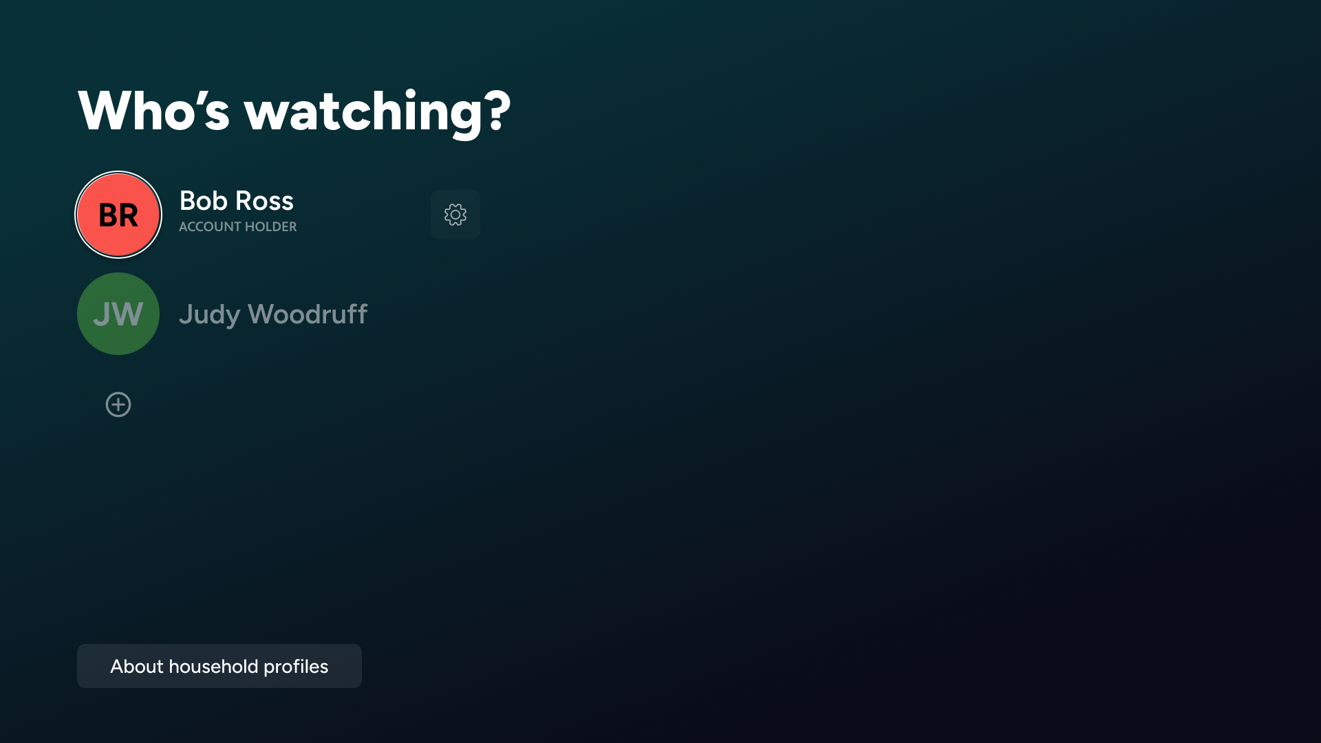
Profiles
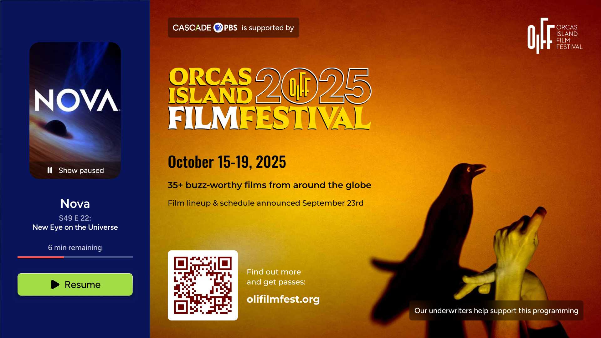
Pause screen promotions
Improvements to messages
Multiple stations in a single app
Many designed features had to be shelved to finish the apps on time. I’ve worked with stations and our product team to prioritize these features. They range from large, new features like profiles, to refinements of existing features, like allowing stations to place images on messages.
Other additional features are derived from survey results and user feedback. These can be seen above
Additionally, excitement around the apps has generated a future roadmap of app improvements and integrations. These additions have been prioritized and planned for future design work. They include
- NPR integration
- Film festival integration
- Local sports integration
- Community collections
- Gifted content
My Other Case Studies
Responsive web
Designing a PBS video, news, podcast, and events website, serving 100,000+ members.
Frontend apps

BACKEND WEB ADMIN
Read case study


OTT
Mobile
WEB
Crafting a scalable, 1000 component atomic design system for 15 PBS stations and multiple device types.
Read case study

Copyright © 2025 | Designed and Built in Seattle, Washington


Designing a cross-platform streaming app, serving 15 PBS stations
Jump to product screens
View web app
Overview
Process
Product
Results
Top


1. Overview
As audiences shift from broadcast TV to digital streaming services, PBS stations across the country are suffering lost viewership and revenue. Meanwhile, national PBS released an app lacking fundamental features and content, and is undercutting their symbiotic relationship with local stations by directly hosting content on commercial platforms like Amazon Prime.
PBS national
- Hosts content produced by the individual stations
Local PBS stations
- Produces content for local and national audiences
- Broadcasts content
The content cycle between national PBS and individual stations is breaking, hurting stations and eventually national PBS.
To solve the viewership problem and expand local public media, we worked with stations to create a multi-platform streaming service that empowers individual PBS stations with tools, including extensive content management, custom branding, and direct audience communication pathways.

Role
UX Design Lead
TEAM
In-house product team (10)
External teams: Oxagile (7), Phase 2 Technologies (8)
TIMELINE
Jan. 2023 - Sept. 2025
END USERS
PBS stations (15)
PBS stations’ audiences (180,000)
1.
Audiences are migrating away from linear TV
Audiences are rapidly shifting from traditional broadcast to digital platforms, making it increasingly difficult for stations to attract new donors and sustain revenue goals.

Problem
Provide a digital platform for migrating audiences
Provide a comprehensive streaming app that exceeds audience expectations. Make it available on a wide range of devices, including Roku, Apple TV, iOS, Android, and Fire TV.

Provide a digital platform for migrating audiences
Provide a comprehensive streaming app that exceeds audience expectations. Make it available on a wide range of devices, including Roku, Apple TV, iOS, Android, and Fire TV.
Goal

Success metrics
User adoption
Track the number of stations adopting the platform and the growth in active users.
Revenue growth
Monitor the increase in donations and memberships generated through the app, especially through features designed to enhance digital fundraising
2.
Current digital PBS offerings are confusing and dated
PBS content is spread across different platforms causing audiences confusion. Additionally, the public media apps that exist have dated UX and lacking feature sets. Viewers expect seamless, multi-platform experiences.
Problem

Build a unified platform with an intuitive user experience
Deliver a modern, intuitive interface that enables users to easily discover and watch all PBS content on any device using one app.
Goal
User engagement
Measure user interaction with the app, including average watch time, use of recommendation features, and engagement with local content.
Success metric
3.
Stations don’t have the resources to manage a unique digital presence
Stations are oriented towards programming linear TV and don’t have teams available to build and maintain digital experiences. They need a low-effort, high capability solution for digital streaming.
Problem
Build a backend portal for stations to exchange content
Provide stations a CMS where they can share content, tagging, and content surfacing. Also give them easy tools to customize their own apps, allowing them to establish unique branding, messaging, and revenue generation.
Goal
Station feedback
Collect and incorporate feedback from participating stations to ensure the platform effectively meets their needs.
Success metric
Stakeholders
My role
As the lead UX designer for the project, I worked with a variety of stakeholders as shown in the diagram below (hover over the labels).
During the second half of the project, I contracted two other designers who I managed and supported.
Two target audiences
- Audience end users
Each station’s app has a set of users browsing content, viewing videos, and receiving messaging on various devices.
- Station backend app managers
Each station has a set of users curating content, customizing branding, and delivering messaging for their app.


Product Team
UX designer
Digital director
Product manager
Internal developers
Project manager
Advertisers
Community partners
Marketing and communications
Audience
Partner stations
Cascade PBS leadership
Contracted teams

Participating Stations


Timeline
It took over two years to get from conception to product launch. During that time, my focus was either entirely on the project (like during design phases) or split between supporting the build process and other projects.
Jan 2023
JUNE 2023
NOV 2023
APRIL 2024
SEPT 2024
FEB 2025
JULY 2025
Coordinating with stations and PBS
Information architecture
Ott designs
CMS designs
Work with second contracted team begins
App refinement with developers and stations
Web refinement work with developers
Continued launches and improvement
Foundational research
Design exploration and testing
Work with first contracted team
Web app designs
Mobile designs
Beta testing of OTT and mobile apps
Initial public launches for all stations
Platforms
To provide a complete service that meets audiences where they are, we designed cross-platform compatibility across all major streaming devices. Additionally, we designed a custom backend content management system for stations to use on the web.
TV
End User App
Apple TV
Google TV
Fire TV
Roku
LG TV
Samsung TV
Mobile
End User App
iOS
iPadOS
Android
Web
End User App
Backend CMS
Responsive

2. Design Process
After coordinating with PBS national and individual stations to launch the project and secure funding, I identified our audience, discovered pain points, leveraged secondary research, audited the competition, established the information architecture, and worked on initial concepts.
Target Audience
Pain Points
Competitive Analysis
Leveraging Secondary Research
Information Architecture
Concepts
Target Audience:
Ages 18-85
(skewing older)
All genders
Philanthropists
(community-minded folks)
Documentary fans
(science, art, and history nerds)
International content fans
(film and TV connoisseurs)
Parents and their children
Businesses with TVs
(Gyms, lobbies, airports, etc.)
Nostalgic PBS Millenials
Those with different abilities
(including those who struggle with tech)
Non English speakers
Using data collected from our existing user base and surveys from participating stations, we identified our target audience.
The chart represents some of the different groups our app serves and some of their overlaps, but is not an exact representation.
Pain Points
To understand the issues stations and audiences encounter with the current PBS app and other streaming apps, we interviewed both groups. Below are four of the pain points we uncovered.
Audience Pain Point
1.
Browsing for content is a struggle
- Browsing is slow since it’s hard to know what a show really is about until you open its page or start watching it.
- Carousels are very basic, leading to a lot of content being hidden or not relevant.
- Besides the homepage, there aren’t more sophisticated ways to browse.
Audience Pain Point
2.
Current streaming offerings feel lifeless
- Part of the appeal of PBS is its non-profit, community feel. Linear TV provides this liveliness through interstitials, live programming, and two-way communication using phone or web. The current streaming apps only display rows of outdated, stale content.
Station Pain Point
3.
Content metadata is rigid
- Stations receive content from PBS national with locked-in tags. Tagging is limited and often not specific enough, limiting the degree to which stations can sort and display content.
- Stations lack granular control they desire like choosing which show images are featured and how episodes are organized.
Station Pain Point
4.
Managing a streaming service is impractical
- Stations have limited resources, especially the smaller ones, and don’t have capacity to curate and operate a streaming service.
- Besides the homepage, there aren’t more sophisticated ways to browse.
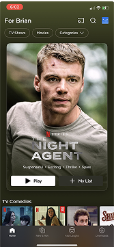
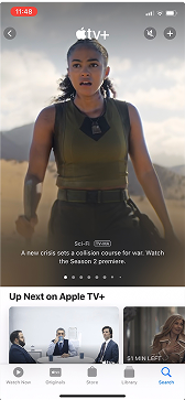
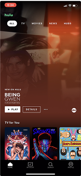
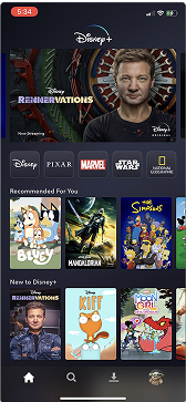
Competitive Analysis
Ideas to Model:
- Emulate some of the information architecture to prevent users from being overwhelmed by the new app
Issues with Current App:
- Challenging navigation (too many moves to get around)
- Accessibility and legibility issues
- Lack of visual hierarchy (visual overload)
- Dated visuals (iconography, component design)
- Lack of expected features
- Lack of interactive and delightful design (animations, user feedback)
Current streaming offering
PBS app/original prototype app
Direct competitors
Netflix, Hulu, Disney +, Apple +, Google TV, Tubi
Ideas to Model:
- General structure of homepage, including a featured show and selection of carousels to foster familiarity
- Expected and time-tested navigation: side menu for TV, bottom menu for mobile, and top menu for web
Areas for improvement:
- Provide browsing pages that let stations feature timely content
- Create a communal feel by letting stations communicate with users
- Infuse station branding where appropriate to give a less sanitized feel and increase recognizability
Indirect competitors
Comcast Xfinity, Spotify, YouTube
Ideas to Model:
- Could use the “now playing” feature on Spotify
- EPG from cable offerings that older audience is used to
- Could incorporate some of the YouTube community aspects for a communal feel
Gaps In offerings:
- Improved browse pages that allow users to
- Messaging users directly for a local vibe
- Infuse a little bit of branding and colors for stations to be recognizable and stand out
Ideas to Model:
- Emulate some of the information architecture to prevent users from being overwhelmed by the new app
Issues with Current App:
- Challenging navigation (too many moves to get around)
- Accessibility and legibility issues
- Lack of visual hierarchy (visual overload)
- Dated visuals (iconography, component design)
- Lack of expected features
- Lack of interactive and delightful design (animations, user feedback)
Current streaming offering
PBS app/original prototype app
Direct competitors
Netflix, Hulu, Disney +, Apple +, Google TV, Tubi
Ideas to Model:
- General structure of homepage, including a featured show and selection of carousels to foster familiarity
- Expected and time-tested navigation: side menu for TV, bottom menu for mobile, and top menu for web
Areas for improvement:
- Provide browsing pages that let stations feature timely content
- Create a communal feel by letting stations communicate with users
- Infuse station branding where appropriate to give a less sanitized feel and increase recognizability
Indirect competitors
Comcast Xfinity, Spotify, YouTube
Ideas to Model:
- Could use the “now playing” feature on Spotify
- EPG from cable offerings that older audience is used to
- Could incorporate some of the YouTube community aspects for a communal feel
Gaps In offerings:
- Improved browse pages that allow users to
- Messaging users directly for a local vibe
- Infuse a little bit of branding and colors for stations to be recognizable and stand out
Leveraging Secondary Research
Having limited resources, it was imperative for me to find and study established research, which could supplement the primary research I conducted using our audience. Using the research I found, I learned how users search (especially on TV with a less optimal typing experience), how they browse, and what content grabs their attention.
Information Architecture
Carousels: resume watching, trending, custom, automatic, mixed


Hero carousel
Messaging
Live TV
Promos
Future browsing and messaging
Search
Trending searches
Search input
Browse series
Browse movies
All A-Z
Recommended
Popular
By genre
Seasonal, etc. (future)
Live TV
Channels
My List
Recommended
My List
Watch history
Other future (watch later, shared with)
Settings
Passport (if non-member
Home
Account
Help
Contact
About
Sponsor
Main Menu
Sub Pages

The main considerations in designing the information architecture were
- Keeping navigation as familiar and intuitive for our tech-challenged audience
- Building a replicable foundation, allowing users to easily hand-off from one device to the next
The following helped in achieving the main considerations:
- Navigation requires the fewest moves possible
- Menus and other components emerge on the edges of screens to establish context (see the TV content page, for example)
- Device strengths are leveraged while keeping the platform unified and familiar
- Features can be added and improvements made without major interface changes
“One move away”

Details (Series or Movie Page)
various content types use different combinations of these


Details (play episode/movie)
All episodes
Specials
Extras
Schedule
Similar
More info
Trailer
Return to Add
Return to All Episodes
Like
Dislike
Add
Future: share, gift, save for later
Stations can fully order and manage their homepages using the CMS.
Home
Live
Details


Concepts
To begin design work, I created wireframes for stakeholders to understand potential layouts as well as medium fidelity concepts for them to see styling possibilities.
Sketches

Medium fidelity exploration
Early concepts allowed me to experiment with out of the box ideas and styling approaches. We bounced the ideas off our internal groups and stations to get see what emotions were evoked. I used this feedback to incorporate ideas that were received favorably, and dialed back layout ideas that would be too out of the ordinary for users.
Home
Live
Details
3. Final Product
To demonstrate the consideration of design throughout the project, I’ve selected four areas to highlight and a gallery of screens.
Individual station branding
Content pages
Management of apps through CMS
Pioneering a better browsing experience
Gallery
Individual station branding
After identifying patterns in color palettes across all stations, I worked with each station to establish primary, secondary, and background colors guaranteed to work well together. The challenge was to accommodate all stations while keeping screens accessible and not detracting from the content imagery. A key decision was to use transparent whites and blacks to expand color palettes while keeping branding consistent.

Highlight station identities while retaining clean and accessible design
GOAL:
Exemplifying five stations to highlight branding across platforms:
TV
Mobile
Web


Primary.100


SECONDARY.500


Primary.500
Background
Content Pages
GOAL 1:
Make layouts intuitive regardless of device: establish a cohesive feel while leveraging device strengths
GOAL 2:
Accommodate many different types of content while highlighting content identities and branding
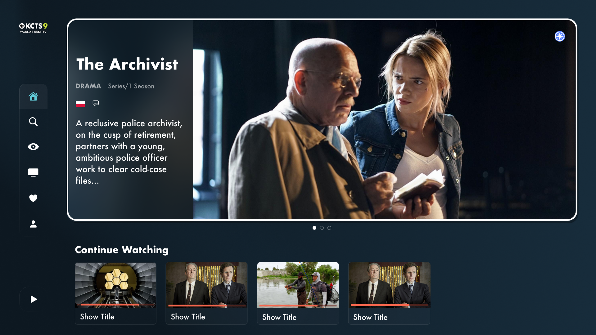
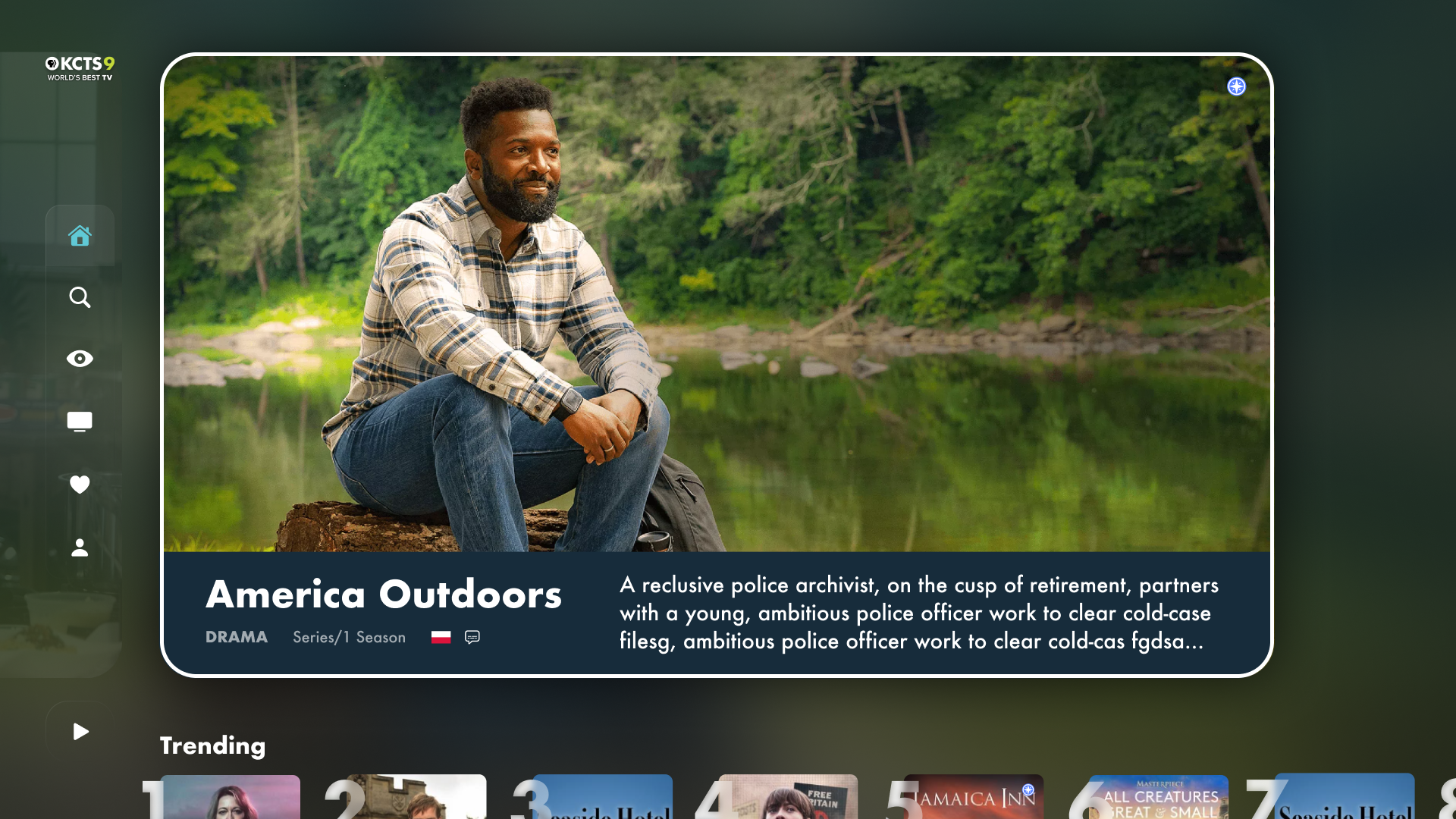
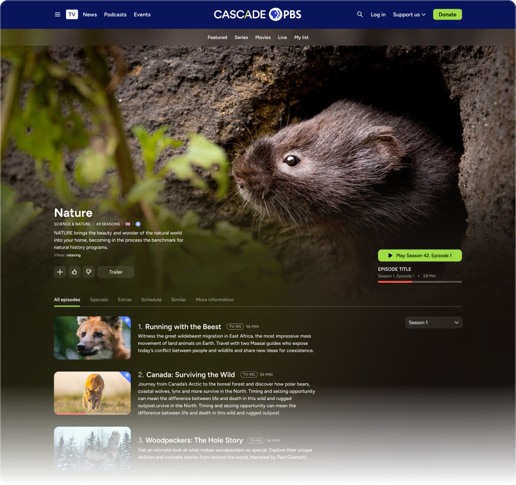
Navigating a TV content page
Interaction
- Condensed buttons when not focused
- Menu content pokes above the fold so users are contextually aware of where they are
- Delightful, in-button animations,
- Overlays on posters when focused to show relevant information when needed
Integration
- Live content integrated into schedule view -- open the live player right from the details page or set a reminder of when the show goes live
- Content states remain the same across devices
Highlighting content identity
- Full page background imagery of the selected video that highlights the focal point and uses a masked blur effect to create an immersive feel
Example of a web content page
Modularity
- All content types can be injected into a content page without sacrifice:
- Episodes are properly ordered depending on content type (e.g. latest episode for news, oldest episode for episodic)
- Menu adapts based on content type
- TV, mobile, and web have similar layouts, adapted to take advantage of input methods
Future proofing
- Future updates can implement features without UI overhauls.
- Example 1: the “More information” tab can expand to feature cast and crew
- Example 2: a “Gift episode” button can be added to the button cluster.
- Content titles to be replaced with content logos eventually
Management of apps through CMS
In addition to the frontend apps, I designed the backend content management system (CMS). Each frontend feature required careful backend consideration:
- How much control do stations want?
- How much automation should we incorporate?
Ultimately, we provided robust manual controls that could also be automated. Additionally, we let stations share setups so that more resourced stations could pave the way for others.
For a peak into the CMS design, I’ve provided two examples items stations can manage.
Allow stations to easily edit and curate content, share with each other, and communicate with their audiences
GOAL:
Hero carousel
Automated or Manual
Community Sharable
The hero carousel is the only required carousel and must be at the top of the page to create homogeneity between the apps.
Keyword carousel
Automated
Community Sharable
Admins determine which genres and vibes are included/excluded to populate these automated carousels.
Manually curated carousel
Manual
Community Sharable
These are for those who want complete control when curating their carousels.
Trending, continue watching, My List, recommended
Automated
These are classic carousels stations can easily add.
Live cards
Automated
Admins can promote their live content by letting it live on the homepage.
Promo or message cards
Manual
Admins can use basic text/URL messages to communicate with their audience or create artistic promos for more impact.
Example 1: Homepage customization
Building a homepage
Station admins can build and order their homepages using as many of components as they like. They can choose carousels made by other stations, schedule when lineups will change, and decide which carousels can be expanded to collection pages. They can even decide to adjust their homepages based on device type.

Backend CMS
Example 2: Member messaging
To accommodate two scenarios, stations can communicate to their audiences on the homepage in the following ways:
- Promos (pictured)
Promos are visually appealing cards stations can design and place anywhere on the homepage, giving them both branding and messaging control (within determined bounds).
We wanted these messages be visual, so we gave stations the ability to upload their own images. To accommodate text and button overlays, we provided guidelines. In the future, we would like to implement automatic systems that apply gradients over images, letting smaller stations make beautiful promos quickly.
- Messages (not pictured)
Messages are slim, text-only cards that can be opened to read more and scan QR codes/see URLs.
We wanted these messages to be quick and to-the-point, allowing stations to communicate with their audience at the top of the homepage where their message won’t be missed, but won’t be distracting.
Balancing customization with ease of use
Some stations have full staffs of designers and content programmers. Others have small, multi-role staffs. To accommodate both, the messaging features can be quickly made or more deliberately customized.
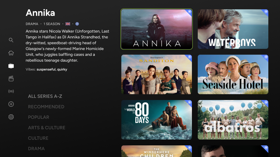
Pioneering a better browsing experience
When users are looking for content to watch, they fall somewhere on a spectrum of knowing the exact title they want to see and having no idea what interests them. The search page serves their needs for the former and the homepage serves their needs for the latter. But what about the in-between?
To meet this need, I trialed several designs before creating an original concept that balances several challenges:
- TV layouts need to be simple to read and navigate (not too many elements)
- Users need to see enough content options at one time to not feel “claustrophobic” while browsing
- Users need to understand each piece of content without leaving the page to ensure quick browsing

Allow users to discover interesting content whether they have no idea what to watch or some idea what to watch.
GOAL:
User has no idea what they want to watch. Stations curate the homepage to surface content they think their users will appreciate.
User has a general idea of what they want to watch, but no specific piece of content in mind. The Series and Movies pages fill this gap using a unique layout.
User exactly knows what they want to watch. The search page begins surfacing content as keystrokes are inputted.
Unbounded browsing
precise searching
Homepage
Browse pages (series and movies)
Search page
This is the browsing problem I needed to solve

The spectrum of user browsing precision
State 1: browsing the sorting list
State 2: browsing the content within list
The list has three tiers, invisible to the user, but carefully ordered. Filtering these tiers would add unnecessary complexity and decision-fatigue, especially on TV:
- Automatic
- Popular
- Recent
- Recommended
- Alphabetical
- Station-curated
- Seasonal
- Local
- Event-based
- Whatever they feel like!
- Genres
- Arts & Culture
- Drama
- Food
- etc.
When the user moves right, the list shrinks down providing space above for the information for each focused item to display. This let’s users quickly learn about each show without going to its content page. To properly execute this experience and make it intuitive, the animations, transparencies, and sizing of each element was carefully considered.
Gallery
TV, PBS Charlotte, Live
TV, Cascade PBS, Home (carousel with top shelf)
Mobile, Weta+, Onboarding
Mobile, PBS KVIE, Passport Gate
TV, Cascade PBS, Account Settings
TV, Nashville PBS, Video Player
TV, Cascade PBS, Home (top message)
Web, Cascade PBS, Video player
Web, KPBS, Home (scrolled down)
TV, Rocky Mountain PBS, Home (video carousel)

3. Results and Next Steps
Since launching apps, we’ve gathered initial data and surveyed our users. As the apps and user base matures, we will gather further data to analyze and help guide decision making.
Results
Next Steps
Results
With the help of the Washington, D.C. station, WETA, we surveyed users following the launch of the apps.
Based on 136 survey responses, there was strong user satisfaction
with generally positive ratings across all categories. However, several issues were identified that could improve the user experience and app adoption.
Additionally, shortly after launch, CEOs of participating stations met and provided glowing reviews of the product.
73%
of users rated overall experience
"Excellent"
or
"Very Good"
61%
of users use the apps
three times a week
or more.
Beyond surveying users, we looked at hard-data, including retention.
The retention rate of the apps has been high after the first few months post-launch. Continuing to track retention will be important as the apps mature and their newness-factor reduces.
Excellent
Very good
Good
Fair
Poor
Finding what I want to watch
32%
30%
18%
9%
11%
Learning about things I may want to watch
29%
30%
20%
10%
11%
Playing what I want to watch
37%
27%
18%
6%
11%
User app ratings
This is how I rate...
Positive feedback from users
“More modern, more swim lanes, better search results. More recommendations.”
“The content seems so much more vast on the new platform!”
“I absolutely love the format on this app! There are so many things to find , it's like being in candy store! And I love that I can watch live , which I couldn't before. I am HAPPY! HAPPY! HAPPY! with everything on this app!!!”
“I didn't expect the app to be very useful, but we are using it almost daily. Easy to find unexpected local content without wading thru all those PBS series.”
“Much better organized than the existing PBS app. The breakdown categories made certain shows more appealing.”
“I find the new site extensive and curated extremely well. It made it easy to identify some Walter Presents shows previously awkward to find, for example. I like that the categories are so varied. It’s like finding a treasure trove of forgotten programming available to watch. Very impressive!”
“This app is much better than the old one - quicker/more responsive, cleaner interface, faster loading. Really good!”
Issues based on survey results
Problem: Multiple users struggled with sign-in, password resets, and account confusion between PBS Passport and WETA+.
"Will not take my WETA password and my Roku password is different"
"I have both a WETA password and a PBS password...Not sure why I had two passwords"
Potential Action Items
- Implement unified authentication with PBS Passport
- Create clearer password reset instructions
- Develop one-time passcode email authentication option
1.
Authentication & Password Management
Problem: Difficulty finding subtitles and poor visual indicators for navigation
"I had difficulty finding the option to turn on subtitles"
"Please make it MUCH easier to identify which option is highlighted"
Potential Action Items
- Make subtitle/closed caption settings more prominent
- Improve visual contrast for selected menu items
- Add persistent subtitle settings across episodes
- Enhance accessibility features for visually impaired users
2.
Accessibility and Usability
Problem: Limited live TV guide functionality and scheduling information
"I wish you could use the right arrow button to see what is coming on in later hours"
"I could not find a Guide for Live TV shows”
Potential Action Items
- Improve program discriptions
- Add extended schedule viewing
- Consider DVR-like features for live content
3.
Live TV Features
Next Steps
Add stations
As the apps have rolled out, interest has grown from stations who wanted to see a proof of concept before committing themselves. I’m currently working with several stations to onboard them and optimize their branding and styling.
With the rate of stations signing up increasing, I’m working with a developer to automate some of the station onboarding.
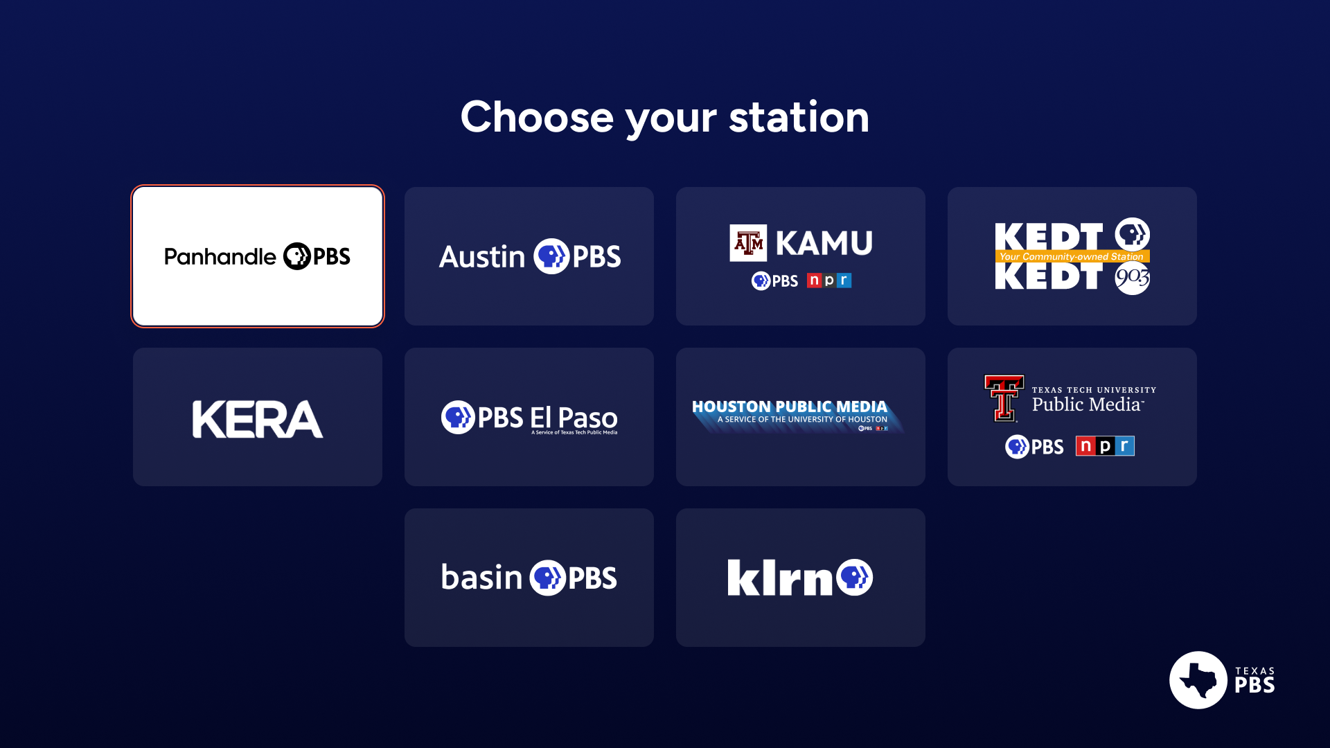
Additionally, we’re working on a feature that could bundle several smaller stations into a single app. The image on the right depicts how this will work with stations across Texas.
Conduct further user research
Beyond the initial surveys we performed post-launch, I would like to continue conducting user research:
- Survey all stations
- Work with stations to survey their audiences
- Conduct usability studies
- A/B test new features
Refine app and CMS UX
Many designed features had to be shelved to finish the apps on time. I’ve worked with stations and our product team to prioritize these features. They range from large, new features like profiles, to refinements of existing features, like allowing stations to place images on messages.
Other additional features are derived from survey results and user feedback. These can be seen above
Additionally, excitement around the apps has generated a future roadmap of app improvements and integrations. These additions have been prioritized and planned for future design work. They include
- NPR integration
- Film festival integration
- Local sports integration
- Community collections
- Gifted content
Profiles
Pause screen promotions
Improvements to messages
Multiple stations in a single app
My Other Case Studies

Designing a PBS video, news, podcast, and events website, serving 100,000+ members.
Crafting a scalable, 1000 component atomic design system for 15 PBS stations and multiple device types.


Copyright © 2025 | Designed and Built in Seattle, Washington


Designing a cross-platform streaming app, serving 15 PBS stations
Jump to product screens
View web app


Overview
Design Process
Final Product
Results and Next Steps
Cascade PBS
Design System
Resume

Back to top

1. Overview
As audiences shift from broadcast TV to digital streaming services, PBS stations across the country are suffering lost viewership and revenue. Meanwhile, national PBS released an app lacking fundamental features and content, and is undercutting their symbiotic relationship with local stations by directly hosting content on commercial platforms like Amazon Prime.

PBS national
- Hosts content produced by the individual stations
Local PBS stations
- Produces content for local and national audiences
- Broadcasts content


The content cycle between national PBS and individual stations is breaking, hurting stations and eventually national PBS.
To solve the viewership problem and expand local public media, we worked with stations to create a multi-platform streaming service that empowers individual PBS stations with tools, including extensive content management, custom branding, and direct audience communication pathways.

Role
UX Design Lead
TEAM
In-house product team (10)
External teams: Oxagile (7), Phase 2 Technologies (8)
TIMELINE
Jan. 2023 - Sept. 2025
END USERS
PBS stations (15)
PBS stations’ audiences (180,000)
Audiences are migrating away from linear TV
Audiences are rapidly shifting from traditional broadcast to digital platforms, making it increasingly difficult for stations to attract new donors and sustain revenue goals.

Problem

Provide a digital platform for migrating audiences
Provide a comprehensive streaming app that exceeds audience expectations. Make it available on a wide range of devices, including Roku, Apple TV, iOS, Android, and Fire TV.

Goal

User adoption
Track the number of stations adopting the platform and the growth in active users.
Revenue growth
Monitor the increase in donations and memberships generated through the app, especially through features designed to enhance digital fundraising
Success metrics
Current digital PBS offerings are confusing and dated
PBS content is spread across different platforms causing audiences confusion. Additionally, the public media apps that exist have dated UX and lacking feature sets. Viewers expect seamless, multi-platform experiences.
Problem
Build a unified platform with an intuitive user experience
Deliver a modern, intuitive interface that enables users to easily discover and watch all PBS content on any device using one app.
Goal
User engagement
Measure user interaction with the app, including average watch time, use of recommendation features, and engagement with local content.
Success metric
Stations don’t have the resources to manage a unique digital presence
Stations are oriented towards programming linear TV and don’t have teams available to build and maintain digital experiences. They need a low-effort, high capability solution for digital streaming.
Problem
Build a backend portal for stations to exchange content
Provide stations a CMS where they can share content, tagging, and content surfacing. Also give them easy tools to customize their own apps, allowing them to establish unique branding, messaging, and revenue generation.
Goal
Station feedback
Collect and incorporate feedback from participating stations to ensure the platform effectively meets their needs.
Success metric
Stakeholders
My role
As the lead UX designer for the project, I worked with a variety of stakeholders as shown in the diagram below (hover over the labels).
During the second half of the project, I contracted two other designers who I managed and supported.
Two target audiences
- Audience end users
Each station’s app has a set of users browsing content, viewing videos, and receiving messaging on various devices.
- Station backend app managers
Each station has a set of users curating content, customizing branding, and delivering messaging for their app.


Product Team
UX designer
Digital director
Product manager
Internal developers
Project manager

Advertisers
Community partners
Marketing and communications
Audience
Partner stations
Cascade PBS leadership
Contracted teams

Participating Stations


600k monthly
149k monthly
1M+ monthly
Timeline
It took over two years to get from conception to product launch. During that time, my focus was either entirely on the project (like during design phases) or split between supporting the build process and other projects.
Jan 2023
JUNE 2023
NOV 2023
APRIL 2024
SEPT 2024
FEB 2025
JULY 2025
Coordinating with stations and PBS
Information architecture
Ott designs
CMS designs
Work with second contracted team begins
App refinement with developers and stations
Web refinement work with developers
Continued launches and improvement
Foundational research
Design exploration and testing
Work with first contracted team
Web app designs
Mobile designs
Beta testing of OTT and mobile apps
Initial public launches for all stations
Platforms
To provide a complete service that meets audiences where they are, we designed cross-platform compatibility across all major streaming devices. Additionally, we designed a custom backend content management system for stations to use on the web.
TV
End User App
Apple TV
Google TV
Fire TV
Roku
LG TV
Samsung TV
Mobile
End User App
iOS
iPadOS
Android
Web
End User App
Backend CMS
Responsive
2. Design Process
After coordinating with PBS national and individual stations to launch the project and secure funding, I identified our audience, discovered pain points, leveraged secondary research, audited the competition, established the information architecture, and worked on initial concepts.
Target Audience
Pain Points
Competitive Analysis
Leveraging Secondary Research
Information Architecture
Concepts
Target Audience:
Ages 18-85
(skewing older)
All genders
Philanthropists
(community-minded folks)
Documentary fans
(science, art, and history nerds)
International content fans
(film and TV connoisseurs)
Parents and their children
Businesses with TVs
(Gyms, lobbies, airports, etc.)
Nostalgic PBS Millenials
Those with different abilities
(including those who struggle with tech)
Non English speakers
Using data collected from our existing user base and surveys from participating stations, we identified our target audience.
The chart represents some of the different groups our app serves and some of their overlaps, but is not an exact representation.
Pain Points
To understand the issues stations and audiences encounter with the current PBS app and other streaming apps, we interviewed both groups. Below are four of the pain points we uncovered.
Audience Pain Point
- Browsing is slow since it’s hard to know what a show really is about until you open its page or start watching it.
- Carousels are very basic, leading to a lot of content being hidden or not relevant.
- Besides the homepage, there aren’t more adequate ways to browse.
1.
Browsing for content is a struggle
- Part of the appeal of PBS is its non-profit, community feel. Linear TV provides this liveliness through interstitials, live programming, and two-way communication using phone or web. The current streaming apps only display rows of outdated, stale content.
Audience Pain Point
2.
Current streaming offerings feel lifeless
- Stations receive content from PBS national with locked-in tags. Tagging is limited and often not specific enough, limiting the degree to which stations can sort and display content.
- Stations lack granular control they desire like choosing which show images are featured and how episodes are organized.
Station Pain Point
3.
Content metadata is rigid
- Stations have limited resources, especially the smaller ones, and don’t have capacity to curate and operate a streaming service.
- Besides the homepage, there aren’t more sophisticated ways to browse.
4.
Managing a streaming service is impractical
Station Pain Point
Competitive Analysis
Current streaming offering
PBS app/original prototype app
Ideas to Model:
- Emulate some of the information architecture to prevent users from being overwhelmed by the new app
Issues with Current App:
- Challenging navigation (too many moves to get around)
- Accessibility and legibility issues
- Lack of visual hierarchy (visual overload)
- Dated visuals (iconography, component design)
- Lack of expected features
- Lack of interactive and delightful design (animations, user feedback)
Direct competitors
Netflix, Hulu, Disney +, Apple +, Google TV, Tubi
Ideas to Model:
- General structure of homepage, including a featured show and selection of carousels to foster familiarity
- Expected and time-tested navigation: side menu for TV, bottom menu for mobile, and top menu for web
Areas for improvement:
- Provide browsing pages that let stations feature timely content
- Create a communal feel by letting stations communicate with users
- Infuse station branding where appropriate to give a less sanitized feel and increase recognizability
Indirect competitors
Comcast Xfinity, Spotify, YouTube
Ideas to Model:
- Could use the “now playing” feature on Spotify
- EPG from cable offerings that older audience is used to
- Could incorporate some of the YouTube community aspects for a communal feel
Gaps In offerings:
- Improved browse pages that allow users to
- Messaging users directly for a local vibe
- Infuse a little bit of branding and colors for stations to be recognizable and stand out
Leveraging Secondary Research
Having limited resources, it was imperative for me to find and study established research, which could supplement the primary research I conducted using our audience. Using the research I found, I learned how users search (especially on TV with a less optimal typing experience), how they browse, and what content grabs their attention.
Information Architecture
Carousels: resume watching, trending, custom, automatic, mixed


Hero carousel
Messaging
Live TV
Promos
Future browsing and messaging
Search
Trending searches
Search input
Browse series
Browse movies
All A-Z
Recommended
Popular
By genre
Seasonal, etc. (future)
Live TV
Channels
My List
Recommended
My List
Watch history
Other future (watch later, shared with)
Settings
Passport (if non-member
Home
Account
Help
Contact
About
Sponsor
Main Menu
Sub Pages

The main considerations in designing the information architecture were
- Keeping navigation as familiar and intuitive for our tech-challenged audience
- Building a replicable foundation, allowing users to easily hand-off from one device to the next
The following helped in achieving the main considerations:
- Navigation requires the fewest moves possible
- Menus and other components emerge on the edges of screens to establish context (see the TV content page, for example)
- Device strengths are leveraged while keeping the platform unified and familiar
- Features can be added and improvements made without major interface changes
“One move away”

Details (Series or Movie Page)
various content types use different combinations of these


Details (play episode/movie)
All episodes
Specials
Extras
Schedule
Similar
More info
Trailer
Return to Add
Return to All Episodes
Like
Dislike
Add
Future: share, gift, save for later
Stations can fully order and manage their homepages using the CMS.

Concepts
To begin design work, I created wireframes for stakeholders to understand potential layouts as well as medium fidelity concepts for them to see styling possibilities.
Sketches

Medium fidelity exploration
Early concepts allowed me to experiment with out of the box ideas and styling approaches. We bounced the ideas off our internal groups and stations to get see what emotions were evoked. I used this feedback to incorporate ideas that were received favorably, and dialed back layout ideas that would be too out of the ordinary for users.
Home
Live
Details


3. Final Product
To demonstrate the consideration of design throughout the project, I’ve selected four areas to highlight and a gallery of screens.
Individual station branding
Content pages
Management of apps through CMS
Pioneering a better browsing experience
Gallery
Individual station branding
After identifying patterns in color palettes across all stations, I worked with each station to establish primary, secondary, and background colors guaranteed to work well together. The challenge was to accommodate all stations while keeping screens accessible and not detracting from the content imagery. A key decision was to use transparent whites and blacks to expand color palettes while keeping branding consistent.

Highlight station identities while retaining clean and accessible design
GOAL:
Exemplifying five stations to highlight branding across platforms:
TV
Mobile
Web


Primary.100
Primary.100


SECONDARY.500


Primary.500


Background
Content Pages
GOAL 1:
Make layouts intuitive regardless of device: establish a cohesive feel while leveraging device strengths
GOAL 2:
Accommodate many different types of content while highlighting content identities and branding
Navigating a TV content page
Interaction
- Condensed buttons when not focused
- Menu content pokes above the fold so users are contextually aware of where they are
- Delightful, in-button animations,
- Overlays on posters when focused to show relevant information when needed
Integration
- Live content integrated into schedule view -- open the live player right from the details page or set a reminder of when the show goes live
- Content states remain the same across devices
Example of a web content page
Highlighting content identity
- Full page background imagery of the selected video that highlights the focal point and uses a masked blur effect to create an immersive feel
Modularity
- All content types can be injected into a content page without sacrifice:
- Episodes are properly ordered depending on content type (e.g. latest episode for news, oldest episode for episodic)
- Menu adapts based on content type
- TV, mobile, and web have similar layouts, adapted to take advantage of input methods
Future proofing
- Future updates can implement features without UI overhauls.
- Example 1: the “More information” tab can expand to feature cast and crew
- Example 2: a “Gift episode” button can be added to the button cluster.
- Content titles to be replaced with content logos eventually
Management of apps through CMS
In addition to the frontend apps, I designed the backend content management system (CMS). Each frontend feature required careful backend consideration:
- How much control do stations want?
- How much automation should we incorporate?
Ultimately, we provided robust manual controls that could also be automated. Additionally, we let stations share setups so that more resourced stations could pave the way for others.
For a peak into the CMS design, I’ve provided two examples items stations can manage.

Allow stations to easily edit and curate content, share with each other, and communicate with their audiences
GOAL:
Hero carousel
Automated or Manual
Community Sharable
The hero carousel is the only required carousel and must be at the top of the page to create homogeneity between the apps.
Keyword carousel
Automated
Community Sharable
Admins determine which genres and vibes are included/excluded to populate these automated carousels.
Manually curated carousel
Manual
Community Sharable
These are for those who want complete control when curating their carousels.
Trending, continue watching, My List, recommended
Automated
These are classic carousels stations can easily add.
Live cards
Automated
Admins can promote their live content by letting it live on the homepage.
Promo or message cards
Manual
Admins can use basic text/URL messages to communicate with their audience or create artistic promos for more impact.
Example 1: Homepage customization
Building a homepage
Station admins can build and order their homepages using as many of components as they like. They can choose carousels made by other stations, schedule when lineups will change, and decide which carousels can be expanded to collection pages. They can even decide to adjust their homepages based on device type.

Backend CMS
Example 2: Member messaging
To accommodate two scenarios, stations can communicate to their audiences on the homepage in the following ways:
- Promos (pictured)
Promos are visually appealing cards stations can design and place anywhere on the homepage, giving them both branding and messaging control (within determined bounds).
We wanted these messages be visual, so we gave stations the ability to upload their own images. To accommodate text and button overlays, we provided guidelines. In the future, we would like to implement automatic systems that apply gradients over images, letting smaller stations make beautiful promos quickly.
- Messages (not pictured)
Messages are slim, text-only cards that can be opened to read more and scan QR codes/see URLs.
We wanted these messages to be quick and to-the-point, allowing stations to communicate with their audience at the top of the homepage where their message won’t be missed, but won’t be distracting.
Balancing customization with ease of use
Some stations have full staffs of designers and content programmers. Others have small, multi-role staffs. To accommodate both, the messaging features can be quickly made or more deliberately customized.
Pioneering a better browsing experience
When users are looking for content to watch, they fall somewhere on a spectrum of knowing the exact title they want to see and having no idea what interests them. The search page serves their needs for the former and the homepage serves their needs for the latter. But what about the in-between?
To meet this need, I trialed several designs before creating an original concept that balances several challenges:
- TV layouts need to be simple to read and navigate (not too many elements)
- Users need to see enough content options at one time to not feel “claustrophobic” while browsing
- Users need to understand each piece of content without leaving the page to ensure quick browsing
Allow users to discover interesting content whether they have no idea what to watch or some idea what to watch.
GOAL:
User has no idea what they want to watch. Stations curate the homepage to surface content they think their users will appreciate.
User has a general idea of what they want to watch, but no specific piece of content in mind. The Series and Movies pages fill this gap using a unique layout.
User exactly knows what they want to watch. The search page begins surfacing content as keystrokes are inputted.
Unbounded browsing
precise searching
Homepage
Browse pages (series and movies)
Search page
This is the browsing problem I needed to solve

The spectrum of user browsing precision
State 1: browsing the sorting list
State 2: browsing the content within list
The list has three tiers, invisible to the user, but carefully ordered. Filtering these tiers would add unnecessary complexity and decision-fatigue, especially on TV:
- Automatic
- Popular
- Recent
- Recommended
- Alphabetical
- Station-curated
- Seasonal
- Local
- Event-based
- Whatever they feel like!
- Genres
- Arts & Culture
- Drama
- Food
- etc.
When the user moves right, the list shrinks down providing space above for the information for each focused item to display. This let’s users quickly learn about each show without going to its content page. To properly execute this experience and make it intuitive, the animations, transparencies, and sizing of each element was carefully considered.
Gallery
TV, PBS Charlotte, Live
TV, Cascade PBS, Home (carousel with top shelf)
Mobile, Weta+, Onboarding
Mobile, PBS KVIE, Passport Gate
TV, Cascade PBS, Account Settings
TV, Nashville PBS, Video Player
TV, Cascade PBS, Home (top message)
Web, Cascade PBS, Video player
Web, KPBS, Home (scrolled down)
TV, Rocky Mountain PBS, Home (video carousel)

3. Results and Next Steps
Since launching apps, we’ve gathered initial data and surveyed our users. As the apps and user base matures, we will gather further data to analyze and help guide decision making.
Results
With the help of the Washington, D.C. station, WETA, we surveyed users following the launch of the apps.
Based on 136 survey responses, there was strong user satisfaction
with generally positive ratings across all categories. However, several issues were identified that could improve the user experience and app adoption.
Additionally, shortly after launch, CEOs of participating stations met and provided glowing reviews of the product.
or
"Excellent"
"Very Good"
of users rated overall experience
73%
or more.
three times a week
of users use the apps
61%
Beyond surveying users, we looked at hard-data, including retention.
The retention rate of the apps has been high after the first few months post-launch. Continuing to track retention will be important as the apps mature and their newness-factor reduces.
Excellent
Very good
Good
Fair
Poor
Finding what I want to watch
32%
30%
18%
9%
11%
Learning about things I may want to watch
29%
30%
20%
10%
11%
Playing what I want to watch
37%
27%
18%
6%
11%
This is how I rate...
User app ratings
Positive feedback from users
“More modern, more swim lanes, better search results. More recommendations.”
“The content seems so much more vast on the new platform!”
“I absolutely love the format on this app! There are so many things to find , it's like being in candy store! And I love that I can watch live , which I couldn't before. I am HAPPY! HAPPY! HAPPY! with everything on this app!!!”
“I didn't expect the app to be very useful, but we are using it almost daily. Easy to find unexpected local content without wading thru all those PBS series.”
“Much better organized than the existing PBS app. The breakdown categories made certain shows more appealing.”
“I find the new site extensive and curated extremely well. It made it easy to identify some Walter Presents shows previously awkward to find, for example. I like that the categories are so varied. It’s like finding a treasure trove of forgotten programming available to watch. Very impressive!”
“This app is much better than the old one - quicker/more responsive, cleaner interface, faster loading. Really good!”
Issues based on survey results
Problem: Multiple users struggled with sign-in, password resets, and account confusion between PBS Passport and WETA+.
"Will not take my WETA password and my Roku password is different"
"I have both a WETA password and a PBS password...Not sure why I had two passwords"
Potential Action Items
- Implement unified authentication with PBS Passport
- Create clearer password reset instructions
- Develop one-time passcode email authentication option
1.
Authentication & Password Management
Problem: Difficulty finding subtitles and poor visual indicators for
navigation
"I had difficulty finding the option to turn on subtitles"
"Please make it MUCH easier to identify which option is highlighted"
Potential Action Items
- Make subtitle/closed caption settings more prominent
- Improve visual contrast for selected menu items
- Add persistent subtitle settings across episodes
- Enhance accessibility features for visually impaired users
2.
Accessibility and Usability

Problem: Limited live TV guide functionality and scheduling information
"I wish you could use the right arrow button to see what is coming on in later hours"
"I could not find a Guide for Live TV shows"
Potential Action Items
- Add extended schedule viewing
- Improve program descriptions
- Consider DVR-like features for live content
3.
Live TV Features
Next Steps
Add stations
As the apps have rolled out, interest has grown from stations who wanted to see a proof of concept before committing themselves. I’m currently working with several stations to onboard them and optimize their branding and styling.
With the rate of stations signing up increasing, I’m working with a developer to automate some of the station onboarding.
Additionally, we’re working on a feature that could bundle several smaller stations into a single app. The image on the right depicts how this will work with stations across Texas.
Conduct further user research
Beyond the initial surveys we performed post-launch, I would like to continue conducting user research:
- Survey all stations
- Work with stations to survey their audiences
- Conduct usability studies
- A/B test new features
Refine app and CMS UX
Many designed features had to be shelved to finish the apps on time. I’ve worked with stations and our product team to prioritize these features. They range from large, new features like profiles, to refinements of existing features, like allowing stations to place images on messages.
Other additional features are derived from survey results and user feedback. These can be seen above
Additionally, excitement around the apps has generated a future roadmap of app improvements and integrations. These additions have been prioritized and planned for future design work. They include
- NPR integration
- Film festival integration
- Local sports integration
- Community collections
- Gifted content
Profiles
Pause screen promotions
Improvements to messages
Multiple stations in a single app
My Other Case Studies

Designing a PBS video, news, podcast, and events website, serving 100,000+ members.
Crafting a scalable, 1000 component atomic design system for 15 PBS stations and multiple device types.
Copyright © 2025 | Designed and Built in Seattle, Washington


Designing a cross-platform streaming app, serving 15 PBS stations
Jump to product screens
View web app
Overview
Design Process
Final Product
Results and Next Steps
Cascade PBS
Design System
Resume


Back to top